@hdoc/react-input


Simple input components for your React app
Installation
npm install @hdoc/react-input
Usage
import { EmailIcon, StarIcon, StarBorderIcon } from "third-party-package";
import { Input, Textarea, Checkbox } from "@hdoc/react-input";

function App() {
  return (
    <>
      <Input label="Email" type="email" iconEnd={<EmailIcon />} />
      <Textarea label="Message" />
      <Checkbox
        label="Favorite"
        icon={<StarBorderICon />}
        iconChecked={<StarIcon />}
        color="warning"
      />
    </>
  );
}
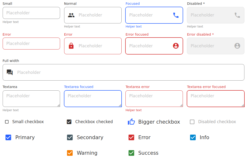
API
See documentation below for reference to all of the props, classes and CSS
custom properties available for the following components:
General Customization
You can customize the label, placeholder and helper text for any of the
previously mentioned components.
CSS Custom Properties
:root,
[data-theme="my-custom-theme"],
body.dark,
.any-parent,
.class-to-extend-styles {
--placeholder-color: #636363;
--placeholder-disabled: #434343;
--label-font-family: "Roboto";
--label-font-size: 14px;
--label-font-weight: 600;
--label-text: #828282;
--label-text-focus: lightblue;
--helper-text-color: #828282;
--error: #f44336;
}
CSS Classes
.label
The styles for the label
.label--error
The error styles for the label
.label--fullwidth
The full width styles for the label
.helper-text
The styles for the helper text
Reducing Build Size
The default entry point includes CSS for all of the components. If you are
only using a few components, you can reduce the build size by importing only
the components you need:
- import { Input, Textarea } from "@hdoc/react-input";
+ import { Input } from "@hdoc/react-input/dist/Input";
+ import { Textarea } from "@hdoc/react-input/dist/Textarea";
Or, you can use babel-plugin-import to automatically import the components:
{
...otherConfig,
plugins: [
[
"import",
{
libraryName: "@hdoc/react-input",
libraryDirectory: "dist",
camel2DashComponentName: false,
transformToDefaultImport: false,
},
],
]
}
Additionally, you will need to import the global CSS in your entry file:
import "@hdoc/react-input/dist/main.css";


