Security News
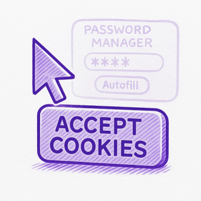
Researcher Exposes Zero-Day Clickjacking Vulnerabilities in Major Password Managers
Hacker Demonstrates How Easy It Is To Steal Data From Popular Password Managers
By Jonathan Leitschuh - Aug 19, 2025
@hurtigruten/design-system-components
Advanced tools
A set of living components that align with designs to form a Design System
A set of living components that align with designs to form a Design System
Install packages:
$ npm install
View components in local storybook:
$ npm start
Install husky and prepare git hook for linting
npm run husky-prepare
Build a production bundle:
$ npm run build
Please familiarise yourself with the code style of this project when contributing. To make this process a bit easier, we suggest that you use VSCode and open the project from the workspace file.
The master branch is the default branch for the project. That means that all pull requests should be sent here using the squash and merge option.
Whenever a release is triggered, an automated action will merge the latest master into production. This is to have a place to find the source code of the published design system, and it will also deploy a new version of the Storybook.
Pull requests are set up with certain requirements.
We ask that you please name your pull request in the following format:
${release_type}: ${precise short description of work}.
An example can be PATCH: fixed button hover transition time or MAJOR: renamed property link to href in <Button />.
This will help us when we want to do a release and we need to know what version we should bump to.
Please use squash and merge when you are ready to merge your pull request. This will help keep the generated changelog clean.
To publish to NPM, you need to trigger a github workflow called release package. Run it on the master branch with the correct version upgrade, and it will be released to our NPMJS registry. We ask that you follow the principle of semantic version when deciding what version you are upgrading to. If you look at the merged commits since the last release, you should be able to spot what type of release you need to do.
Example of version number changes based on release keyword:
FAQs
A set of living components that align with designs to form a Design System
The npm package @hurtigruten/design-system-components receives a total of 25 weekly downloads. As such, @hurtigruten/design-system-components popularity was classified as not popular.
We found that @hurtigruten/design-system-components demonstrated a healthy version release cadence and project activity because the last version was released less than a year ago. It has 0 open source maintainers collaborating on the project.
Did you know?

Socket for GitHub automatically highlights issues in each pull request and monitors the health of all your open source dependencies. Discover the contents of your packages and block harmful activity before you install or update your dependencies.
Security News
Hacker Demonstrates How Easy It Is To Steal Data From Popular Password Managers

Security News
Oxlint’s new preview brings type-aware linting powered by typescript-go, combining advanced TypeScript rules with native-speed performance.

Security News
A new site reviews software projects to reveal if they’re truly FOSS, making complex licensing and distribution models easy to understand.