OEB WIDGETS GRAPHS
A charts collection based on OpenEBench Application


Documentation
:point_right: You can see the complete documentation here
:point_right: There is a repository with some examples here
The package is build with Lint Elements components and javascript modules.
It has some dependencies associated for the functionalities:
- html2canvas
- jspdf
- pareto-frontier
- simple-statistics
- plotly.js
Project structure
- /src. Where the main application files are hosted.
- /src/demo. Live demo of applications functionalities and a .json file to simulate real data.
Build Setup
Download the package and install dependencies:
npm install
Serve with hot reload at localhost:
npm run dev
Build package for production:
npm run build
Usage
npm i @inb/oeb-widgets-graphs
or
import '/dist/oeb-widgets-graphs.es.js';
or
<script type="module" src="https://cdn.jsdelivr.net/gh/inab/oeb-widgets-graphs@main/dist/oeb-widgets-graphs.umd.js" />
Then just declare the element with the variables that contain the data to be able to build the corresponding graph.
<widget-element
  :data=graphData
  :type=graphType>
</widget-element>
Graphs types
Bar plot
Bar plot shows the results of a benchmarking challenge that uses one single evaluation metric in the form of a Barplot. Challenge participants are shown in the X axis, while the value of their metric is shown in the Y axis. Bar plot live demo
)
#### Bar plot classification
The results of this plot format can be transformed into a tabular format by sorting the participants in descending/ascending order according to their metrics and applying a quartile classification over that linear set of values. This classification splits the participants into four different groups/clusters depending on their performance. Clusters are separated in the plot with vertical lines and shown in the right table together with a green color-scale, which is easier to interpret for both experts and non-expert users.

Bar plot structure
You can see an example of a structure to display bar graphs within the "demo" section of the application. Bar plot structure example
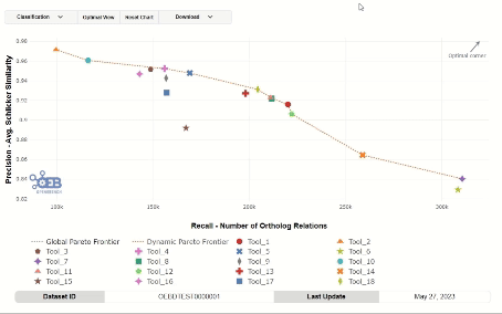
Scatter plot
Scatter plot displays the results of scientific benchmarking experiments in graph format, and apply various classification methods to transform them to tabular format. Scatter plot live demo

Scatter plot classification
- Square quartiles - divide the plotting area in four squares by getting the 2nd quartile of the X and Y metrics.

- Diagonal quartiles - divide the plotting area with diagonal lines by assigning a score to each participant based in the distance to the 'optimal performance'.

- Clustering - group the participants using the K-means clustering algorithm and sort the clusters according to the performance.

Scatter plot structure
You can see an example of a structure to display bar graphs within the "demo" section of the application. Scatter plot structure example
Box plot
Box plot shiw the results of a benchmarking challenge that uses a graphical representation of the distribution of a dataset on a seven-number summary of datapoints. The challenge metrics is represented in Y axis by default. Box plot live demo

Box plot classification
The result of the plot can be ordened by maximum or minimum median value.

Box plot structure
You can see an example of a structure to display bar graphs within the "demo" section of the application. Box plot structure example
Radar plot
A radar chart is an informative visual tool in which multiple variables (three or more) are compared on a two-dimensional plane. To do this, we will create different axes that come from a common central point. In most cases, all axes are evenly distributed and drawn evenly relative to each other.
Radar plot live demo

Radar plot structure
You can see an example of a structure to display bar graphs within the "demo" section of the application. Radar plot structure example.
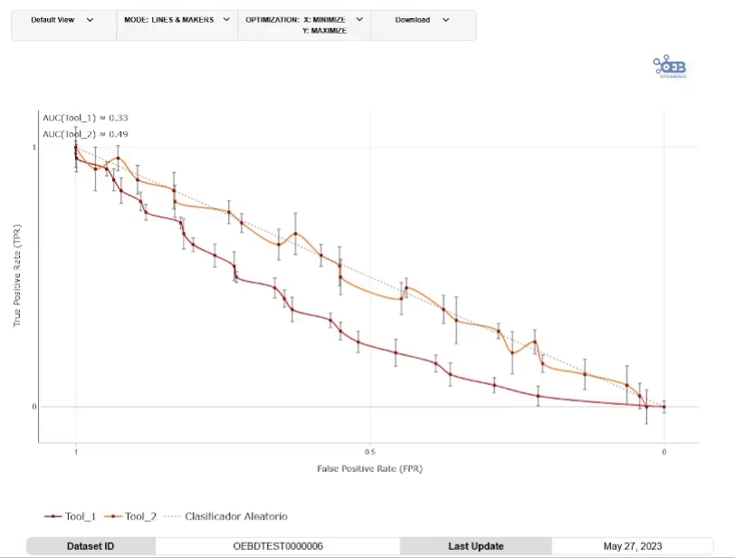
Line plot
A line plot is an effective visual tool used to display trends and relationships between numerical variables over a continuous range. It consists of data points connected by a line, typically plotted on a two-dimensional plane with one variable on the x-axis and another on the y-axis. Line plots are particularly useful for illustrating patterns over time, comparing multiple datasets, or highlighting fluctuations and trends within the data.
Line plot live demo
Line plot structure
You can see an example of a structure to display bar graphs within the "demo" section of the application. Line plot structure example.