Product
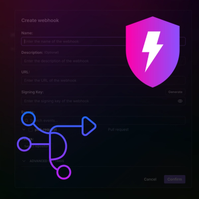
Introducing Webhook Events for Pull Request Scans
Add real-time Socket webhook events to your workflows to automatically receive pull request scan results and security alerts in real time.
@iy4u/form-gen-client-lib
Advanced tools
Create your own component library with Vue CLI 3 and VuePress.
This starter project includes a documentation app powered by VuePress. It not only documents the usage of the component, but also provides a testing bed during the development of components.
Dev dependency "@vue/babel-preset-app": "^4.1.1" is introduced as Vue CLI v4 is using core-js v3.x while vuepress 1.2.0 is still using core-js v2.x.
# install dependencies
npm install
# start the doc app with hot reload, great for testing components
npm run docs:dev
# build the library, available under dist
npm run build
# build the doc app, available under docs/.vuepress/dist
npm run docs:build
create npm account.
npmrc -c iy4u
npm login --scope=@iy4u --registry=https://registry.npmjs.org/
npmrc -c ionrev
npm login --scope=@ionrev --registry=https://registry.npmjs.org/
npmrc ionrev
npmrc iy4u
The library is a Vue plugin. Its install function in install.js imports all components from components folder, registers them to Vue and automatically call itself.
Besides the install function, index.js may also exports mixins, utils and constants. The client may use them as below:
<script>
import { MyMixin, MyConstants, MyUtil } from '@iy4u/form-gen-client-lib'

export default {
  mixins: [MyMixin],
  data () {
    return {
      magicNum: MyConstants.MAGIC_NUM
    }
  },
  methods: {
    add (a, b) {
      return MyUtil.add(a, b)
    }
  }
}
</script>
If your component library contains a set of styles used by all components, you may refer to asserts/main.css as an example. It defines a simple style (green color border) used by the two example components in the library.
To use the global style in client app, including the components defined by the client app, import it in your main.js:
import '@iy4u/form-gen-client-lib/assets/main.css'
If you want to avoid conflicting with other global styles, consider pre-fix your classes in your style, or wrap them into a namespace class.
Third-party libraries you library depends on bloats the size of your library, if not handled well.
One strategy is to make it external. As an example, the popular library moment is used by ComponentA. Since it is very likely the client of your library may also use this library, we configure CLI not to include it to the bundle by adding the following in vue.config.js.
module.exports = {
  //...
  chainWebpack: config => {
    config.externals({
      moment: 'moment'
    })
  }
}
In your client app, you don't need to explicitly add dependency to moment in package.json as it is a dependency of @iy4u/form-gen-client-lib. However, if you want to reduce the size of the bundle size of client app, add the following in the vue.config.js of client app (details), assuming it is also built with Vue CLI .
const webpack = require('webpack')
module.exports = {
  //...
  plugins: [
    // Ignore all locale files of moment.js
    new webpack.IgnorePlugin(/^\.\/locale$/, /moment$/),
  ],
}
Another strategy is to embed cherry-picked functions with tree shaking. As an example, the fill function of popular library lodash is used by ComponentA.
To get the tree shaking working, import the fill function like the following. Note that import { fill } from 'lodash' or import _ from 'lodash' will not work and will embed the whole lodash library.
import fill from 'lodash/fill'
If your client app also use lodash and you don't want lodash to be in both the client app and the component libraries, even after cherry-picking, you may consider cherry picking in component library and re-export them as utils for client to consume, so that the client does not need to depend on lodash, therefore avoiding duplication.
You may publish your component library to NPM repository. If you prefer to use/test your component library locally in a client app, you may use npm link or install-local.
If your app is not using a bundler, the following is the example of how to use the library in vanilla HTML page. Note that it loads the global and component level CSS, as well as externalized third-party library Moment.
<!DOCTYPE html>
<html>
  <head>
    <title>Demo app</title>
    <link rel="stylesheet" href="assets/main.css">
    <link rel="stylesheet" href="dist/form-gen-client-lib.css">
  </head>
  <body>
    <div id="app">
      <p>Component A: <component-a/></p>
      <p>Component B: <component-b @click="onClick"/></p>
    </div>
  </body>

  <script src="https://unpkg.com/vue"></script>
  <script src="https://unpkg.com/moment"></script>
  <script src="dist/form-gen-client-lib.umd.js"></script>
  <script>
      console.log(window['form-gen-client-lib'])
      var app = new Vue({
        el: '#app',
        methods: {
          onClick (message) {
            alert(message)
          }
        }
      })
    </script>
</html>
FAQs
IY Foundation Client Library
The npm package @iy4u/form-gen-client-lib receives a total of 359 weekly downloads. As such, @iy4u/form-gen-client-lib popularity was classified as not popular.
We found that @iy4u/form-gen-client-lib demonstrated a not healthy version release cadence and project activity because the last version was released a year ago. It has 3 open source maintainers collaborating on the project.
Did you know?

Socket for GitHub automatically highlights issues in each pull request and monitors the health of all your open source dependencies. Discover the contents of your packages and block harmful activity before you install or update your dependencies.

Product
Add real-time Socket webhook events to your workflows to automatically receive pull request scan results and security alerts in real time.

Research
The Socket Threat Research Team uncovered malicious NuGet packages typosquatting the popular Nethereum project to steal wallet keys.

Product
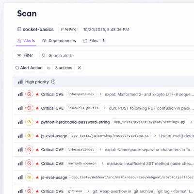
A single platform for static analysis, secrets detection, container scanning, and CVE checks—built on trusted open source tools, ready to run out of the box.