
Research
Two Malicious Rust Crates Impersonate Popular Logger to Steal Wallet Keys
Socket uncovers malicious Rust crates impersonating fast_log to steal Solana and Ethereum wallet keys from source code.
By Kirill Boychenko - Sep 24, 2025
@iyio/at-dot-css
Advanced tools
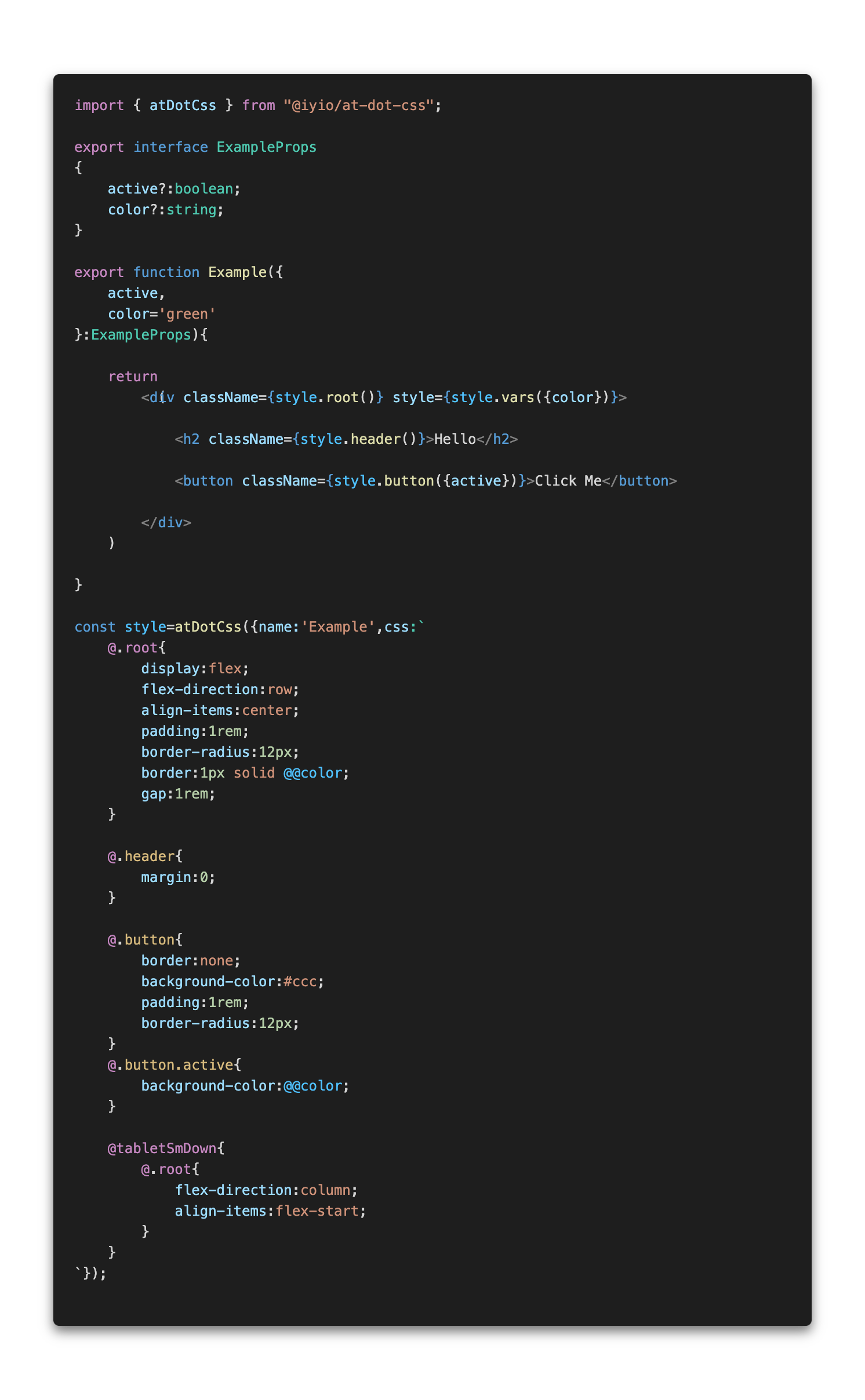
A fast and lightweight css-in-js library. The at-dot-css is a superset of css with a few simple additions to make it a little easier to scope component styles, work with variables and define responsive breakpoints.
A fast and lightweight css-in-js library. The at-dot-css is a superset of css with a few simple additions to make it a little easier to scope component styles, work with variables and define responsive breakpoints.
The syntax is designed to be vary simple to implement, only requiring a simple find and replace algorithm which keeps parsing times to a minimum. There is no nesting, functions or mixins, just good old css with a couple of extra goodies 🤓
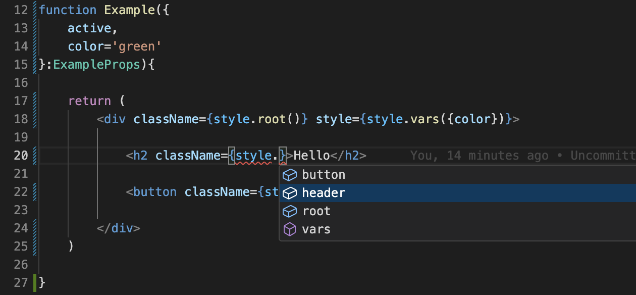
AtDot styles are defined using the atDotCss function. The atDotCss function returns a ParseAtDotStyle
object with functions that correspond to each of the @. selectors defined in the style. After the
first call to a selector function the style is parsed and a new style sheet is inserted into the
head of the document or added to a custom style sheet renderer.
 (note - css-in-js syntax highlighting is provided by the
 high-js vscode extension)
The css in the example above is converted to the css below.
.Example{
    display:flex;
    flex-direction:row;
    align-items:center;
    padding:1rem;
    border-radius:12px;
    border:1px solid var(--Example-color);
    gap:1rem;
}

.Example-header{
    margin:0;
}

.Example-button{
    border:none;
    background-color:#ccc;
    padding:1rem;
    border-radius:12px;
}
.Example-button.active{
    background-color:var(--Example-color);
}

@media(max-width:768px){
    .Example{
        flex-direction:column;
        align-items:flex-start;
    }
}
When using at-dot-css in a NextJS project and rending server side or at build time styles are added
to a style queue that is then rendered using the NextJsStyleSheets component from the
@iyio/nextjs-common package. Using the NextJsStyleSheets component allows css generated by
at-dot-css to be included in the css bundles generated by NextJs.
npm install @iyio/at-dot-css
There is no configuration 🥹, no extra build steps, no messing with webpack. Just install the package and start using it 🥳
All the code examples below assume the name of the current style is "Example".
@.root - The root selector is replaced with the current style name.
/* at-dot */
@.root{
    padding:1rem;
}

/* converted css*/
.Example{
    padding:1rem;
}
@.{selector-name} - Named selectors are prefixed with the name of the current style.
/* at-dot */
@.title{
    margin:1rem 0;
}

/* converted css*/
.Example-title{
    margin:1rem 0;
}
@@{variable-name} - Variable names are prefixed with the current style name and wrapped in a var function call.
/* at-dot */
.some-name{
    color:@@color;
    width:calc( 100% - @@extraMargin )
}

/* converted css*/
.some-name{
    color:var(--Example-color);
    width:calc( 100% - var(--Example-extraMargin) )
}
(note - when using vars in calculations a space after the var name is required for typescript intellisense to function correctly)
@{break-point} - Breakpoint media queries allow you to quickly define media queries for standard
breakpoints.
/* at-dot */
@tabletSmDown{
    .my-component{
        flex-direction:column;
    }
}
@tabletSmUp{
    .my-title{
        font-size:2rem;
    }
}

/* converted css*/
@media(max-width:768px){
    .my-component{
        flex-direction:column;
    }
}
@media(min-width:577px){
    .my-title{
        font-size:2rem;
    }
}
Breakpoints:
@mobileSmUp - Small mobile breakpoint and up - (all breakpoints)@mobileUp - Mobile breakpoint and up@tabletSmUp - Small tablet breakpoint and up@tabletUp - Tablet breakpoint and up@desktopSmUp - Small desktop breakpoint and up@desktopUp - Desktop breakpoint and up@mobileSmDown - Small mobile breakpoint and down@mobileDown - Mobile breakpoint and down@tabletSmDown - Small tablet breakpoint and down@tabletDown - Tablet breakpoint and down@desktopSmDown - Small desktop breakpoint and down@desktopDown - Desktop breakpoint and down - (all breakpoints)Syntax highlighting is provided using the high-js vscode extension
When using at-dot-css with TypeScript you get full type safety and intellisense.
FAQs
A fast and lightweight css-in-js library. The at-dot-css is a superset of css with a few simple additions to make it a little easier to scope component styles, work with variables and define responsive breakpoints.
The npm package @iyio/at-dot-css receives a total of 69 weekly downloads. As such, @iyio/at-dot-css popularity was classified as not popular.
We found that @iyio/at-dot-css demonstrated a healthy version release cadence and project activity because the last version was released less than a year ago. It has 1 open source maintainer collaborating on the project.
Did you know?

Socket for GitHub automatically highlights issues in each pull request and monitors the health of all your open source dependencies. Discover the contents of your packages and block harmful activity before you install or update your dependencies.
Research
Socket uncovers malicious Rust crates impersonating fast_log to steal Solana and Ethereum wallet keys from source code.

Research
A malicious package uses a QR code as steganography in an innovative technique.

Research
/Security News
Socket identified 80 fake candidates targeting engineering roles, including suspected North Korean operators, exposing the new reality of hiring as a security function.