
Research
Two Malicious Rust Crates Impersonate Popular Logger to Steal Wallet Keys
Socket uncovers malicious Rust crates impersonating fast_log to steal Solana and Ethereum wallet keys from source code.
By Kirill Boychenko - Sep 24, 2025
@junk-temporary-prototypes/addon-viewport
Advanced tools
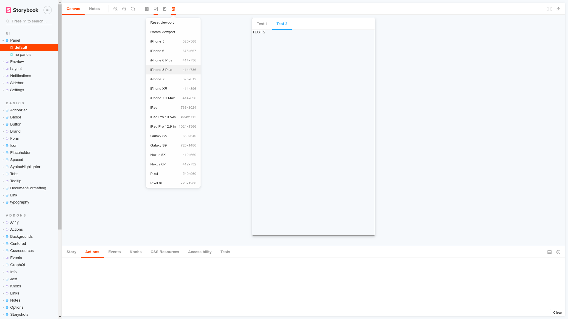
Build responsive components by adjusting Storybook’s viewport size and orientation
Storybook Viewport Addon allows your stories to be displayed in different sizes and layouts in Storybook. This helps build responsive components inside of Storybook.
Viewport is part of essentials and so is installed in all new Storybooks by default. If you need to add it to your Storybook, you can run:
npm i -D @storybook/addon-viewport
Then, add following content to .storybook/main.js:
export default {
  addons: ['@storybook/addon-viewport'],
};
You should now be able to see the viewport addon icon in the the toolbar at the top of the screen.
The usage is documented in the documentation.
FAQs
Build responsive components by adjusting Storybook’s viewport size and orientation
The npm package @junk-temporary-prototypes/addon-viewport receives a total of 31 weekly downloads. As such, @junk-temporary-prototypes/addon-viewport popularity was classified as not popular.
We found that @junk-temporary-prototypes/addon-viewport demonstrated a not healthy version release cadence and project activity because the last version was released a year ago. It has 2 open source maintainers collaborating on the project.
Did you know?

Socket for GitHub automatically highlights issues in each pull request and monitors the health of all your open source dependencies. Discover the contents of your packages and block harmful activity before you install or update your dependencies.
Research
Socket uncovers malicious Rust crates impersonating fast_log to steal Solana and Ethereum wallet keys from source code.

Research
A malicious package uses a QR code as steganography in an innovative technique.

Research
/Security News
Socket identified 80 fake candidates targeting engineering roles, including suspected North Korean operators, exposing the new reality of hiring as a security function.