
AngularEditor


A simple native WYSIWYG/Rich Text editor for Angular 20+
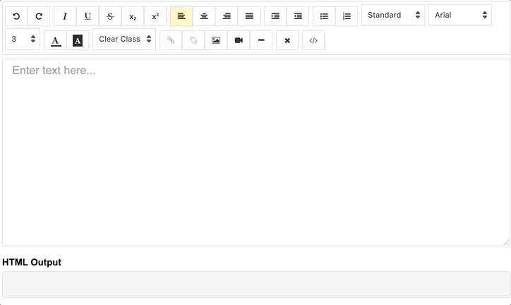
Demo
demo | See the code in StackBlitz.
Getting Started
Installation
Install via npm package manager
npm install @kolkov/angular-editor --save
Versions
3.0.0 and above - for Angular v20+ (CSS variables, modern Angular 20)
2.0.0 and above - for Angular v13-19
1.0.0 and above - for Angular v8-12
0.18.4 and above - for Angular v7.x.x
0.15.x - for Angular v6.x.x
Note: Version 3.0.0 requires:
- Angular 20.0.0 or higher (also compatible with Angular 21)
- RxJS 7.8.0 or higher
- TypeScript 5.4 or higher
Attention! alpha and beta versions may contain breaking changes.
Usage
Import angular-editor module
import { HttpClientModule} from '@angular/common/http';
import { AngularEditorModule } from '@kolkov/angular-editor';

@NgModule({
  imports: [ HttpClientModule, AngularEditorModule ]
})
Then in HTML
<angular-editor [placeholder]="'Enter text here...'" [(ngModel)]="htmlContent"></angular-editor>
or for usage with reactive forms
<angular-editor formControlName="htmlContent" [config]="editorConfig"></angular-editor>
if you are using more than one editor on same page set id property
<angular-editor id="editor1" formControlName="htmlContent1" [config]="editorConfig"></angular-editor>
<angular-editor id="editor2" formControlName="htmlContent2" [config]="editorConfig"></angular-editor>
where
import { AngularEditorConfig } from '@kolkov/angular-editor';


editorConfig: AngularEditorConfig = {
    editable: true,
      spellcheck: true,
      height: 'auto',
      minHeight: '0',
      maxHeight: 'auto',
      width: 'auto',
      minWidth: '0',
      translate: 'yes',
      enableToolbar: true,
      showToolbar: true,
      placeholder: 'Enter text here...',
      defaultParagraphSeparator: '',
      defaultFontName: '',
      defaultFontSize: '',
      fonts: [
        {class: 'arial', name: 'Arial'},
        {class: 'times-new-roman', name: 'Times New Roman'},
        {class: 'calibri', name: 'Calibri'},
        {class: 'comic-sans-ms', name: 'Comic Sans MS'}
      ],
      customClasses: [
      {
        name: 'quote',
        class: 'quote',
      },
      {
        name: 'redText',
        class: 'redText'
      },
      {
        name: 'titleText',
        class: 'titleText',
        tag: 'h1',
      },
    ],
    uploadUrl: 'v1/image',
    upload: (file: File) => { ... }
    uploadWithCredentials: false,
    sanitize: true,
    toolbarPosition: 'top',
    toolbarHiddenButtons: [
      ['bold', 'italic'],
      ['fontSize']
    ]
};
For ngModel to work, you must import FormsModule from @angular/forms, or for formControlName, you must import ReactiveFormsModule from @angular/forms
To serve the icons file, ensure that your angular.json contains the following asset configuration:
{
  "glob": "**/*",
  "input": "node_modules/@kolkov/angular-editor/assets/icons",
  "output": "assets/ae-icons/"
}
Styling
Connect default theme file to your angular.json or nx.json
"styles": [
     "projects/angular-editor-app/src/styles.scss",
     "node_modules/@kolkov/angular-editor/themes/default.scss"
],
or @include or @use in your project styles.scss file, and then override default theme variables like this:
:root {
  --ae-gap: 5px;
  --ae-text-area-border: 1px solid #ddd;
  --ae-text-area-border-radius: 0;
  --ae-focus-outline-color: #afaeae auto 1px;
  --ae-toolbar-padding: 1px;
  --ae-toolbar-bg-color: #b3dca0;
  --ae-toolbar-border-radius: 1px solid #ddd;
  --ae-button-bg-color: #dadad7;
  --ae-button-border: 3px solid #3fb74e;
  --ae-button-radius: 5px;
  --ae-button-hover-bg-color: #3fb74e;
  --ae-button-active-bg-color: red;
  --ae-button-active-hover-bg-color: blue;
  --ae-button-disabled-bg-color: gray;
  --ae-picker-label-color: rgb(78, 84, 155);
  --ae-picker-icon-bg-color: rgb(34, 41, 122);
  --ae-picker-option-bg-color: rgba(221, 221, 84, 0.76);
  --ae-picker-option-active-bg-color: rgba(237, 237, 62, 0.9);
  --ae-picker-option-focused-bg-color: rgb(255, 255, 0);
}
Custom buttons
You can define your custom buttons with custom actions using executeCommandFn. It accepts commands from execCommand.
The first argument of this method is aCommandName and the second argument is aValueArgument. Example shows a button that adds Angular editor logo into the editor.
<angular-editor id="editor1" [(ngModel)]="htmlContent1" [config]="config1" (ngModelChange)="onChange($event)"
                (blur)="onBlur($event)">
  <ng-template #customButtons let-executeCommandFn="executeCommandFn">
    <ae-toolbar-set>
      <button aeButton title="Angular editor logo" (click)="executeCommandFn('insertHtml', angularEditorLogo)">
        <svg viewBox="-8 0 272 272" xmlns="http://www.w3.org/2000/svg"
             preserveAspectRatio="xMidYMid" fill="#000000">
          <g id="SVGRepo_bgCarrier" stroke-width="0"></g>
          <g id="SVGRepo_tracerCarrier" stroke-linecap="round" stroke-linejoin="round"></g>
          <g id="SVGRepo_iconCarrier">
            <g>
              <path
                d="M0.0996108949,45.522179 L125.908171,0.697276265 L255.103502,44.7252918 L234.185214,211.175097 L125.908171,271.140856 L19.3245136,211.971984 L0.0996108949,45.522179 Z"
                fill="#E23237"></path>
              <path
                d="M255.103502,44.7252918 L125.908171,0.697276265 L125.908171,271.140856 L234.185214,211.274708 L255.103502,44.7252918 L255.103502,44.7252918 Z"
                fill="#B52E31"></path>
              <path
                d="M126.107393,32.27393 L126.107393,32.27393 L47.7136187,206.692607 L76.9992218,206.194553 L92.7377432,166.848249 L126.207004,166.848249 L126.306615,166.848249 L163.063035,166.848249 L180.29572,206.692607 L208.286381,207.190661 L126.107393,32.27393 L126.107393,32.27393 Z M126.306615,88.155642 L152.803113,143.5393 L127.402335,143.5393 L126.107393,143.5393 L102.997665,143.5393 L126.306615,88.155642 L126.306615,88.155642 Z"
                fill="#FFFFFF"></path>
            </g>
          </g>
        </svg>
      </button>
    </ae-toolbar-set>
  </ng-template>
</angular-editor>
API
Inputs
| id | string | - | no | Id property when multiple editor used on same page |
| [config] | AngularEditorConfig | default config | no | config for the editor |
| placeholder | string | - | no | Set custom placeholder for input area |
| tabIndex | number | - | no | Set Set tabindex on angular-editor |
Outputs
| (html) | Output html |
| (viewMode) | Fired when switched visual and html source mode |
| (blur) | Fired when editor blur |
| (focus) | Fired when editor focus |
Methods
| focus | Focuses the editor element |
Other
| AngularEditorConfig | configuration | Configuration for the AngularEditor component. |
Configuration
| editable | bolean | true | no | Set editing enabled or not |
| spellcheck | bolean | true | no | Set spellchecking enabled or not |
| translate | string | yes | no | Set translating enabled or not |
| sanitize | bolean | true | no | Set DOM sanitizing enabled or not |
| height | string | auto | no | Set height of the editor |
| minHeight | string | 0 | no | Set minimum height of the editor |
| maxHeight | string | auto | no | Set maximum height of the editor |
| width | string | auto | no | Set width of the editor |
| minWidth | string | 0 | no | Set minimum width of the editor |
| enableToolbar | bolean | true | no | Set toolbar enabled or not |
| showToolbar | bolean | true | no | Set toolbar visible or not |
| toolbarPosition | string | top | no | Set toolbar position top or bottom |
| placeholder | string | - | no | Set placeholder text |
| defaultParagraphSeparator | string | - | no | Set default paragraph separator such as p |
| defaultFontName | string | - | no | Set default font such as Comic Sans MS |
| defaultFontSize | string | - | no | Set default font size such as 1 - 7 |
| uploadUrl | string | - | no | Set image upload endpoint https://api.exapple.com/v1/image/upload and return response with imageUrl key. {"imageUrl" : } |
| upload | function | - | no | Set image upload function |
| uploadWithCredentials | bolean | false | no | Set passing or not credentials in the image upload call |
| fonts | Font[] | - | no | Set array of available fonts [{name, class},...] |
| customClasses | CustomClass[] | - | no | Set array of available fonts [{name, class, tag},...] |
| outline | bolean | true | no | Set outline of the editor if in focus |
| toolbarHiddenButtons | string[][] | - | no | Set of the array of button names or elements to hide |
toolbarHiddenButtons: [
  [
    'undo',
    'redo',
    'bold',
    'italic',
    'underline',
    'strikeThrough',
    'subscript',
    'superscript',
    'justifyLeft',
    'justifyCenter',
    'justifyRight',
    'justifyFull',
    'indent',
    'outdent',
    'insertUnorderedList',
    'insertOrderedList',
    'heading',
    'fontName'
  ],
  [
    'fontSize',
    'textColor',
    'backgroundColor',
    'customClasses',
    'link',
    'unlink',
    'insertImage',
    'insertVideo',
    'insertHorizontalRule',
    'removeFormat',
    'toggleEditorMode'
  ]
]
What's included
Within the download you'll find the following directories and files. You'll see something like this:
angular-editor/
└── projects/
    ├── angular-editor/
    └── angular-editor-app/
angular-editor/ - library
angular-editor-app/ - demo application
Documentation
The documentation for the AngularEditor is hosted at our website AngularEditor
Icons from Ligature Symbols Icons Collection icons
Contributing
Please read through our contributing guidelines. Included are directions for opening issues, coding standards, and notes on development.
Editor preferences are available in the editor config for easy use in common text editors. Read more and download plugins at http://editorconfig.org.
Versioning
For a transparency into our release cycle and in striving to maintain backward compatibility, AngularEditor is maintained under the Semantic Versioning guidelines.
See the Releases section of our project for changelogs for each release version.
Creators
Andrey Kolkov
Donate
If you like my work and I save your time you can buy me a :beer: or :pizza:


