Product
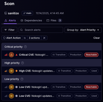
Reachability for Ruby Now in Beta
Reachability analysis for Ruby is now in beta, helping teams identify which vulnerabilities are truly exploitable in their applications.
@leafygreen-ui/typography
Advanced tools
pnpm add @leafygreen-ui/typography
yarn add @leafygreen-ui/typography
npm install @leafygreen-ui/typography
| Package | Version |
|---|---|
@leafygreen-ui/leafygreen-provider | ^1.1.0 |
import { H1, H2, Subtitle, Body, InlineCode, InlineKeyCode, Disclaimer, Overline, Link, BackLink } from '@leafygreen-ui/typography';
<H1>Heading 1</H1>
<H2>Heading 2</H2>
<H3>Heading 3</H3>
<Subtitle>Subtitle</Subtitle>
<Body weight="medium">Body</Body>
<InlineCode>Code</InlineCode>
<>
  <InlineKeyCode>CTRL</InlineKeyCode>
  <InlineCode>+</InlineCode>
  <InlineKeyCode>C</InlineKeyCode>
</>
<Disclaimer>Disclaimer</Disclaimer>
<Overline>Overline</Overline>
<Link href="http://mongodb.design">MongoDB.design</Link>
<BackLink href="/home">MongoDB.design</BackLink>
All props extend the HTMLElementProps of their root tag, however the below components accept extra props
| Component | Root |
|---|---|
H1 | h1 |
H2 | h2 |
H3 | h3 |
Subtitle | h6 |
Body | p |
InlineCode | code |
InlineKeyCode | code |
Disclaimer | small |
Overline | p |
Link | a |
BackLink | a |
Label | label |
Description | p |
Label | p |
| Prop | Type | Description | Default |
|---|---|---|---|
darkMode | boolean | Determines if the component renders in dark mode | false |
as | React.ElementType | Element to render the component as. Note: This will supersede the behavior of any other props. | 'h1' |
| Prop | Type | Description | Default |
|---|---|---|---|
darkMode | boolean | Determines if the component renders in dark mode | false |
as | React.ElementType | Element to render the component as. Note: This will supersede the behavior of any other props. | 'h2' |
| Prop | Type | Description | Default |
|---|---|---|---|
darkMode | boolean | Determines if the component renders in dark mode | false |
as | React.ElementType | Element to render the component as. Note: This will supersede the behavior of any other props. | 'h3' |
| Prop | Type | Description | Default |
|---|---|---|---|
darkMode | boolean | Determines if the component renders in dark mode | false |
as | React.ElementType | Element to render the component as. Note: This will supersede the behavior of any other props. | 'h6' |
| Prop | Type | Description | Default |
|---|---|---|---|
weight | 'regular' | 'medium' | 'semiBold' | font-weight applied to typography element | 'regular' |
darkMode | boolean | Determines if the component renders in dark mode | false |
as | React.ElementType | Element to render the component as. Note: This will supersede the behavior of any other props. | 'p' |
baseFontSize | 13 | 16 | font-size applied to typography element | Defaults to value set by LeafyGreen Provider. |
| Prop | Type | Description | Default |
|---|---|---|---|
href | string | undefined | If an href prop is passed to InlineCode it will be rendered with an a tag wrapping the code tag. Otherwise, it'll simply render as a code tag. | |
darkMode | boolean | Determines if the component renders in dark mode | |
baseFontSize | 13 | 16 | font-size applied to typography element | Defaults to value set by LeafyGreen Provider. |
| Prop | Type | Description | Default |
|---|---|---|---|
darkMode | boolean | Determines if the component renders in dark mode | |
baseFontSize | 13 | 16 | font-size applied to typography element | Defaults to value set by LeafyGreen Provider. |
| Prop | Type | Description | Default |
|---|---|---|---|
darkMode | boolean | Determines if the component renders in dark mode | false |
| Prop | Type | Description | Default |
|---|---|---|---|
darkMode | boolean | Determines if the component renders in dark mode | false |
| Prop | Type | Description | Default |
|---|---|---|---|
as | React.ElementType | The component or Element to render the component as. Note: This will supersede the behavior of any other props. | p |
darkMode | boolean | Determines if the component renders in dark mode | false |
| Prop | Type | Description | Default |
|---|---|---|---|
arrowAppearance | 'hover', 'persist', 'none' | Displays a right arrow adjacent to the anchor tag. When set to persist the arrow will always be present. When set to hover, the arrow will only appear when hovering over the arrow. | 'none' |
hideExternalIcon | boolean | Hides the external icon when the current host name is different from the host of the destination URL | false |
darkMode | boolean | Determines if the component renders in dark mode | false |
as | React.ElementType | Element to render the component as. Note: This will supersede the behavior of any other props. | 'a' |
baseFontSize | 13 | 16 | font-size applied to typography element | Defaults to value set by LeafyGreen Provider. |
Note: BackLink is intended for internal linking only
| Prop | Type | Description | Default |
|---|---|---|---|
darkMode | boolean | Determines if the component renders in dark mode | false |
as | React.ElementType | Element to render the component as. Note: This will supersede the behavior of any other props. | 'a' |
baseFontSize | 13 | 16 | font-size applied to typography element | Defaults to value set by LeafyGreen Provider. |
| Prop | Type | Description | Default |
|---|---|---|---|
darkMode | boolean | Determines if the component renders in dark mode | false |
disabled | boolean | Determines whether the component should appear disabled | false |
baseFontSize | 13 | 16 | font-size applied to typography element | Defaults to value set by LeafyGreen Provider. |
as | React.ElementType | The component or Element to render the component as. Note: This will supersede the behavior of any other props. | label |
| Prop | Type | Description | Default |
|---|---|---|---|
darkMode | boolean | Determines if the component renders in dark mode | false |
baseFontSize | 13 | 16 | font-size applied to typography element | Defaults to value set by LeafyGreen Provider. |
The 'typography' package is a powerful toolkit for building websites with beautiful typography. It provides a wide range of customization options and plugins to enhance the typography of your site. Compared to @leafygreen-ui/typography, it offers more flexibility and is not tied to a specific design system.
The 'styled-components' package allows you to write actual CSS code to style your components. It provides a way to create reusable, styled typography components. While it does not offer predefined typography components like @leafygreen-ui/typography, it gives you the freedom to create custom styles.
The 'material-ui' package is a popular React UI framework that includes a comprehensive set of typography components. It follows Google's Material Design guidelines and offers a wide range of customization options. Compared to @leafygreen-ui/typography, it provides a more extensive set of UI components beyond just typography.
FAQs
leafyGreen UI Kit Typography
We found that @leafygreen-ui/typography demonstrated a healthy version release cadence and project activity because the last version was released less than a year ago. It has 6 open source maintainers collaborating on the project.
Did you know?

Socket for GitHub automatically highlights issues in each pull request and monitors the health of all your open source dependencies. Discover the contents of your packages and block harmful activity before you install or update your dependencies.

Product
Reachability analysis for Ruby is now in beta, helping teams identify which vulnerabilities are truly exploitable in their applications.

Research
/Security News
Malicious npm packages use Adspect cloaking and fake CAPTCHAs to fingerprint visitors and redirect victims to crypto-themed scam sites.

Security News
Recent coverage mislabels the latest TEA protocol spam as a worm. Here’s what’s actually happening.