Research
/Security News
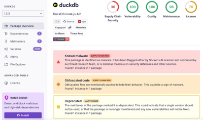
DuckDB npm Account Compromised in Continuing Supply Chain Attack
Ongoing npm supply chain attack spreads to DuckDB: multiple packages compromised with the same wallet-drainer malware.
@lgenzelis/gatsby-remark-images
Advanced tools
Processes images in markdown so they can be used in the production build.
Processes images in markdown so they can be used in the production build.
In the processing, it make images responsive by:
srcset and sizes of the img element so regardless of the width of the
device, the correct image is downloaded.npm install --save gatsby-remark-images gatsby-plugin-sharp
// In your gatsby-config.js
plugins: [
  `gatsby-plugin-sharp`,
  {
    resolve: `gatsby-transformer-remark`,
    options: {
      plugins: [
        {
          resolve: `gatsby-remark-images`,
          options: {
            // It's important to specify the maxWidth (in pixels) of
            // the content container as this plugin uses this as the
            // base for generating different widths of each image.
            maxWidth: 590,
          },
        },
      ],
    },
  },
]
| Name | Default | Description |
|---|---|---|
maxWidth | 650 | The maxWidth in pixels of the div where the markdown will be displayed. This value is used when deciding what the width of the various responsive thumbnails should be. |
linkImagesToOriginal | true | Add a link to each image to the original image. Sometimes people want to see a full-sized version of an image e.g. to see extra detail on a part of the image and this is a convenient and common pattern for enabling this. Set this option to false to disable this behavior. |
showCaptions | false | Add a caption to each image with the contents of the title attribute, when this is not empty. If the title attribute is empty but the alt attribute is not, it will be used instead. Set this option to true to enable this behavior. You can also pass an array instead to specify which value should be used for the caption — for example, passing ['alt', 'title'] would use the alt attribute first, and then the title. When this is set to true it is the same as passing ['title', 'alt']. If you just want to use the title (and omit captions for images that have alt attributes but no title), pass ['title']. |
markdownCaptions | false | Parse the caption as markdown instead of raw text. Ignored if showCaptions is false. |
sizeByPixelDensity | false | Analyze images' pixel density to make decisions about target image size. This is what GitHub is doing when embedding images in tickets. This is a useful setting for documentation pages with a lot of screenshots. It can have unintended side effects on high pixel density artworks. Example: A screenshot made on a retina screen with a resolution of 144 (e.g. Macbook) and a width of 100px, will be rendered at 50px. |
wrapperStyle | Add custom styles to the div wrapping the responsive images. Use the syntax for the style attribute e.g. margin-bottom:10px; background: red; or a function returning a style string which receives the information about the image you can use to dynamically set styles based on the aspectRatio for example. | |
backgroundColor | white | Set the background color of the image to match the background image of your design. Note: - set this option to transparent for a transparent image background.- set this option to none to completely remove the image background. |
quality | 50 | The quality level of the generated files. |
withWebp | false | Additionally generate WebP versions alongside your chosen file format. They are added as a srcset with the appropriate mimetype and will be loaded in browsers that support the format. Pass true for default support, or an object of options to specifically override those for the WebP files. For example, pass { quality: 80 } to have the WebP images be at quality level 80. |
tracedSVG | false | Use traced SVGs for placeholder images instead of the "blur up" effect. Pass true for traced SVGs with the default settings (seen here), or an object of options to override the defaults. For example, pass { color: "#F00", turnPolicy: "TURNPOLICY_MAJORITY" } to change the color of the trace to red and the turn policy to TURNPOLICY_MAJORITY. See node-potrace parameter documentation for a full listing and explanation of the available options. |
loading | lazy | Set the browser's native lazy loading attribute. One of lazy, eager or auto. |
{
  resolve: `gatsby-remark-images`,
  options: {
    maxWidth: 800,
    wrapperStyle: fluidResult => `flex:${_.round(fluidResult.aspectRatio, 2)};`,
  },
}
This plugin will support the following formats:
Since Sharp is used for image processing, this plugin will not support GIFs or SVGs. If you would like to render these file types with the image markdown syntax, use the gatsby-remark-copy-linked-files plugin. Do note with this it will load in the images, but won't use the features of Sharp such as the elastic container or the blur-up enhancements.
FAQs
Processes images in markdown so they can be used in the production build.
We found that @lgenzelis/gatsby-remark-images demonstrated a not healthy version release cadence and project activity because the last version was released a year ago. It has 1 open source maintainer collaborating on the project.
Did you know?

Socket for GitHub automatically highlights issues in each pull request and monitors the health of all your open source dependencies. Discover the contents of your packages and block harmful activity before you install or update your dependencies.

Research
/Security News
Ongoing npm supply chain attack spreads to DuckDB: multiple packages compromised with the same wallet-drainer malware.

Security News
The MCP Steering Committee has launched the official MCP Registry in preview, a central hub for discovering and publishing MCP servers.

Product
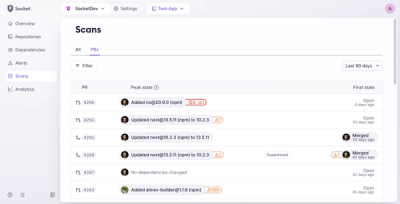
Socket’s new Pull Request Stories give security teams clear visibility into dependency risks and outcomes across scanned pull requests.