Product
Introducing Socket Fix for Safe, Automated Dependency Upgrades
Automatically fix and test dependency updates with socket fix—a new CLI tool that turns CVE alerts into safe, automated upgrades.
@mantine/core
Advanced tools
React components library focused on usability, accessibility and developer experience
@mantine/core is a comprehensive React component library that provides a wide range of customizable UI components and hooks for building modern web applications. It focuses on accessibility, performance, and ease of use, making it a popular choice for developers looking to create responsive and visually appealing user interfaces.
Button
The Button component is a versatile and customizable button element that can be used to trigger actions or navigate within the application.
import { Button } from '@mantine/core';
function Demo() {
return <Button>Click me</Button>;
}Modal
The Modal component provides a way to display content in a dialog overlay, which can be used for forms, notifications, or additional information.
import { useState } from 'react';
import { Modal, Button } from '@mantine/core';

function Demo() {
  const [opened, setOpened] = useState(false);

  return (
    <>
      <Button onClick={() => setOpened(true)}>Open modal</Button>
      <Modal opened={opened} onClose={() => setOpened(false)}>
        Modal content
      </Modal>
    </>
  );
}
Grid
The Grid component allows for the creation of responsive layouts using a flexible grid system, making it easy to arrange content in a structured manner.
import { Grid, Col } from '@mantine/core';

function Demo() {
  return (
    <Grid>
      <Col span={4}>1</Col>
      <Col span={4}>2</Col>
      <Col span={4}>3</Col>
    </Grid>
  );
}
Notifications
The Notifications component provides a way to display temporary messages to the user, which can be used for alerts, confirmations, or other types of feedback.
import { showNotification } from '@mantine/notifications';

function Demo() {
  return (
    <Button onClick={() => showNotification({ message: 'Hello, world!' })}>
      Show notification
    </Button>
  );
}Material-UI is a popular React component library that implements Google's Material Design guidelines. It offers a wide range of components and customization options, making it a strong alternative to @mantine/core. Material-UI is known for its comprehensive documentation and large community support.
Chakra UI is a simple, modular, and accessible component library that gives you the building blocks to create React applications with speed. It emphasizes ease of use and accessibility, similar to @mantine/core, and provides a wide range of customizable components.
Ant Design is a comprehensive design system and React component library developed by Alibaba. It offers a wide range of high-quality components and design patterns, making it suitable for enterprise-level applications. Ant Design is known for its robust feature set and extensive documentation.
Mantine core components library.
# With yarn
yarn add @mantine/core @mantine/hooks

# With npm
npm install @mantine/core @mantine/hooks
MIT
FAQs
React components library focused on usability, accessibility and developer experience
The npm package @mantine/core receives a total of 0 weekly downloads. As such, @mantine/core popularity was classified as not popular.
We found that @mantine/core demonstrated a healthy version release cadence and project activity because the last version was released less than a year ago. It has 1 open source maintainer collaborating on the project.
Did you know?

Socket for GitHub automatically highlights issues in each pull request and monitors the health of all your open source dependencies. Discover the contents of your packages and block harmful activity before you install or update your dependencies.

Product
Automatically fix and test dependency updates with socket fix—a new CLI tool that turns CVE alerts into safe, automated upgrades.

Security News
CISA denies CVE funding issues amid backlash over a new CVE foundation formed by board members, raising concerns about transparency and program governance.

Product
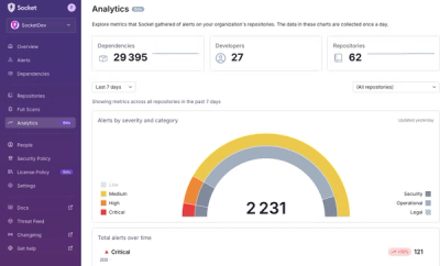
We’re excited to announce a powerful new capability in Socket: historical data and enhanced analytics.