Security News
Vite Releases Technical Preview of Rolldown-Vite, a Rust-Based Bundler
Vite releases Rolldown-Vite, a Rust-based bundler preview offering faster builds and lower memory usage as a drop-in replacement for Vite.
@marxlnfcs/ngx-grid
Advanced tools
Angular Grid System
Angular library to create a simple grid layout

npm i @marxlnfcs/ngx-grid
Import NgxGridModule from @marxlnfcs/ngx-grid
import { NgxGridModule } from '@marxlnfcs/ngx-grid-alt';

@NgModule({
  imports: [
    NgxGridModule.forRoot({ ... })
  ]
})
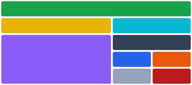
Simple component to build a dynamic and easy to use grid layout
<ngx-grid>
  <ngx-grid-column>...</ngx-grid-column>
  <ngx-grid-column>...</ngx-grid-column>
  <ngx-grid-group>
    <ngx-grid-column>...</ngx-grid-column>
    <ngx-grid-column>...</ngx-grid-column>
  </ngx-grid-group>
</ngx-grid>
<ngx-grid>strategy - Defines the strategy of the grid component. SCREEN uses the media queries and CONTAINER uses the container queries which is experimental, Possible values: screen, containerbaseBreakpoint - Defines the base breakpoint of this component. (default is xs), Possible values: xs, sm, md, lg, xl, 2xl, 3xl, 4xlbaseSize - Defines the default column size of the grid. (default is 12), Possible values: 2, 4, 6, 8, 10, 12gap - Sets the spacing between all columns and rows. (default is 1rem)columnGap - Sets the spacing between all columns. (default is the value of the gap option)rowGap - Sets the spacing between all rows. (default is the value of the gap option)autoRows - Whether to use the grid-auto-rows feature. (default is false)rows - Accepts a list of strings to define the size of each row statically. (default is null)<ngx-grid-column>For every directive there are multiple size, offset and order options for each breakpoint.
The [size], [offset] and [order] input uses the current base breakpoint.
Breakpoints: xs, sm, md, lg, xl, 2xl, 3xl and 4xl
Sizes: 1-12
Offset sizes: 2, 4, 6, 8, 10
size - Sets the width (1-12) of the column. (default is 12)*:size - Sets the width (1-12) of the column. (default is 12)offset - Sets the distance from the left. (default is null)*:offset - Sets the distance from the left. (default is null)order - Sets the position of the column. (default is null)*:order - Sets the position of the column. (default is null)<ngx-grid-group>For every directive there are multiple size, offset and order options for each breakpoint.
The [size], [offset] and [order] input uses the current base breakpoint.
Breakpoints: xs, sm, md, lg, xl, 2xl, 3xl and 4xl
Sizes: 1-12
Offset sizes: 2, 4, 6, 8, 10
gap - Sets the spacing between all columns and rows. (default is 1rem)columnGap - Sets the spacing between all columns. (default is the value of the gap option)rowGap - Sets the spacing between all rows. (default is the value of the gap option)autoRows - Whether to use the grid-auto-rows feature. (default is true)rows - Accepts a list of strings to define the size of each row statically. (default is null)size - Sets the width (1-12) of the column. (default is 12)*:size - Sets the width (1-12) of the column. (default is 12)offset - Sets the distance from the left. (default is null)*:offset - Sets the distance from the left. (default is null)order - Sets the position of the column. (default is null)*:order - Sets the position of the column. (default is null)Simple component to center a specific size of container
<ngx-grid-centered>
  ...
</ngx-grid-centered>
<ngx-grid-centered>For every breakpoint, there is a native size option.
The [size] input uses the current base breakpoint.
Breakpoints: xs, sm, md, lg, xl, 2xl, 3xl and 4xl
Sizes: 1-12
size - Sets the width (1-12) of the column. (default is 12)*:size - Sets the width (1-12) of the column. (default is 12)autoRows - Whether to use the grid-auto-rows feature. (default is false)Structural directive to add/remove an element if the defined breakpoint fits.
<div *ngxScreenSize"'xs'">
...
</div>
Directive to add classes and/or styles based on the breakpoint
<div
  [xs.class]="'class1, class2'"
  [xs.class]="['class1', 'class2']"
  [xs.class]="{ class1: true, class2: true }"

  [xs.style]="'display: none; color: black;'"
  [xs.style]="['display: none', 'color: black; background-color: green;']"
  [xs.style]="{ 'display': 'none', 'color': 'black' }"
>
  ...
</div>
In the forRoot method when importing the grid module in the app module you can specify the following options that will be globally applied to all grid instances.
strategy - Defines the strategy of the grid component. SCREEN uses the media queries and CONTAINER uses the container queries which is still experimental, Possible values: screen, containerbaseBreakpoint - Defines the base breakpoint of this component. (default is xs), Possible values: xs, sm, md, lg, xl, 2xl, 3xl, 4xlbaseSize - Defines the default column size of the grid. (default is 12), Possible values: 2, 4, 6, 8, 10, 12gap - Sets the spacing between all columns and rows. (default is 1rem)columnGap - Sets the spacing between all columns. (default is the value of the gap option)rowGap - Sets the spacing between all rows. (default is the value of the gap option)autoRows - Whether to use the grid-auto-rows feature. (default is false)breakpoints - Key-Value object with name of breakpoint as key and minWidth as numberFAQs
Angular library to create a simple grid layout
The npm package @marxlnfcs/ngx-grid receives a total of 0 weekly downloads. As such, @marxlnfcs/ngx-grid popularity was classified as not popular.
We found that @marxlnfcs/ngx-grid demonstrated a healthy version release cadence and project activity because the last version was released less than a year ago. It has 0 open source maintainers collaborating on the project.
Did you know?

Socket for GitHub automatically highlights issues in each pull request and monitors the health of all your open source dependencies. Discover the contents of your packages and block harmful activity before you install or update your dependencies.

Security News
Vite releases Rolldown-Vite, a Rust-based bundler preview offering faster builds and lower memory usage as a drop-in replacement for Vite.

Research
Security News
A malicious npm typosquat uses remote commands to silently delete entire project directories after a single mistyped install.

Research
Security News
Malicious PyPI package semantic-types steals Solana private keys via transitive dependency installs using monkey patching and blockchain exfiltration.