@masumdev/rn-bottom-sheet
A highly customizable and gesture-responsive bottom sheet component for React Native applications.

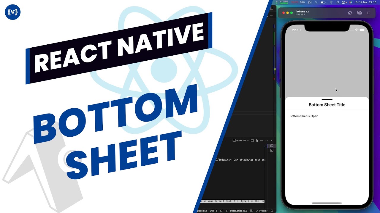
Demo


Youtube Tutorial
Features
- 🎯 Customizable snap points (10% to 100% of screen height)
- 🎨 Customizable background and backdrop colors
- 📱 iOS and Android back gesture/button handling
- 💫 Smooth animations and gestures using react-native-reanimated
- 🔄 Context-based state management
- 📜 Scrollable content support
- 🔝 Dynamic height adjustment
- 🎯 Title and content management through hooks
- 🛡️ Safe area support
Installation
Prerequisites
Make sure you have these peer dependencies installed in your React Native project:
{
"react": "^18.3.1",
"react-native": "^0.76.7",
"react-native-reanimated": "^3.16.7",
"react-native-gesture-handler": "^2.20.2",
"react-native-safe-area-context": "^4.12.0",
"@react-navigation/native": "^6.x"
}
Installing peer dependencies
npm install react react-native react-native-reanimated react-native-gesture-handler react-native-safe-area-context @react-navigation/native
or
yarn add react react-native react-native-reanimated react-native-gesture-handler react-native-safe-area-context @react-navigation/native
or
bun add react react-native react-native-reanimated react-native-gesture-handler react-native-safe-area-context @react-navigation/native
or
pnpm add react react-native react-native-reanimated react-native-gesture-handler react-native-safe-area-context @react-navigation/native
Installing @masumdev/rn-bottom-sheet
npm install @masumdev/rn-bottom-sheet
or
yarn add @masumdev/rn-bottom-sheet
or
bun add @masumdev/rn-bottom-sheet
or
pnpm add @masumdev/rn-bottom-sheet
Basic Usage
- Wrap your app with
BottomSheetProvider:
import { BottomSheetProvider } from '@masumdev/rn-bottom-sheet';
export default function App() {
  return (
    <BottomSheetProvider>
      <YourApp />
    </BottomSheetProvider>
  );
}
- Import
useBottomSheet hook and use it in your components:
import { useBottomSheet } from '@masumdev/rn-bottom-sheet';
import { ScrollView, StyleSheet, View, Text } from 'react-native';

const ScrollableContent = () => {
  const { expand } = useBottomSheet();

  return (
    <ScrollView
      style={styles.scrollView}
      onScrollEndDrag={({ nativeEvent }) => {
        const { contentOffset, contentSize, layoutMeasurement } = nativeEvent;
        const isEndReached = contentOffset.y + layoutMeasurement.height >= contentSize.height;
        if (isEndReached) {
          expand('80%');
        }
      }}>
      {Array.from({ length: 50 }).map((_, index) => (
        <View key={index} style={styles.content}>
          <Text>Scrollable Content {index + 1}</Text>
        </View>
      ))}
    </ScrollView>
  );
};

const styles = StyleSheet.create({
  scrollView: {
    flex: 1,
    width: '100%',
  },
  content: {
    padding: 16,
    alignItems: 'center',
  },
});

export default ScrollableContent;
Advanced Usage
Custom Configuration
import { BottomSheetProvider } from '@masumdev/rn-bottom-sheet';

<BottomSheetProvider
  defaultSnapTo="50%"
  maxSnapTo="80%"
  backgroundColor="#F5F5F5"
  backDropColor="rgba(0,0,0,0.7)"
  onStateChange={(isOpen) => console.log('Sheet is open:', isOpen)}
>
  <App />
</BottomSheetProvider>
Dynamic Height Adjustment
import { useBottomSheet } from '@masumdev/rn-bottom-sheet';
const { expand, setContent } = useBottomSheet();
const showHalfSheet = () => {
setContent(<Text>Half Sheet Content</Text>);
expand('50%');
};
API Reference
BottomSheetProvider Props
| defaultSnapTo | string | '70%' | Default height of the bottom sheet |
| maxSnapTo | string | '100%' | Maximum height the bottom sheet can expand to |
| backgroundColor | string | '#FFFFFF' | Background color of the bottom sheet |
| backDropColor | string | 'rgba(0,0,0,0.5)' | Color of the backdrop overlay |
| onStateChange | function | - | Callback when bottom sheet state changes |
useBottomSheet Hook
The hook returns an object with the following methods:
| isOpen | boolean | Current state of the bottom sheet |
| isLoading | boolean | Loading state of the bottom sheet |
| expand | function | Opens the bottom sheet with optional height |
| close | function | Closes the bottom sheet |
| toggle | function | Toggles the bottom sheet state |
| setContent | function | Sets the content of the bottom sheet |
| setSheetTitle | function | Sets the title of the bottom sheet |
| setSnapTo | function | Sets the height of the bottom sheet |
License
MIT


