
Security News
The Hidden Blast Radius of the Axios Compromise
The Axios compromise shows how time-dependent dependency resolution makes exposure harder to detect and contain.
By Ahmad Nassri - Apr 01, 2026
@mdbootstrap/bootstrap-slider
Advanced tools
Responsive Sliders built with Bootstrap 5. Range slider bar with label or a carousel image slider? No matter what you are looking for, we've got you covered.
Responsive Sliders built with Bootstrap 5. Range slider bar with label or a carousel image slider? No matter what you are looking for, we've got you covered.
Check out Bootstrap Slider Documentation for detailed instructions & even more examples.
:warning: Important!:The term "Bootstrap Slider" is currently very ambiguous. There are two distinct components, that are both colloquially referred to as "Slider" by some developers. We created this page to help you find the proper component that you are looking for. You will find more examples of each one in the main documentation pages that are linked below.
If you were looking for something that looks like the "slider" below, check out the Range Slider documentation, for more examples & customization options for this component.
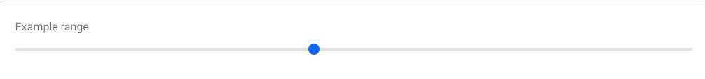
<label class="form-label" for="customRange1">Example range</label>
<div class="range">
<input type="range" class="form-range" id="customRange1" />
</div>
If you were looking for something that looks like the "slider" below, check out the Carousel Slider documentation, for more examples & customization options for this component.

<!-- Carousel wrapper -->
<div id="carouselBasicExample" class="carousel slide carousel-fade" data-mdb-ride="carousel">
  <!-- Indicators -->
  <div class="carousel-indicators">
    <button type="button" data-mdb-target="#carouselBasicExample" data-mdb-slide-to="0" class="active"
      aria-current="true" aria-label="Slide 1"></button>
    <button type="button" data-mdb-target="#carouselBasicExample" data-mdb-slide-to="1"
      aria-label="Slide 2"></button>
    <button type="button" data-mdb-target="#carouselBasicExample" data-mdb-slide-to="2"
      aria-label="Slide 3"></button>
  </div>

  <!-- Inner -->
  <div class="carousel-inner">
    <!-- Single item -->
    <div class="carousel-item active">
      <img src="https://mdbcdn.b-cdn.net/img/Photos/Slides/img%20(15).webp" class="d-block w-100"
        alt="Sunset Over the City" />
      <div class="carousel-caption d-none d-md-block">
        <h5>First slide label</h5>
        <p>Nulla vitae elit libero, a pharetra augue mollis interdum.</p>
      </div>
    </div>

    <!-- Single item -->
    <div class="carousel-item">
      <img src="https://mdbcdn.b-cdn.net/img/Photos/Slides/img%20(22).webp" class="d-block w-100"
        alt="Canyon at Nigh" />
      <div class="carousel-caption d-none d-md-block">
        <h5>Second slide label</h5>
        <p>Lorem ipsum dolor sit amet, consectetur adipiscing elit.</p>
      </div>
    </div>

    <!-- Single item -->
    <div class="carousel-item">
      <img src="https://mdbcdn.b-cdn.net/img/Photos/Slides/img%20(23).webp" class="d-block w-100"
        alt="Cliff Above a Stormy Sea" />
      <div class="carousel-caption d-none d-md-block">
        <h5>Third slide label</h5>
        <p>Praesent commodo cursus magna, vel scelerisque nisl consectetur.</p>
      </div>
    </div>
  </div>
  <!-- Inner -->

  <!-- Controls -->
  <button class="carousel-control-prev" type="button" data-mdb-target="#carouselBasicExample"
    data-mdb-slide="prev">
    <span class="carousel-control-prev-icon" aria-hidden="true"></span>
    <span class="visually-hidden">Previous</span>
  </button>
  <button class="carousel-control-next" type="button" data-mdb-target="#carouselBasicExample"
    data-mdb-slide="next">
    <span class="carousel-control-next-icon" aria-hidden="true"></span>
    <span class="visually-hidden">Next</span>
  </button>
</div>
<!-- Carousel wrapper -->
Download MDB 5 - free UI KIT
Choose your favourite customized component and click on the image
Copy & paste the code into your MDB project
▶️ Subscribe to YouTube channel for web development tutorials & resources
FAQs
Responsive Sliders built with Bootstrap 5. Range slider bar with label or a carousel image slider? No matter what you are looking for, we've got you covered.
The npm package @mdbootstrap/bootstrap-slider receives a total of 8 weekly downloads. As such, @mdbootstrap/bootstrap-slider popularity was classified as not popular.
We found that @mdbootstrap/bootstrap-slider demonstrated a not healthy version release cadence and project activity because the last version was released a year ago. It has 1 open source maintainer collaborating on the project.
Did you know?

Socket for GitHub automatically highlights issues in each pull request and monitors the health of all your open source dependencies. Discover the contents of your packages and block harmful activity before you install or update your dependencies.
Security News
The Axios compromise shows how time-dependent dependency resolution makes exposure harder to detect and contain.

Research
A supply chain attack on Axios introduced a malicious dependency, plain-crypto-js@4.2.1, published minutes earlier and absent from the project’s GitHub releases.

Research
Malicious versions of the Telnyx Python SDK on PyPI delivered credential-stealing malware via a multi-stage supply chain attack.