react-native-action-sheet


ActionSheet is a cross-platform React Native component that uses the native UIActionSheet on iOS and a JS implementation on Android. Almost a drop in replacement for ActionSheetIOS except it cannot be called statically.
Installation
$ npm install @expo/react-native-action-sheet -S
or
$ yarn add @expo/react-native-action-sheet
A basic ActionSheet Setup
1. Connect your component which uses showActionSheetWithOptions.
import { connectActionSheet } from '@expo/react-native-action-sheet'

class App extends React.Component {
  /* ... */
}

const ConnectedApp = connectActionSheet(App)

export default ConnectedApp
App component can access the actionSheet method as this.props.showActionSheetWithOptions
_onOpenActionSheet = () => {
// Same interface as https://facebook.github.io/react-native/docs/actionsheetios.html
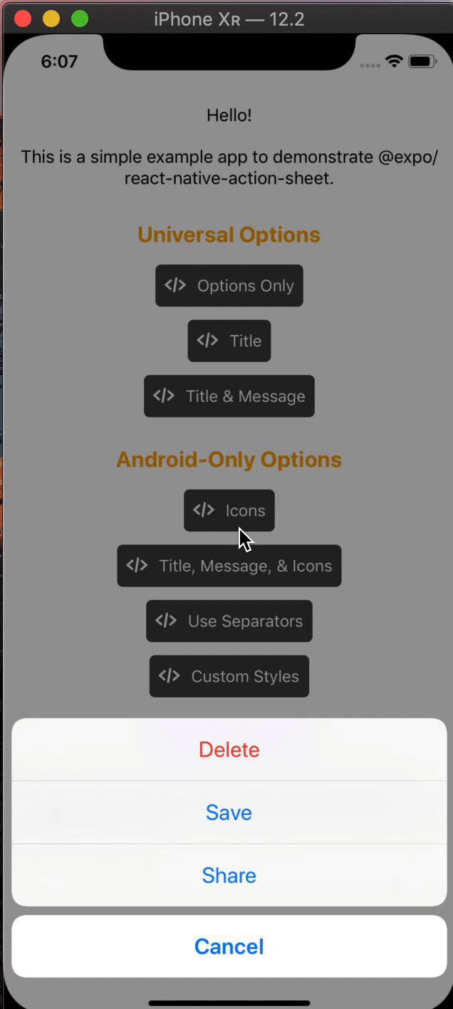
const options = ['Delete', 'Save', 'Cancel'];
const destructiveButtonIndex = 0;
const cancelButtonIndex = 2;
this.props.showActionSheetWithOptions(
{
options,
cancelButtonIndex,
destructiveButtonIndex,
},
buttonIndex => {
// Do something here depending on the button index selected
},
);
};
2. Wrap your top-level component with <ActionSheetProvider />
import { ActionSheetProvider } from '@expo/react-native-action-sheet'

class AppContainer extends React.Component {
  render() {
    return (
      <ActionSheetProvider>
        <ConnectedApp />
      </ActionSheetProvider>
    );
  }
}
Options
The goal of this library is to mimic the native iOS and Android ActionSheets as closely as possible.
This library can also be used with on web with Expo.
Universal Props
The same options available on React Native's ActionSheetIOS component exist for both iOS and Android in this library.
Android/Web-Only Props
The below props allow modification of the Android ActionSheet. They have no effect on the look on iOS as the native iOS Action Sheet does not have options for modifying these options.
| icons | array of required images or icons | No | |
| tintIcons | boolean | No | true |
| textStyle | TextStyle | No | |
| titleTextStyle | TextStyle | No | |
| messageTextStyle | TextStyle | No | |
| showSeparators | boolean | No | false |
| separatorStyle | ViewStyle | No | |
icons (optional)
Show icons to go along with each option. If image source paths are provided via require, images will be rendered for you. Alternatively, you can provide an array of elements such as vector icons, pre-rendered Images, etc.
tintIcons (optional)
Icons by default will be tinted to match the text color. When set to false, the icons will be the color of the source image. This is useful if you want to use multicolor icons. If you provide your own nodes/pre-rendered icons rather than required images in the icons array, you will need to tint them appropriately before providing them in the array of icons; tintColor will not be applied to icons unless they are images from a required source.
textStyle (optional)
Apply any text style props to the options. If the tintColor option is provided, it takes precedence over a color text style prop.
titleTextStyle (optional)
Apply any text style props to the title if present.
messageTextStyle (optional)
Apply any text style props to the message if present.
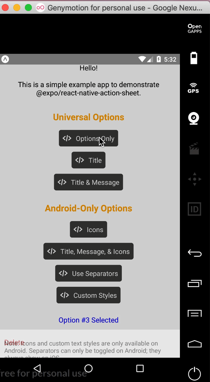
showSeparators: (optional)
Show separators between items. On iOS, separators always show so this prop has no effect.
separatorStyle: (optional)
Modify the look of the separators rather than use the default look.
Try it out
Try it in Expo: https://expo.io/@community/react-native-action-sheet-example
Example
See the example app.
Usage
$ cd example
$ yarn

// build simulator
$ yarn ios
$ yarn android

// web
$ yarn web
Development
Setup
$ git clone git@github.com:expo/react-native-action-sheet.git
$ cd react-native-action-sheet
$ yarn
Build
We use bob.
$ yarn build
Lint & Format
// tsc
$ yarn type-check

// ESLint
$ yarn lint

// prettier
$ yarn fmt