Product
Introducing Socket Firewall: Free, Proactive Protection for Your Software Supply Chain
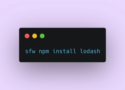
Socket Firewall is a free tool that blocks malicious packages at install time, giving developers proactive protection against rising supply chain attacks.
@nebula.js/sn-bullet-chart
Advanced tools
Visualize measures or measure values as bars with multiple axes and user-defined ranges. The ranges provide context to the bars which makes them easier to interpret.
The bullet chart displays a gauge with extended options. Bullet charts can be used to visualize and compare performance of a measure to a target value and to a qualitative scale, such as poor, average, and good.
Requires @nebula.js/stardust version 1.7.0 or later.
If you use npm: npm install @nebula.js/sn-bullet-chart. You can also load through the script tag directly from https://unpkg.com.
In the example below, the sales in different quarters are compared using a bullet chart.
import { embed } from '@nebula.js/stardust';
import bulletChart from '@nebula.js/sn-bullet-chart';

// 'app' is an enigma app model
const nuked = embed(app, {
  types: [
    {
      // register bullet chart
      name: 'bullet-chart',
      load: () => Promise.resolve(bulletChart),
    },
  ],
});

// Rendering a simple bullet chart
nuked.render({
  element: document.querySelector('.bullet'),
  type: 'bullet-chart',
  fields: ['Quarter', '=Sum(Sales)'],
  properties: {
    title: 'Sales by Quarters',
  },
});
You can create a bullet chart with one dimension and one measure, or no dimension and multiple measures.
| Dimensions | Measures | Results |
|---|---|---|
| 1 | 1 | A bullet chart with columns corresponding to different values in the dimension |
| 0 | n | A bullet chart with columns corresponding to the measures, aggreated over the dimension. |
Sometime it is easier for the eyes to perceive the information from a bullet chart if it is horizontal and its measure has a common range.
// Render a bullet chart horizontally, and with common range
nuked.render({
  element: document.querySelector('.bullet'),
  type: 'bullet-chart',
  fields: ['Quarter', '=Sum(Sales)'],
  properties: {
    title: 'Sales by Quarters',
    orientation: 'horizontal',
    measureAxis: {
      commonRange: true,
      dock: 'near',
    },
  },
});
By adding targets, you can compare not only the sales between different quarters but also the sale of each quarter to its sale target.
// Rendering a bullet chart with targets
nuked.render({
  element: document.querySelector('.bullet'),
  type: 'bullet-chart',
  fields: ['Quarter'],

  // Define `qMeasures` in `properties` instead of in `fields`
  properties: {
    title: 'Sales by Quarters',
    qHyperCubeDef: {
      qMeasures: [
        {
          qDef: {
            qDef: 'Sum(Sales)',
            target: 'Sum([Sale targets])',
          },
          qSortBy: {
            qSortByNumeric: -1,
          },
          qAttributeExpressions: [
            {
              qExpression: 'Sum([Sale targets])',
              id: 'bullet-target',
            },
          ],
        },
      ],
      qInitialDataFetch: [
        {
          qLeft: 0,
          qTop: 0,
          qWidth: 15,
          qHeight: 500,
        },
      ],
    },

    // Horizontal, with common range
    orientation: 'horizontal',
    measureAxis: {
      commonRange: true,
      dock: 'near',
    },
  },
});
You can also add color segments to the chart to show poor/normal/good performance. Here two limits are added, splitting the range into three segments: red (lower than 90% of the target), yellow (within 90-110% of the target), and green (higher than 110% of the target).
// Rendering a bullet chart with segments
nuked.render({
  element: document.querySelector('.bullet'),
  type: 'bullet-chart',

  // Define all `fields` in `properties`
  properties: {
    title: 'Sales by Quarters',

    qHyperCubeDef: {
      qDimensions: [
        {
          qDef: {
            qFieldDefs: ['Quarter'],
            qSortCriterias: [{ qSortByAscii: 1 }],
          },
        },
      ],
      qMeasures: [
        {
          qDef: {
            qDef: 'Sum(Sales)',
            target: 'Sum([Sale targets])',
            conditionalColoring: {
              segments: {
                limits: [
                  {
                    value: {
                      qValueExpression: {
                        qExpr: 'Sum([Sale targets])*0.9',
                      },
                    },
                  },
                  {
                    value: {
                      qValueExpression: {
                        qExpr: 'Sum([Sale targets])*1.1',
                      },
                    },
                  },
                ],
                paletteColors: [
                  {
                    color: '#7c4345',
                  },
                  {
                    color: '#e0db4d',
                  },
                  {
                    color: '#53ad55',
                  },
                ],
              },
            },
          },
          qSortBy: {
            qSortByNumeric: -1,
          },
          qAttributeExpressions: [
            {
              id: 'bullet-target',
              qExpression: 'Sum([Sale targets])',
            },

            {
              id: 'bullet-segment',
              qExpression: 'Sum([Sale targets])*0.9',
            },
            {
              id: 'bullet-segment',
              qExpression: 'Sum([Sale targets])*1.1',
            },
          ],
        },
      ],
      qInitialDataFetch: [
        {
          qLeft: 0,
          qTop: 0,
          qWidth: 15,
          qHeight: 500,
        },
      ],
      qInterColumnSortOrder: [0, 1],
    },

    // Horizontal, with common range
    orientation: 'horizontal',
    measureAxis: {
      commonRange: true,
      dock: 'near',
    },
  },
});
The bullet chart can also be defined with no dimension and multiple measures. Each bar represents corresponding measure aggregate over the dimension.
// Rendering a bullet chart with three measures and no dimension
nuked.render({
  element: document.querySelector('.bullet'),
  type: 'bullet-chart',
  fields: ['=Sum(Coffee)', '=Sum(Tea)', '=Sum(Sales)'],
  properties: {
    title: 'Sales of Coffe, Tea, and Total',
  },
});
A plugin can be passed into a bullet chart to add or modify its capability or visual appearance. A plugin needs to be defined before it can be rendered together with the chart.
// Step 1: define the plugin

// Modifying the look and the position of the major axis
const majorAxisPlugin = {
  info: {
    name: 'major-axis-plugin',
    type: 'component-definition',
  },
  fn: ({ keys, layout }) => {
    const componentDefinition = {
      type: 'axis',

      // Provide the same name as the exisiting component to override it
      key: keys.COMPONENT.MAJOR_AXIS,
      settings: {
        labels: {
          fontFamily: 'Tahoma, san-serif',
          fontSize: '15px',
          fill: 'darkred',
        },
      },
    };
    return componentDefinition;
  },
};

// Step 2: passing the plugin definition into the render function

// Rendering a bullet chart with plugins
    nuked.render({
      element: document.getElementById('object'),
      type: 'sn-bullet-chart',
      plugins: [majorAxisPlugin],
      properties,
    });
});
The plugin definition is an object, with two properties info and fn.
The fn returns a picasso.js component. To build this component,
some important chart internals are passed into the argument object of fn.
// Structure of the argument object of fn
const pluginArgs = {
  layout,
  keys: {
    SCALE: {
      MAIN: {
        MAJOR: KEYS.SCALE.MAIN.MAJOR,
        MINOR: KEYS.SCALE.MAIN.MINOR,
      },
    },
    COMPONENT: {
      BAR: KEYS.COMPONENT.BAR,
      MAJOR_AXIS: KEYS.COMPONENT.MAJOR_AXIS,
      MAJOR_AXIS_TITLE: KEYS.COMPONENT.MAJOR_AXIS_TITLE,
      BULLET_AXIS: KEYS.COMPONENT.BULLET_AXIS,
    },
    COLLECTION: {
      MAIN,
    },
  },
};
With plugins, you can either add new components or modify existing components of the bullet chart.
The new component can be a standard Picasso component or a custom Picasso component. Here we demo a standard reference line component.
// Adding reference line at the mean of the targets
const meanReferenceLinePlugin = {
  info: {
    name: 'mean-reference-line-plugin',
    type: 'component-definition',
  },
  fn: ({ keys, layout }) => {
    const targets = layout.qHyperCube.qDataPages[0].qMatrix.map((item) => item[1].qAttrExps.qValues[0].qNum);
    const averageOfTargets = targets.reduce((accumulator, currentValue) => accumulator + currentValue) / targets.length;
    const componentDefinition = {
      key: 'mean-reference-line',
      type: 'ref-line',
      layout: { displayOrder: 2 },
      lines: {
        x: [
          {
            line: {
              stroke: 'darkgray',
              strokeWidth: 5,
            },
            scale: keys.SCALE.MINOR,
            value: averageOfTargets,
          },
        ],
      },
    };
    return componentDefinition;
  },
};
As an example, the positions and the appearance of the axes can be modified completely by plugins.
To overide an existing component, fn should returns a picasso.js component
that has the same key as the existing component (keys.COMPONENT.BULLET_AXIS in
this example)
// Modifying the look and the position of the bullet axis
const bulletAxisPlugin = {
  info: {
    name: 'bullet-axis-plugin',
    type: 'component-definition',
  },
  fn: ({ keys, layout }) => {
    const componentDefinition = {
      type: 'box-axis',

      // Provide the same name as the exisiting component to override it
      key: keys.COMPONENT.BULLET_AXIS,
      settings: {
        labels: {
          fontFamily: 'Tahoma, san-serif',
          fontSize: '15px',
          fill: 'darkblue',
        },
        line: { stroke: 'gray' },
      },
    };
    return componentDefinition;
  },
};
FAQs
Visualize measures or measure values as bars with multiple axes and user-defined ranges. The ranges provide context to the bars which makes them easier to interpret.
The npm package @nebula.js/sn-bullet-chart receives a total of 657 weekly downloads. As such, @nebula.js/sn-bullet-chart popularity was classified as not popular.
We found that @nebula.js/sn-bullet-chart demonstrated a healthy version release cadence and project activity because the last version was released less than a year ago. It has 9 open source maintainers collaborating on the project.
Did you know?

Socket for GitHub automatically highlights issues in each pull request and monitors the health of all your open source dependencies. Discover the contents of your packages and block harmful activity before you install or update your dependencies.

Product
Socket Firewall is a free tool that blocks malicious packages at install time, giving developers proactive protection against rising supply chain attacks.

Research
Socket uncovers malicious Rust crates impersonating fast_log to steal Solana and Ethereum wallet keys from source code.

Research
A malicious package uses a QR code as steganography in an innovative technique.