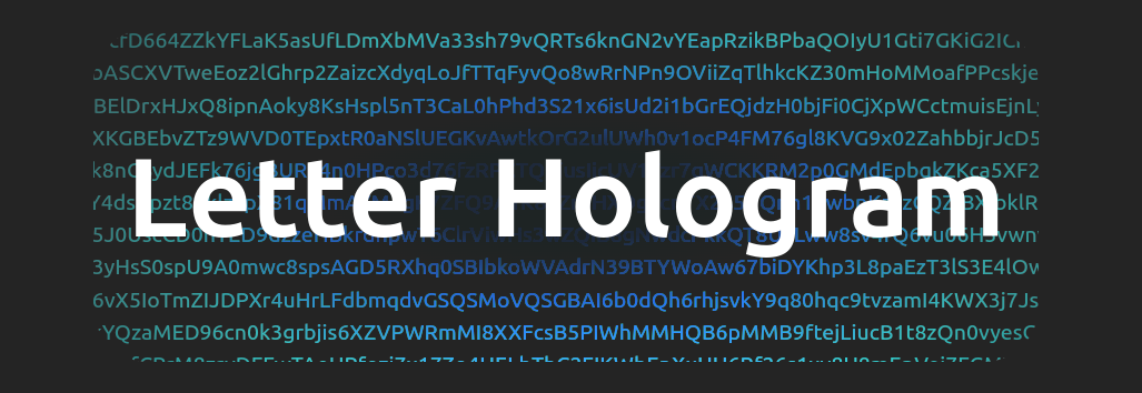
Letter Hologram is a React component that creates an interactive background animation with letters.
Installation
To install the library using npm, run the following command:
npm install @nekzus/react-letter-hologram
Usage
Basic Implementation
The Letter Hologram component can be easily incorporated into your React application. Simply provide the children you want to render within HoloBg:
import React from 'react';
import {HoloBg} from '@nekzus/react-letter-hologram';

const App = () => (
  <HoloBg className="w-[300px]">
    <h1>Hello World</h1>
  </HoloBg>
);

export default App;
Props
The Letter Hologram component accepts the following props:
- children (required): The child elements to be rendered within the
Letter Hologram component.
- className (optional): Additional classes to be applied to the component (you can use Tailwind width utility classes to change the size of the component, such as w-[100px], w-[200px], etc.).
- colorClassName (optional): The class name which determines the color of the gradient. Options are blueColor, greenColor, pinkColor, orangeColor, darkColor, lightColor, and defaultColor. Default is defaultColor.
- style (optional): Additional styles to be applied to the component. If a width is provided through the style prop, it will override any width set through className.
Example with Custom Styling
You can customize the appearance of the Letter Hologram component by providing additional styles or class names:
import React from 'react';
import {HoloBg} from '@nekzus/react-letter-hologram';

const App = () => (
  <HoloBg
    className="w-[300px]"
    colorClassName="pinkColor"
    style={{ borderRadius: '8px' }}
  >
    <h1>Hello World</h1>
  </HoloBg>
);

export default App;
License
This project is licensed under the MIT License - see the LICENSE file for details.