@nextcloud/dialogs


Nextcloud dialog helpers
Installation
npm i -S @nextcloud/dialogs
Version compatibility
| 7.x | ✅ | 9.x (Vue 3)¹ | Nextcloud 31 and newer |
| 6.x | ✅ | 8.x | Nextcloud 29, 30, 31, 32 |
| 5.x | ❌ | 8.x | Nextcloud 28, 29, 30 |
| 4.2+ | ❌ | 7.12² | Nextcloud 25, 26, 27, 27.1 |
| 4.1 | ❌ | any | any up to Nextcloud 30 |
¹: In version 7.x the @nextcloud/vue dependency is moved to dependencies so you can also use this library
with an old version of @nextcloud/vue in your app dependencies if your app still uses Vue 2.
Note that this might increase the bundled app size.
If your app also already uses @nextcloud/vue version 9.x and Vue 3 then the bundle size will not increase.
²: Since version 4.2 this package provides a Vue.js based file picker, so this package depends on @nextcloud/vue.
Usage
General
The styles for the components (Toasts and FilePicker) are provided in the style.css file.
So make sure that the @nextcloud/dialogs/style.css file is included in your app to make sure that the toasts or FilePicker have a proper styling applied.
import '@nextcloud/dialogs/style.css'
Toasts
import { showMessage, showInfo, showSuccess, showWarning, showError } from '@nextcloud/dialogs'
import '@nextcloud/dialogs/style.css'
If you using @nextcloud/dialogs >= 4.0 you don't need any svg or scss loader in you projects anymore.
There are different toast styles available, that are exposed in separate functions:
showMessage('Message without a specific styling')
showInfo('Information')
showSuccess('Success')
showWarning('Warning')
showError('Error')
There are several options that can be passed in as a second parameter, like the timeout of a toast:
showError('This is an error shown without a timeout', { timeout: -1 })
A full list of available options can be found in the documentation.
FilePicker
To spawn the FilePicker provided by the library you have to use the FilePickerBuilder.
The FilePickerBuilder is included in the main entry point of this library, so you can use it like this:
import { getFilePickerBuilder } from '@nextcloud/dialogs'
const filepicker = getFilePickerBuilder('Pick plain text files')
.addMimeTypeFilter('text/plain')
.addButton({
label: 'Pick',
callback: (nodes) => console.log('Picked', nodes),
})
.build()
const paths = await filepicker.pick()
Development
Testing
For testing all components provide data-testid attributes as selectors, so the tests are independent from code or styling changes.
Test selectors
select-all-checkbox | The select all checkbox of the file list |
file-list-row | A row in the file list (tr), can be identified by data-filename |
row-checkbox | Checkbox for selecting a row |
row-name | Name of the row / file |
📤 Releasing a new version
- Pull the latest changes from
main or stableX
- Checkout a new branch with the tag name (e.g
v4.0.1): git checkout -b v<version>
- Run
npm version patch --no-git-tag-version (npm version minor --no-git-tag-version if minor).
This will return a new version name, make sure it matches what you expect
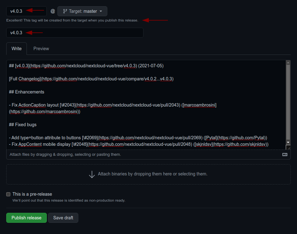
- Generate the changelog content from the release page.
Create a draft release, select the previous tag, click
generate then paste the content to the CHANGELOG.md file
- adjust the links to the merged pull requests and authors so that the changelog also works outside of GitHub
by running
npm run prerelease:format-changelog.
This will apply this regex: by @([^ ]+) in ((https://github.com/)nextcloud-libraries/nextcloud-dialogs/pull/(\d+))
Which this as the replacement: [\#$4]($2) \([$1]($3$1)\)
- use the the version as tag AND title (e.g
v4.0.1)
- add the changelog content as description
- Commit, push and create PR
- Get your PR reviewed and merged
- Create a milestone with the follow-up version at https://github.com/nextcloud-libraries/nextcloud-dialogs/milestones
- Move all open tickets and PRs to the follow-up
- Close the milestone of the version you release
- Publish the previously drafted release on GitHub


