
Security News
The Hidden Blast Radius of the Axios Compromise
The Axios compromise shows how time-dependent dependency resolution makes exposure harder to detect and contain.
By Ahmad Nassri - Apr 01, 2026
@ng-ar/prime-input
Advanced tools
This angular npm library package contains a couple of Angular Input box components that allow to add an icon inside a text input, which helps better identify common input fields like for example email, etc.
This angular npm library package contains a couple of Angular Input box components that allow to add an icon inside a text input, which helps better identify common input fields like for example email, etc.
This module depends on PrimeNg and icon will be as of primeNg icon v5.
The default theme of the input is designed to look just like a plain HTML input, including the focus blue border (tab and shift-tab are supported)
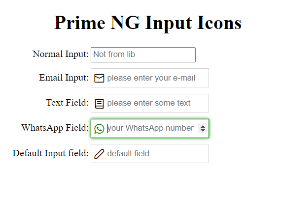
Here is how the inputs with the icons look like on the screen:
This is how to install the components:
npm install @ng-ar/prime-input
or
yarn add @ng-ar/prime-input
Minimum angular version needed for this library is v14.0.0.
And on your application module:
import { PrimeInputModule } from '@ng-ar/prime-input';

@NgModule({
  declarations: [ ...],
  imports: [
    BrowserModule,
    ....,
    PrimeInputModule
],
})
export class AppModule { }
Styles ConfigurationConfigure: required styles at the styles section, example below uses the Saga Blue theme.
"styles": [
  "node_modules/primeng/resources/themes/saga-blue/theme.css",
  "node_modules/primeng/resources/primeng.min.css",
  "node_modules/primeicons/primeicons.css",
  //...
],
nx monorepo, make these changes inside project.json. In normal angular cli generated project
you have to make changes inside angular.json file.Then we can use the Prime Ng Input in html view as below:
<div class="container">
  <h1>Prime NG Input Icons</h1>
  <div class="form">

    <div class="form-row">
      <label>Normal Input:</label>
      <input type="text" placeholder="not from lib">
    </div>

    <div class="form-row">
      <label>Text Field:</label>
      <ng-ar-prime-input [icon]="'envelope'">
        <input type="email" placeholder="please enter your e-mail">
      </ng-ar-prime-input>
    </div>

    <div class="form-row">
      <label>Text Field:</label>
      <ng-ar-prime-input [icon]="'book'">
        <input type="text" placeholder="please enter some text">
      </ng-ar-prime-input>
    </div>

    <div class="form-row">
      <label>Default Input field:</label>
      <ng-ar-prime-input>
        <input type="text" placeholder="default field">
      </ng-ar-prime-input>
    </div>
  </div>
</div>
The html core components to be added
  <ng-ar-prime-input [icon]="'book'">
    <input type="text" placeholder="please enter your text">
  </ng-ar-prime-input>
icon that identifies which prime Ng icon we want to apply.<input> html element.icon, default icon will be applied.Using add-on extra theme
  <div class="form-row prime-input-green-theme">
    <label>WhatsApp Field:</label>
    <ng-ar-prime-input [icon]="'whatsapp'">
      <input type="number" placeholder="your WhatsApp number">
    </ng-ar-prime-input>
  </div>
prime-input-green-theme to the ancestor of the selector (say <ng-ar-prime-input></ng-ar-prime-input>), then the particular them will be applied to the child(children).Sample scss (you can uses css also) used for the demo.
.container {
  padding-top: 4.1rem;
  padding-bottom: 2rem;
  display: flex;
  flex-direction: column;
  justify-content: center;
  align-items: center;

  & h1{
    text-align: center;
  }
}

.form-row {
  width:500px;
  margin-bottom: 10px;

  & label {
    width: 157px;
    text-align: right;
    padding-right: 3px;
    display: inline-block;
  }

  & input {
    height: 25px;
  }
}
FAQs
This angular npm library package contains a couple of Angular Input box components that allow to add an icon inside a text input, which helps better identify common input fields like for example email, etc.
We found that @ng-ar/prime-input demonstrated a not healthy version release cadence and project activity because the last version was released a year ago. It has 1 open source maintainer collaborating on the project.
Did you know?

Socket for GitHub automatically highlights issues in each pull request and monitors the health of all your open source dependencies. Discover the contents of your packages and block harmful activity before you install or update your dependencies.
Security News
The Axios compromise shows how time-dependent dependency resolution makes exposure harder to detect and contain.

Research
A supply chain attack on Axios introduced a malicious dependency, plain-crypto-js@4.2.1, published minutes earlier and absent from the project’s GitHub releases.

Research
Malicious versions of the Telnyx Python SDK on PyPI delivered credential-stealing malware via a multi-stage supply chain attack.