Product
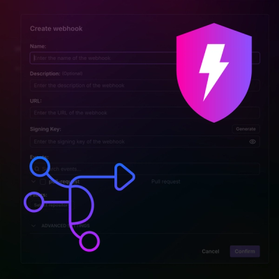
Introducing Webhook Events for Pull Request Scans
Add real-time Socket webhook events to your workflows to automatically receive pull request scan results and security alerts in real time.
@omnedia/ngx-globe
Advanced tools
A simple component library to create a container with an animated and interactive globe.

This Library is part of the NGXUI ecosystem.
View all available components at https://ngxui.com
@omnedia/ngx-globe is an Angular library that provides an interactive 3D globe visualization. The globe is rendered using the cobe library, allowing for smooth animations, rotation, and customizable markers. This component is highly configurable, making it ideal for displaying geographic data or adding a dynamic visual element to your Angular application.
Install the library and its peer dependency using npm:
npm install @omnedia/ngx-globe
npm install cobe --save
cobe is required as a peer dependency for this library to function properly.
Import the NgxGlobeComponent in your Angular module or component:
import {NgxGlobeComponent} from '@omnedia/ngx-globe';

@Component({
  ...
    imports:
[
  ...
    NgxGlobeComponent,
],
...
})
Use the component in your template:
<om-globe
  [rotationSpeed]="0.002"
  [globeSize]="800"
  [globeOptions]="{
    markers: [{ location: [34.0522, -118.2437], size: 0.1 }],
    baseColor: [0.5, 0.5, 1],
    glowColor: [1, 0.5, 0.5],
    markerColor: [0, 1, 0]
  }"
  styleClass="custom-globe-class"
></om-globe>
<om-globe
  [rotationSpeed]="rotationSpeed"
  [globeSize]="globeSize"
  [globeOptions]="globeOptions"
  styleClass="your-custom-class"
>
</om-globe>
<om-globe
  [rotationSpeed]="0.01"
  [globeSize]="500"
  [globeOptions]="{
    markers: [{ location: [51.5074, -0.1278], size: 0.1 }],
    baseColor: [0.2, 0.2, 1],
    markerColor: [1, 0.2, 0.2],
    glowColor: [0.9, 0.9, 0.9]
  }"
  styleClass="globe-custom-style"
></om-globe>
This will render a globe with a custom size, rotation speed, and marker at the specified location (London, UK).
The globeOptions input allows you to configure various aspects of the globe's appearance and behavior:
markers: An array of objects defining locations and sizes of markers on the globe. Each marker should have a location (an array of latitude and longitude) and a size (a number).baseColor: The color of the globe in the form of an RGB array (e.g., [1, 1, 1] for white).glowColor: The color of the globe's glow, also an RGB array.markerColor: The color of the markers on the globe, also an RGB array.mapSamples: Number of samples for the texture mapping.mapBrightness: Brightness of the map texture.diffuse: The intensity of the globe's diffuse lighting.This library uses the cobe npm package as a peer dependency to handle the rendering of the globe. Make sure to install it alongside this library for proper functionality.
npm install cobe --save
To customize the appearance of the globe or container, use the styleClass input to apply your own CSS classes.
.globe-custom-style {
  background-color: #000;
  border-radius: 50%;
  box-shadow: 0 0 20px rgba(255, 255, 255, 0.5);
}
Contributions are welcome. Please submit a pull request or open an issue to discuss your ideas.
This project is licensed under the MIT License.
FAQs
A simple component library to create a container with an animated and interactive globe.
We found that @omnedia/ngx-globe demonstrated a healthy version release cadence and project activity because the last version was released less than a year ago. It has 1 open source maintainer collaborating on the project.
Did you know?

Socket for GitHub automatically highlights issues in each pull request and monitors the health of all your open source dependencies. Discover the contents of your packages and block harmful activity before you install or update your dependencies.

Product
Add real-time Socket webhook events to your workflows to automatically receive pull request scan results and security alerts in real time.

Research
The Socket Threat Research Team uncovered malicious NuGet packages typosquatting the popular Nethereum project to steal wallet keys.

Product
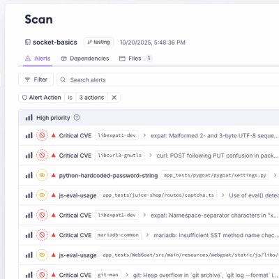
A single platform for static analysis, secrets detection, container scanning, and CVE checks—built on trusted open source tools, ready to run out of the box.