
Security News
Another Round of TEA Protocol Spam Floods npm, But It’s Not a Worm
Recent coverage mislabels the latest TEA protocol spam as a worm. Here’s what’s actually happening.
By Philipp Burckhardt - Nov 14, 2025
@open-tender/components-pos
Advanced tools
A component library built for use with the Open Tender open source web app
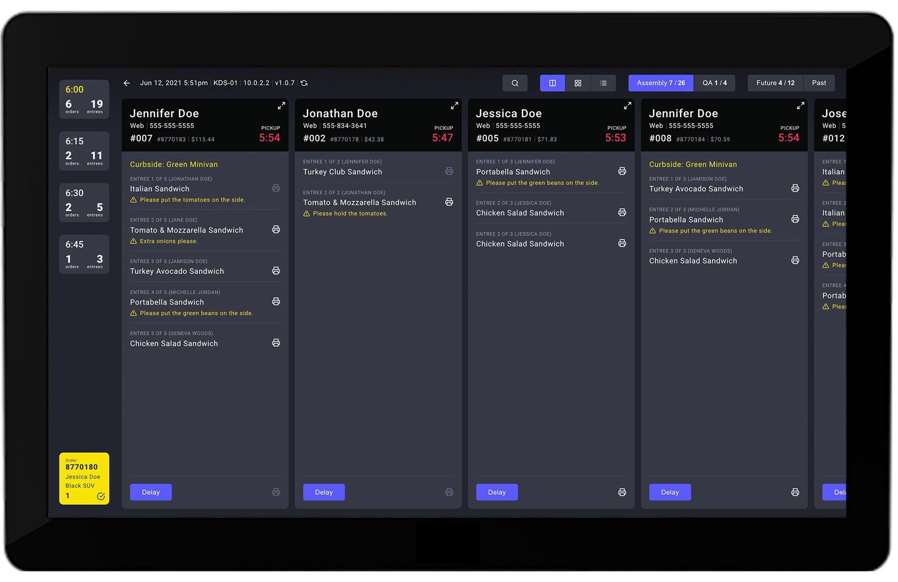
A component library for use with the Open Tender open source POS and KDS apps:
This library is only relevant for restaurant brands that are customers of Open Tender. To learn more about establishing an Open Tender account, please visit our website.
Install via yarn:
yarn add @open-tender/components-pos
Or via npm:
npm install --save @open-tender/components-pos
This library provides many of the components used in the Open Tender POS app and KDS app, which is useful for providing a similar interface across both applications. This is helpful because the apps are typically utilized by the same set of employees at a given restaurant. To give you a sense, here's what the two apps look like:

You can find the storybook for all of the available components here:
@open-tender/components-pos Storybook
This library leverages Emotion for CSS-in-JS styled components and theme support via the @emotion/react and @emotion/styled packages, which are installed and passed down in each of the open-tender-pos app and open-tender-kds app.
The theme itself is also passed down by the POS and KDS app, but, out of the box, the theme originates in this component libray (in order to provide a common set of styles). However, you can easily override this with your own theme in the <App /> component of each of the apps.
Here's an example of a custom component that is built exclusively from components from this library:
import {
  ModalClose,
  ModalHeader,
  ModalFooter,
  Button,
  ButtonGroup,
} from '@open-tender/components-pos'
const CustomModal = () => {
  // code excluded for brevity
  return (
    <>
      <ModalClose close={() => dispatch(closeModal())} />
      <ModalHeader title="Please swipe card" />
      <ModalFooter>
        <ButtonGroup>
          <Button text="Cancel" onClick={cancelSwipe} color="active" />
          <Button text="Enter Pin" onClick={enterPin} color="dark" />
        </ButtonGroup>
      </ModalFooter>
    </>
  )
}
As you can see above, each of the buttons has a color prop that determines the color scheme. You can refer to the @open-tender/components-pos Storybook to see all of the possibilities.
You can see many more examples in the open-tender-pos and open-tender-kds apps themselves.
If you find a bug or have a question, please file an issue on our issue tracker on GitHub.
Built and maintained by Open Tender.
FAQs
A component library built for use with the Open Tender open source web app
We found that @open-tender/components-pos demonstrated a not healthy version release cadence and project activity because the last version was released a year ago. It has 2 open source maintainers collaborating on the project.
Did you know?

Socket for GitHub automatically highlights issues in each pull request and monitors the health of all your open source dependencies. Discover the contents of your packages and block harmful activity before you install or update your dependencies.
Security News
Recent coverage mislabels the latest TEA protocol spam as a worm. Here’s what’s actually happening.

Security News
PyPI adds Trusted Publishing support for GitLab Self-Managed as adoption reaches 25% of uploads

Research
/Security News
A malicious Chrome extension posing as an Ethereum wallet steals seed phrases by encoding them into Sui transactions, enabling full wallet takeover.