@openassistant/ui
The React chat component for OpenAssistant.
Installation
npm install @openassistant/ui
Add the chat component to your app
import { AiAssistant } from '@openassistant/ui';
function App() {
return (
<AiAssistant
modelProvider="openai"
model="gpt-4"
apiKey="your-api-key"
version="0.0.1"
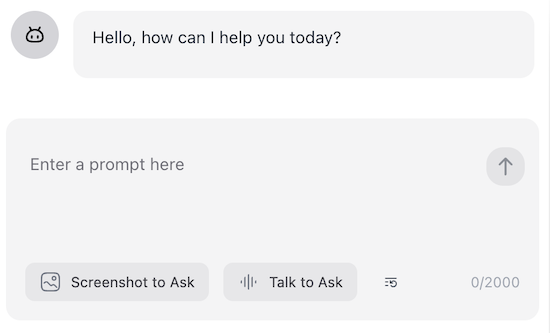
welcomeMessage="Hello! How can I help you today?"
instructions="You are a helpful assistant."
functions={{}}
/>
);
}
TailwindCSS Configuration
If you're using TailwindCSS, configure your tailwind.config.js to include the necessary UI components:
import { heroUI } from '@hero-ui/react';
module.exports = {
content: [
'./node_modules/@openassistant/ui/dist/**/*.{js,ts,jsx,tsx}',
'./node_modules/@hero-ui/react/dist/**/*.{js,ts,jsx,tsx}',
],
darkMode: 'class',
plugins: [heroUI()],
};
Theme
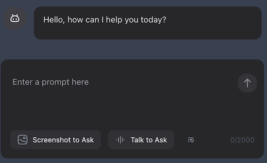
The UI supports both light and dark themes using theme prop.
<AiAssistant
  ...theme="dark"
/>
Tools
The chat component supports tools by default, and it uses @openassistant/core package to call LLMs with tools that helps the LLM to answer the user's question. The tool execution result will be rendered in the chat component by default.
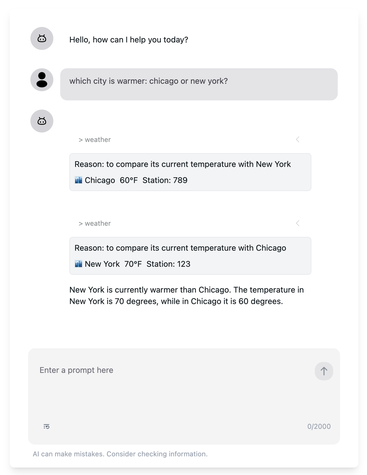
See 📁 examples/zod_function_tools and 📁 examples/multisteps_tools for a complete example.
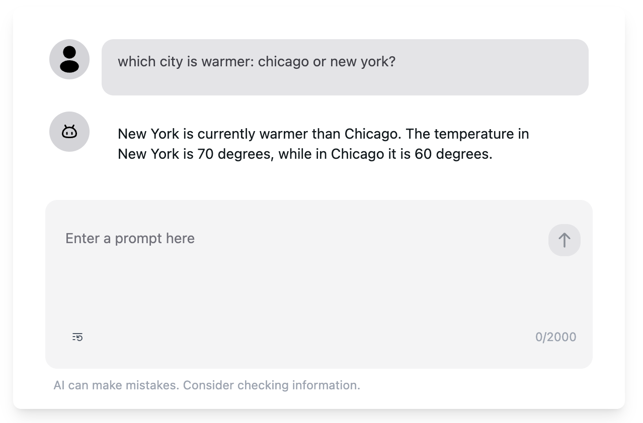
If you don't want to show the tool execution result, you can set showTools prop to false.
<AiAssistant
  tools={{}}
   ...showTools={false}
/>
Messages
The chat component is stateful, you can use initialMessages prop to set the initial messages.
If you want to manage the chat messages for e.g. persistence, you can use onMessagesUpdated prop.
<AiAssistant
...initialMessages={[]}
onMessagesUpdated={(messages) => {
}}
/>
See examples/message_persistent for a complete example.
Markdown
The chat component supports markdown rendering by default, you can configure it by setting useMarkdown prop.
<AiAssistant
   ...useMarkdown={false}
/>
Avatar
The chat component supports avatar by default, you can configure it by setting userAvatar and assistantAvatar props. If you don't want to show the avatar, you can set showAvatar prop to false.
<AiAssistant
   ...userAvatar={<Avatar />}
   ...assistantAvatar={<Avatar />}
   ...showAvatar={true}
/>
AbortController
The chat component has a built-in abort controller that controls stop and restart the chat. You can also pass your own abort controller to the chat component by setting abortController prop.
const abortController = new AbortController();

<AiAssistant
   ...abortController={abortController}
   onRestartChat={() => {
    // Do something after the chat is restarted
   }}
/>


