Product
Reachability for Ruby Now in Beta
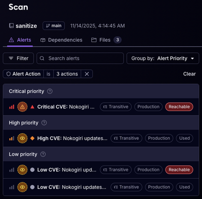
Reachability analysis for Ruby is now in beta, helping teams identify which vulnerabilities are truly exploitable in their applications.
@patternfly/pfe-card
Advanced tools
<pfe-card>
<h2 slot="pfe-card--header">Card header</h2>
<p>This is the pfe-card body.</p>
<pfe-cta slot="pfe-card--footer">
<a href="#">Footer link</a>
</pfe-cta>
</pfe-card>
All slots are optional. If the slot is not defined, the content will be added to the body region of the card.
If this slot is used, we expect a heading level tag (h1, h2, h3, h4, h5, h6). An icon, svg, or use of the icon component are also valid in this region.
Any content that is not designated for the header or footer slot, will go to this slot.
Use this slot for anything that you want to be stuck to the base of the card. This region is bottom-aligned.
There are several attributes available for customizing the visual treatment of this container.
color: Options include darkest, darker, accent, complement, lighter, lightest. The card has a default value of #dfdfdf. Your context will influence these colors so check there first if you are seeing inconsistencies.
| color | hex |
|---|---|
| lightest | #ffffff |
| lighter | #ececec |
| default | #dfdfdf |
| darker | #464646 |
| darkest | #131313 |
| accent | #ee0000 |
| complement | #0477a4 |
img-src: Optional background image applied to the entire card container. Alignment of this image can be managed using the --pfe-card--BackgroundPosition variable which is set to center center by default.
size: Optionally adjusts the padding on the container. Accepts: small.
overflow: Optionally allows an image or element to overflow the padding on the container. This property should be added to the direct child of the slotm such as on an image tag; should be added to the element that you want to overflow the container. Accepts: top, right, bottom, left.
border: Optionally apply a border color and weight to the entire card container. The default color and weight is #d2d2d2 and 1px, respectively.
There are several powerful variables available to hook into and override default styles.
pfe-color attribute is strongly recommended when setting the background color for the band, you can also use completely custom colors by updating the --pfe-band--BackgroundColor variable. If you update this value manually, you should also update the --context context variable to invoke the right context on it and it's child elements. Supported contexts include: light, dark, and saturated.pfe-img-src attribute to allow you to align your background image. Default value is center center. Variable name: --pfe-card--BackgroundPosition.--pfe-card--BorderRadius and --pfe-card--Border or --pfe-card--BorderWeight, --pfe-card--BorderStyle, --pfe-card--BorderColor.--pfe-card--Padding or --pfe-card--PaddingTop, --pfe-card--PaddingRight, --pfe-card--PaddingBottom, --pfe-card--PaddingLeft.npm run test
npm run build
From the PFElements root directory, run:
npm start
Card (and all PFElements) use Prettier to auto-format JS and JSON. The style rules get applied when you commit a change. If you choose to, you can integrate your editor with Prettier to have the style rules applied on every save.
FAQs
Cards for PatternFly Elements
We found that @patternfly/pfe-card demonstrated a not healthy version release cadence and project activity because the last version was released a year ago. It has 16 open source maintainers collaborating on the project.
Did you know?

Socket for GitHub automatically highlights issues in each pull request and monitors the health of all your open source dependencies. Discover the contents of your packages and block harmful activity before you install or update your dependencies.

Product
Reachability analysis for Ruby is now in beta, helping teams identify which vulnerabilities are truly exploitable in their applications.

Research
/Security News
Malicious npm packages use Adspect cloaking and fake CAPTCHAs to fingerprint visitors and redirect victims to crypto-themed scam sites.

Security News
Recent coverage mislabels the latest TEA protocol spam as a worm. Here’s what’s actually happening.