Product
Socket Now Supports pylock.toml Files
Socket now supports pylock.toml, enabling secure, reproducible Python builds with advanced scanning and full alignment with PEP 751's new standard.
@paulxuca/n-animated-progress-circle
Advanced tools
Currently working on both Android and iOS on version 0.57 of react-native and up [with the addition of support for overflow style property on Android](https://github.com/react-native-community/react-native-releases/blob/master/CHANGELOG.md#android-specifi
Currently working on both Android and iOS on version 0.57 of react-native and up with the addition of support for overflow style property on Android
| PROP | TYPE | DESCRIPTION |
|---|---|---|
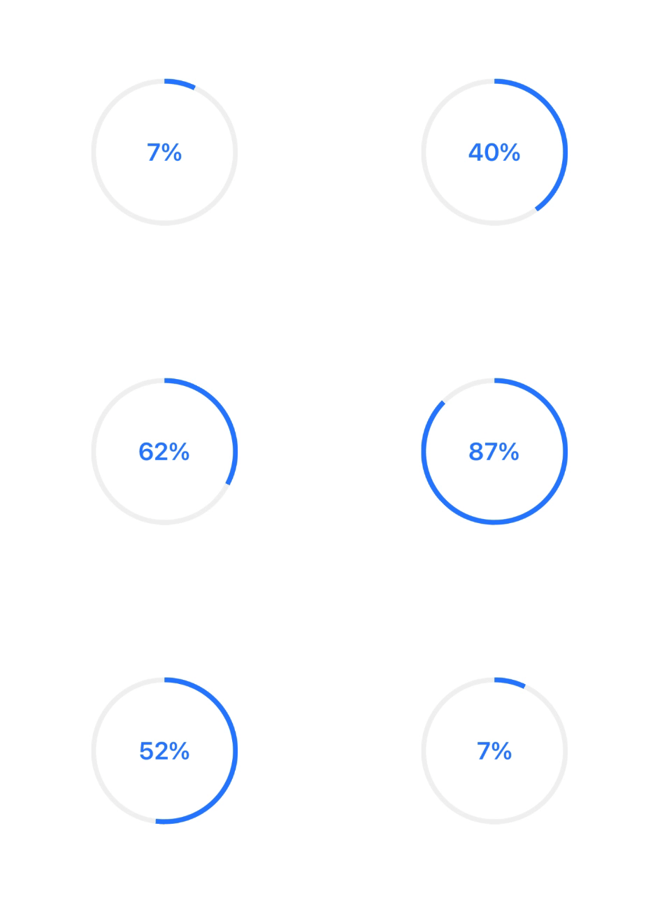
| value | Number / Animated.Value | Number between 0-1 which indicates the total progress of the circle. Default value is 0. Also accepts an Animated.Value (to be interpolated 0-1) if you wish to handle the timing of the animation outside of the component. |
| size | Number | Sets the size of the progress circle. Default size is 64. |
| thickness | Number | Sets the thickness of the progress circle. Default thickness is 7 |
| color | String | Sets the color of the complete portion of the progress circle. Default color is #7e42ed. |
| unfilledColor | String | Sets the color of the incomplete portion of the progress circle. Default unfilledColor is transparent. |
| style | Object | Any arbitrary styles you want to pass to the component. |
| children | ReactNode | Any children you want to appear in the center of the progress circle. |
| animationMethod | String | Animation method to be used. Takes one of the following strings: timing, spring, bounce, decay. Setting this value will animate the component. Please note that this prop will have no effect if you choose to pass in an Animated.Value instead of a Number to the value prop. |
| animationConfig | Object | Configuration object to set animation parameters. See configuration docs for timing, spring, bounce, and decay. useNativeDriver is set to true by default. Please note that this prop will have no effect if you choose to pass in an Animated.Value instead of a Number to the value prop. |
| shouldAnimateFirstValue | Boolean | Indicates whether the initial value passed to the value prop should animate in or not. Defaults to false. If set to true, you should specify how you want the progress circle to animate via animationMethod and animationConfig props. Please note that this prop will have no effect if you choose to pass in an Animated.Value instead of a Number to the value prop. |
| onChange | Function | Callback function which gets called when the value prop changes. |
| onChangeAnimationEnd | Function | Callback function which gets called when the animation that occurs after the value prop changes is complete. Please note that this prop will have no effect if you choose to pass in an Animated.Value instead of a Number to the value prop. |


FAQs
Currently working on both Android and iOS on version 0.57 of react-native and up [with the addition of support for overflow style property on Android](https://github.com/react-native-community/react-native-releases/blob/master/CHANGELOG.md#android-specifi
We found that @paulxuca/n-animated-progress-circle demonstrated a not healthy version release cadence and project activity because the last version was released a year ago. It has 1 open source maintainer collaborating on the project.
Did you know?

Socket for GitHub automatically highlights issues in each pull request and monitors the health of all your open source dependencies. Discover the contents of your packages and block harmful activity before you install or update your dependencies.

Product
Socket now supports pylock.toml, enabling secure, reproducible Python builds with advanced scanning and full alignment with PEP 751's new standard.

Security News
Research
Socket uncovered two npm packages that register hidden HTTP endpoints to delete all files on command.

Research
Security News
Malicious Ruby gems typosquat Fastlane plugins to steal Telegram bot tokens, messages, and files, exploiting demand after Vietnam’s Telegram ban.