Research
Malicious npm Packages Impersonate Flashbots SDKs, Targeting Ethereum Wallet Credentials
Four npm packages disguised as cryptographic tools steal developer credentials and send them to attacker-controlled Telegram infrastructure.
@pwabuilder/pwainstall
Advanced tools

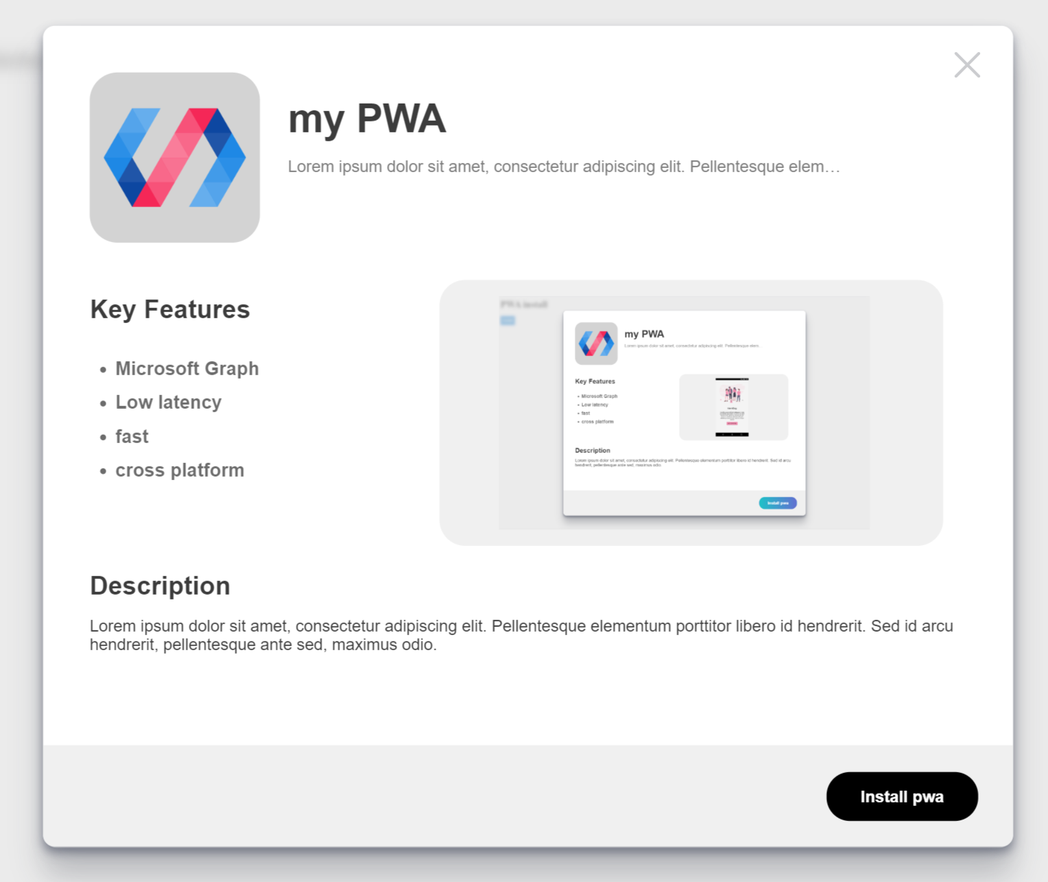
pwa-install is a web component from the PWABuilder team that brings an awesome "install" experience to your Progressive Web App!
Built with lit-element

There are two ways to use this component. For simple projects or just to get started fast, we recommend using the component by script tag. If your project is using npm then we recommend using the npm package.
<script
  type="module"
  src="https://cdn.jsdelivr.net/npm/@pwabuilder/pwainstall"
></script>
npm install @pwabuilder/pwainstallimport '@pwabuilder/pwainstall'Then you can use the element <pwa-install></pwa-install> anywhere in your template, JSX, html etc.
live demo: https://pwainstall.glitch.me
| Property | Attribute | Description | Type | Default |
|---|---|---|---|---|
showopen | showopen | Will always show the install button | boolean | false |
usecustom | usecustom | Hides default button | boolean | false |
manifestpath | manifestpath | path to your web manifest | string | manifest.json |
explainer | explainer | Controls the text of the explainer text just below the titlee of the app header | string | This app can be installed on |
featuresheader | featuresheader | Controls the text of the features header | string | Key Features |
descriptionheader | descriptionheader | Controls the text of the description header | string | Description |
installbuttontext | installbuttontext | Controls the text of the install button | string | Install |
cancelbuttontext | cancelbuttontext | Controls the text of the cancel button | string | Cancel |
iosinstallinfotext | iosinstallinfotext | Controls the iOS installation info text | string | Tap the share button and then 'Add to Homescreen' |
| name | Description |
|---|---|
openPrompt() | Opens the install modal |
closePrompt() | Closes the install modal |
getInstalledStatus() | Tell if the PWA is installed or not |
We recommend using our CSS variables to easliy tweak the style of this component to fit your project. Here are our current supported CSS variables.
| name | Description |
|---|---|
--install-button-color | Changes the color of the install button |
--modal-z-index | Changes the z-index of the install modal |
--modal-background-index | Changes the z-index of the install modal background |
--modal-background-color | Changes the background color of the install modal |
If you need to style this component more comprehensively, you can use Shadow Parts to style both the install button and the install modal. To target these two elements you can use pwa-install::part(openButton) and pwa-install::part(installModal) respectively. For example, to make the background of the install button grey, I would need this CSS:
pwa-install::part(openButton) {
  background: grey;
}
FAQs

The npm package @pwabuilder/pwainstall receives a total of 105 weekly downloads. As such, @pwabuilder/pwainstall popularity was classified as not popular.
We found that @pwabuilder/pwainstall demonstrated a not healthy version release cadence and project activity because the last version was released a year ago. It has 1 open source maintainer collaborating on the project.
Did you know?

Socket for GitHub automatically highlights issues in each pull request and monitors the health of all your open source dependencies. Discover the contents of your packages and block harmful activity before you install or update your dependencies.

Research
Four npm packages disguised as cryptographic tools steal developer credentials and send them to attacker-controlled Telegram infrastructure.

Security News
Ruby maintainers from Bundler and rbenv teams are building rv to bring Python uv's speed and unified tooling approach to Ruby development.

Security News
Following last week’s supply chain attack, Nx published findings on the GitHub Actions exploit and moved npm publishing to Trusted Publishers.