
Product
Introducing Reachability for PHP
Reachability analysis for PHP is now available in experimental, helping teams identify which vulnerabilities are actually exploitable.
By Benjamin Barslev - Apr 24, 2026
@react-native-segmented-control/segmented-control
Advanced tools
React Native SegmentedControlIOS library
@react-native-segmented-control/segmented-control

React Native SegmentedControl library. Use SegmentedControl to render a UISegmentedControl iOS.
For Android and Web, it has a js implementation that mocks iOS 13 style of UISegmentedControl.
| iOS | Android | Web |
|---|---|---|
 |  |  |
| react-native-segmented-control | react-native |
|---|---|
| v2.2.0 | >= 0.62 |
| <= v2.2.0 | >= 0.57 |
This module is NOT supported in the Expo Go app on iOS, because it requires custom native code. You need to use a custom development client or eject into bare workflow in order to use this module on iOS.
Install the library using your package manager:
pnpm:
pnpm install --save @react-native-segmented-control/segmented-control
yarn:
yarn add @react-native-segmented-control/segmented-control
npm:
npm install --save @react-native-segmented-control/segmented-control
The package is automatically linked when building the app. All you need to do is:
npx pod-install
For android, no linking is needed, as the module is implemented in js.
run react-native link @react-native-segmented-control/segmented-control
or you can follow the instructions to manually link this package.
New React Native comes with autolinking feature, which automatically links Native Modules in your project. In order to get it to work, make sure you unlink Segmented Control first:
react-native unlink @react-native-segmented-control/segmented-control
react-native moduleThis module was created when the segmentedControlIos was split out from the core of React Native. To migrate to this module you need to follow the installation instructions above and then change you imports from:
import {SegmentedControlIOS} from 'react-native';
to:
import SegmentedControl from '@react-native-segmented-control/segmented-control';
Start by importing the library:
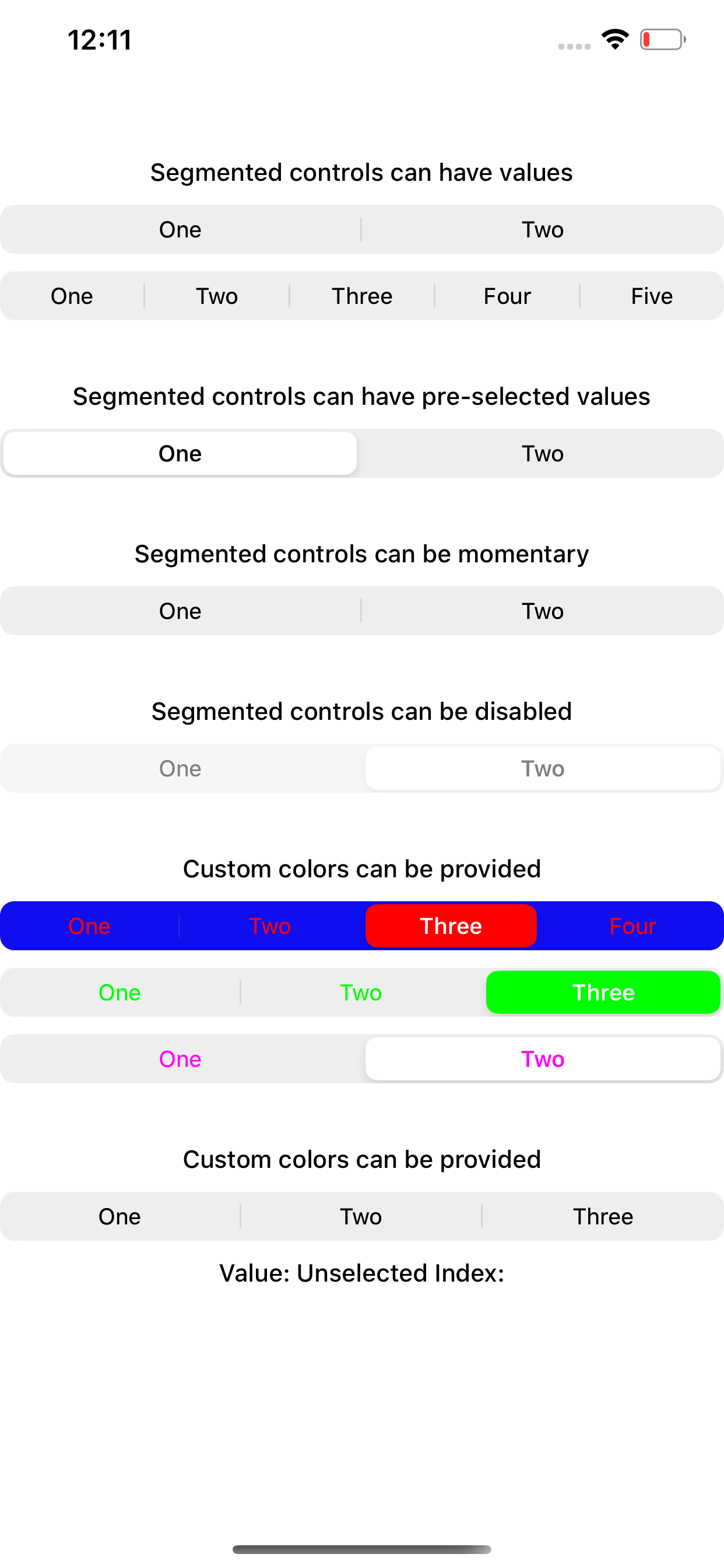
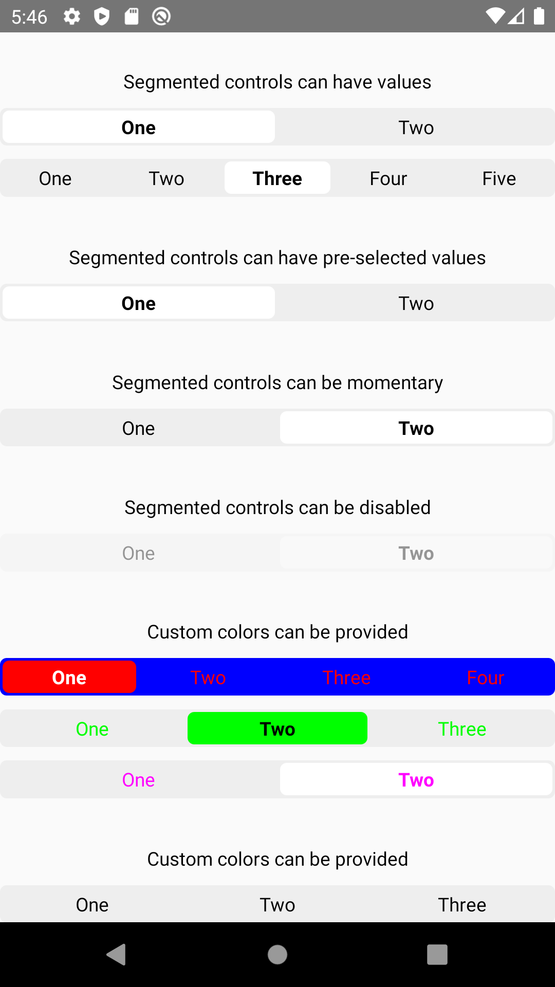
Use SegmentedControl to render a UISegmentedControl iOS.
The selected index can be changed on the fly by assigning the selectedIndex prop to a state variable, then changing that variable. Note that the state variable would need to be updated as the user selects a value and changes the index, as shown in the example below.
import SegmentedControl from '@react-native-segmented-control/segmented-control';

return (
  <SegmentedControl
    values={['One', 'Two']}
    selectedIndex={this.state.selectedIndex}
    onChange={(event) => {
      this.setState({selectedIndex: event.nativeEvent.selectedSegmentIndex});
    }}
  />
);
Inherits View Props.
enabledIf false the user won't be able to interact with the control. Default value is true.
| Type | Required |
|---|---|
| bool | No |
momentaryIf true, then selecting a segment won't persist visually. The onValueChange callback will still work as expected.
| Type | Required | Platform |
|---|---|---|
| bool | No | iOS |
onChangeCallback that is called when the user taps a segment; passes the event as an argument
| Type | Required |
|---|---|
| function | No |
onValueChangeCallback that is called when the user taps a segment; passes the segment's value as an argument
| Type | Required |
|---|---|
| function | No |
selectedIndexThe index in props.values of the segment to be (pre)selected.
| Type | Required |
|---|---|
| number | No |
tintColorAccent color of the control.
| Type | Required |
|---|---|
| string | No |
backgroundColorBackground color color of the control. (iOS 13+ only)
| Type | Required | Supported Version |
|---|---|---|
| string | No | iOS 13+ |
valuesThe labels for the control's segment buttons, in order.
| Type | Required |
|---|---|
| (string | number |
appearance(iOS 13+ only) Overrides the control's appearance irrespective of the OS theme
| Type | Required | Platform |
|---|---|---|
| 'dark', 'light' | No | iOS, Android, Web |
fontStyle(iOS 13+ only)
| Type | Required | Platform |
|---|---|---|
| object | No | iOS, Android, Web |
An object container
color: color of segment textfontSize: font-size of segment textfontFamily: font-family of segment textfontWeight: font-weight of segment textactiveFontStyle(iOS 13+ only)
| Type | Required | Platform |
|---|---|---|
| object | No | iOS, Android, Web |
color: overrides color of selected segment textfontSize: overrides font-size of selected segment textfontFamily: overrides font-family of selected segment textfontWeight: overrides font-weight of selected segment texttabStyle(Android and Web only) Styles the clickable surface which is responsible to change tabs
| Type | Required | Platform |
|---|---|---|
| object | No | Android, Web |
Extends ViewStyles
sliderStyle(Android and Web only) Styles the slider component (Animated.View)
| Type | Required | Platform |
|---|---|---|
| object | No | Android, Web |
Extends ViewStyles
For android and IOS, simply pass prop.style:
{
  "height": number
}
For react-native-web, additionally pass :
{
  "paddingVertical": number,
  or
  "height": number
}
If padding amount exceeds the fixed height of the container, it will shrink the text. So either increase the height or reduce your padding.
Please see the contributing guide.
The library is released under the MIT licence. For more information see LICENSE.
FAQs
React Native SegmentedControlIOS library
The npm package @react-native-segmented-control/segmented-control receives a total of 122,876 weekly downloads. As such, @react-native-segmented-control/segmented-control popularity was classified as popular.
We found that @react-native-segmented-control/segmented-control demonstrated a not healthy version release cadence and project activity because the last version was released a year ago. It has 1 open source maintainer collaborating on the project.
Did you know?

Socket for GitHub automatically highlights issues in each pull request and monitors the health of all your open source dependencies. Discover the contents of your packages and block harmful activity before you install or update your dependencies.
Product
Reachability analysis for PHP is now available in experimental, helping teams identify which vulnerabilities are actually exploitable.

Product
Export Socket alert data to your own cloud storage in JSON, CSV, or Parquet, with flexible snapshot or incremental delivery.

Research
/Security News
Bitwarden CLI 2026.4.0 was compromised in the Checkmarx supply chain campaign after attackers abused a GitHub Action in Bitwarden’s CI/CD pipeline.