Storybook Addon Storybook Visual Variants
Display multiple variations of a component automatically in a grid.
Getting Started
- Install the Visual Variants plugin:
npm i -D @saucelabs/storybook-variants
- Append the plugin to your storybook configuration file
main.ts|js in the addons config property:
import type { StorybookConfig } from "@storybook/react-vite";
const config: StorybookConfig = {
addons: [
"@saucelabs/storybook-variants",
],
};
export default config;
Usage
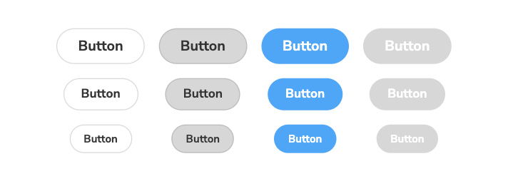
NOTE: This is best used with smaller components combined with the centered layout ( layout: "centered" ), however, it can also be used with larger components if the grid is adjusted to account for size / layout.
Features can be enabled/disabled and customized on a global, component, or per story basis using Storybook's parameters API with the variants key. Variants are disabled globally by default, and generally are recommended to enable on a per-story basis. Once enabled, you can use the new toolbar icon to toggle the display of variants while viewing a story.
To enable variants, add the variants key with an object configured using the options available below:
variants
enable (boolean | undefined) - Whether variant output should be enabled for this story. Will inherit from a parent / global config if set higher in the tree. When enabled, the toolbar button can still be used to toggle the variants on / off while developing.include (string[] | undefined) - A list of prop names that we should use to generate variants. If omitted, we will use all compatible props -- booleans, or anything that generates 'options', such as enums, selects, controls, etc. While this covers most scenarios, it may be overwhelming and generate too many options in a grid. Recommended to use a select few which generate the visual differences you're looking to cover (color, size, focus, disabled variants).exclude (string[] | undefined) - A list of prop names that we should exclude from variant generation. Can be used if you would like to generate for all available props and omit only a select few.wrapperProps (HTMLAttributes<HTMLDivElement> | undefined) - Additional props to place / override on the wrapper / container element in the grid. Can be used to customize inline styles or adjust the CSS grid templates -- for example by using a style override to use only a single column of items: { style: { gridTemplateColumns: 'repeat(1, 1fr)' } }.itemProps (HTMLAttributes<HTMLDivElement> | undefined) - Additional props to place / override on the child elements in the grid.
Example Configuration:
const meta: Meta<typeof Button> = {
title: "Example/Button",
component: Button,
parameters: {
layout: 'centered',
variants: {
enable: true,
include: ['size', 'primary'],
},
},
};


