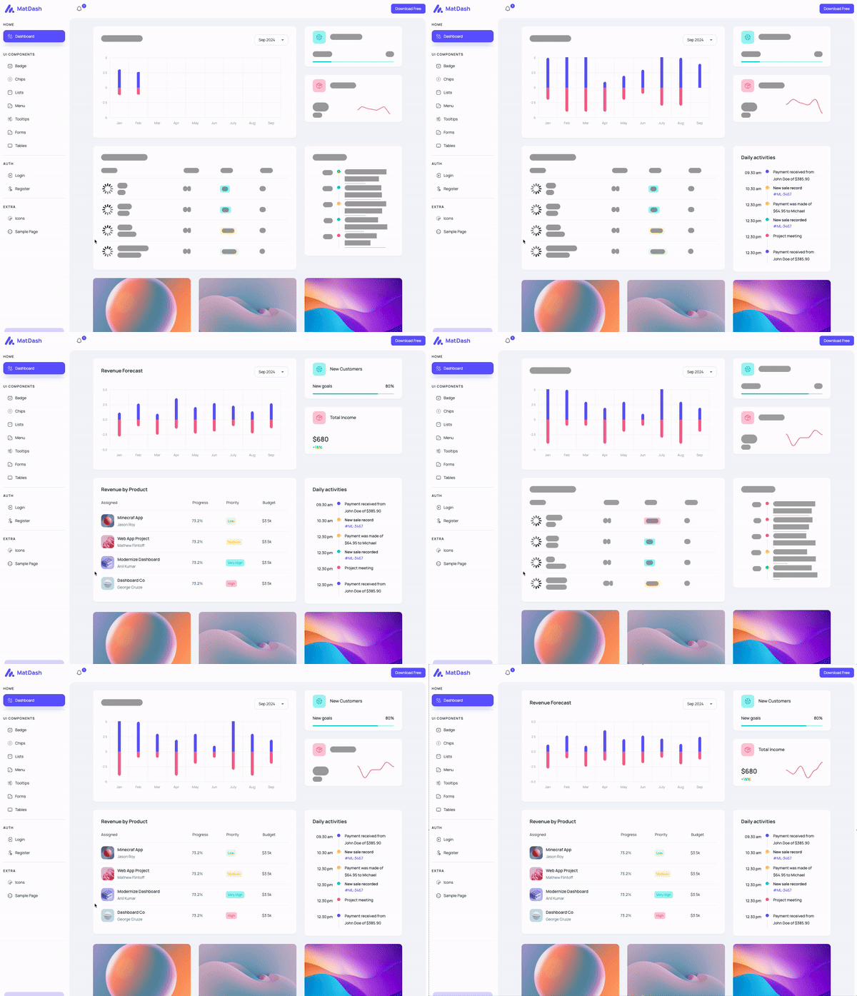
@skeletonizer/angular


This is the Angular adapter for Skeletonizer. It provides a simple way to create skeletonized views for your Angular application.

Example app on Stackblitz for Angular can be found here
Installation
To install the package, run the following command:
npm install @skeletonizer/angular @skeletonizer/utils --save
@skeletonizer/angular is always used in conjunction with @skeletonizer/utils. The @skeletonizer/utils package provides the core functionality for creating skeletonized views, while the @skeletonizer/angular package provides the Angular-specific functionality. The versions should always match.
Template Adjustments
Generally speaking, all you need to do to use the skeletonizer in the template, is to wrap the part of the template you wish to skeletonize in the <skeletonizer-skeleton> component and in a <ng-template let-foo> (all examples henceforth assume foo is called context). The skeletonConfig, showSkeleton and scope properties must be passed to the <skeletonizer-skeleton> as inputs.
Furthermore, all the data that you wish to access in the skeletonized part of the template must be accessed through the proxy(context) method, except the data that you provide and is available even whilst the data is being loaded (ie. [showSkeleton]="true")..
As far as the template goes, it essentially means transforming the code from this:
<div>{{ somePropOrMethodCallAvailableAsync }}</div>
<div>{{ someAlreadyHardCodedOrInputBoundPropAvailableSync }} </div>
into this:
<skeletonizer-skeleton [showSkeleton]="showSkeleton" [config]="skeletonConfig" [scope]="{ somePropOrMethodCallAvailableAsync } ">
  <ng-template let-context>
    <div>{{ proxy(context).somePropOrMethodCallAvailableAsync }}</div>
    <div>{{ someAlreadyHardCodedOrInputBoundPropAvailableSync }} </div>
  </ng-template>
</skeletonizer-skeleton>
As long as the shape of the properties you access within the skeleton part of the template matches the shape of the data you provide in the scope and skeletonConfig properties, the skeletonized view will be in sync with the actual view, regardless of changes to the design.
Usage
You can use Skeletonizer either in a standalone component or in a component that is a part of a module.
If you wish to use Skeletonizer in a standalone component, you need to add SkeletonizerSkeletonComponent in the imports of the component.
The usage in a component that is a part of a module is the same as the standalone component, but you need to add SkeletonizerSkeletonComponent in the imports of the module where the component is declared.
Every component that uses Skeletonizer should extend SkeletonAbstractComponent, which is available in @skeletonizer/utils.
The SkeletonAbstractComponent requires you to pass a type argument that represents the data model of the part(s) of the component that you intend to skeletonize.
It also requires you to implement the skeletonConfig (type validated against the type argument you pass to SkeletonAbstractComponent) and showSkeleton properties which must be passed to the SkeletonizerSkeletonComponent as inputs.
By extending the SkeletonAbstractComponent, you also get access to the proxy method via which you can (type) safely access props and methods within the skeletonized part of the current component.
In the skeletonized part of the template, you must access the data through the proxy(context) method.
You can think of proxy(context) in the same way as you would think of this in a class method (or in the template, where the this is usually omitted when accessing props / methods and we usually call foo instead of this.foo). The only difference is that when using proxy(context), the content-projected template will use the mocked values when the showSkeleton is true, and resolved values when showSkeleton is false - all while maintaining the type safety.
For more details about the SkeletonAbstractComponent, see the SkeletonAbstractComponent section.
For more details about the SchemaItem property, see the SchemaItem section.
For more details about the skeletonConfig property, see the TSchemaConfig section.
import { Component } from '@angular/core';
import { SkeletonizerSkeletonComponent } from '@skeletonizer/angular';
import { SchemaItem, SkeletonAbstractComponent, TSchemaConfig } from '@skeletonizer/utils';
import { DomSanitizer } from '@angular/platform-browser';
interface IResource {
title: string;
link: string;
svg: string;
}
const learnNgSvg: string = '<svg xmlns="http://www.w3.org/2000/svg" width="24" height="24" viewBox="0 0 24 24"><path d="M5 13.18v4L12 21l7-3.82v-4L12 17l-7-3.82zM12 3L1 9l11 6 9-4.91V17h2V9L12 3z"/></svg>';
const cliDocsSvg: string = '<svg xmlns="http://www.w3.org/2000/svg" width="24" height="24" viewBox="0 0 24 24"><path d="M9.4 16.6L4.8 12l4.6-4.6L8 6l-6 6 6 6 1.4-1.4zm5.2 0l4.6-4.6-4.6-4.6L16 6l6 6-6 6-1.4-1.4z"/></svg>';
const loadingSvg: string = '<svg width="24" height="24" viewBox="0 0 24 24" xmlns="http://www.w3.org/2000/svg"><style>.spinner{transform-origin:center;animation:spinner .75s linear infinite}@keyframes spinner{from{transform:rotate(0deg)}to{transform:rotate(360deg)}}</style><g class="spinner"><circle cx="12" cy="2.5" r="1.5" opacity=".14"/><circle cx="16.75" cy="3.77" r="1.5" opacity=".29"/><circle cx="20.23" cy="7.25" r="1.5" opacity=".43"/><circle cx="21.50" cy="12.00" r="1.5" opacity=".57"/><circle cx="20.23" cy="16.75" r="1.5" opacity=".71"/><circle cx="16.75" cy="20.23" r="1.5" opacity=".86"/><circle cx="12" cy="21.5" r="1.5"/></g></svg>';
type TSkeletonizedPart = Pick<AppComponent, 'resources' | 'otherPropWeWantToUseInSkeletonizedPart'>;
@Component({
selector: 'my-component',
template: `
<h2>{{ pageTitle }}</h2>
<skeletonizer-skeleton [showSkeleton]="showSkeleton" [config]="skeletonConfig" [scope]="{ resources, otherPropWeWantToUseInSkeletonizedPart }">
<ng-template let-context>
<span>{{ proxy(context).otherPropWeWantToUseInSkeletonizedPart }}</span>
@for (resource of proxy(context).resources; track $index) {
<a target="_blank" rel="noopener" [href]="resource.link">
<div [innerHTML]="sanitizer.bypassSecurityTrustHtml(resource.svg)"></div>
<span>{{ resource.title }}</span>
</a>
}
</ng-template>
</skeletonizer-skeleton>
`,
styleUrls: ['./my-component.component.scss'],
})
export class MyComponent extends SkeletonAbstractComponent<TSkeletonizedPart> implements OnInit {
public pageTitle: string = 'Some prop that we do not wish to skeletonize, but wish to use in the view nonetheless';
public otherPropWeWantToUseInSkeletonizedPart: string = 'angular';
public resources: IResource[] = [];
public showSkeleton: boolean = true;
public readonly skeletonConfig: TSchemaConfig<TSkeletonizedPart> = {
repeat: 1,
schemaGenerator: () => ({
otherPropWeWantToUseInSkeletonizedPart: new SchemaItem<string>().words(3),
resources: Array.from({ length: 5 }, () => ({
title: new SchemaItem<string>().words(3),
link: new SchemaItem().identical('https://www.google.com'),
svg: new SchemaItem().identical(loadingSvg),
})),
}),
};
public constructor(
public readonly sanitizer: DomSanitizer,
) {
super();
}
public ngOnInit(): void {
setTimeout(() => {
this.resources = [
{
title: 'Mocked Resolved Resource #1',
link: 'https://github.com/lukaVarga/skeletonizer/tree/main/packages/angular/projects/skeletonizer',
svg: learnNgSvg,
},
{
title: 'Mocked Resolved Resource #2',
link: 'https://github.com/lukaVarga/skeletonizer/tree/main',
svg: cliDocsSvg,
},
];
this.otherPropWeWantToUseInSkeletonizedPart = 'loaded title'
this.showSkeleton = false;
}, Math.max(3_000, Math.random() * 10_000));
}
}
You can also skeletonize multiple independent parts (ie. parts for which the data gets loaded independently of each-other) of the same component by using the <skeletonizer-skeleton> multiple times in the template. Each skeletonizer-skeleton component should, in this case, receive its own showSkeleton input property, while the config and the scope can be shared for all of them. That way, the config is defined in a single place and all skeletonized parts enjoy the same level of type safety via the known proxy(context) method.
You can also provide separate config and scope for each skeletonizer-skeleton component if needed, although it is recommended that you do not extend SkeletonAbstractComponent in this case, and you will need to provide your own (separate) proxy-like methods for each of the skeletonized parts of the component to maintain the same level of type safety in the template.
import { Component } from '@angular/core';
import { SkeletonizerSkeletonComponent } from '@skeletonizer/angular';
import { SchemaItem, SkeletonAbstractComponent, TSchemaConfig } from '@skeletonizer/utils';
import { DomSanitizer } from '@angular/platform-browser';
interface IResource {
title: string;
link: string;
svg: string;
}
const learnNgSvg: string = '<svg xmlns="http://www.w3.org/2000/svg" width="24" height="24" viewBox="0 0 24 24"><path d="M5 13.18v4L12 21l7-3.82v-4L12 17l-7-3.82zM12 3L1 9l11 6 9-4.91V17h2V9L12 3z"/></svg>';
const loadingSvg: string = '<svg width="24" height="24" viewBox="0 0 24 24" xmlns="http://www.w3.org/2000/svg"><style>.spinner{transform-origin:center;animation:spinner .75s linear infinite}@keyframes spinner{from{transform:rotate(0deg)}to{transform:rotate(360deg)}}</style><g class="spinner"><circle cx="12" cy="2.5" r="1.5" opacity=".14"/><circle cx="16.75" cy="3.77" r="1.5" opacity=".29"/><circle cx="20.23" cy="7.25" r="1.5" opacity=".43"/><circle cx="21.50" cy="12.00" r="1.5" opacity=".57"/><circle cx="20.23" cy="16.75" r="1.5" opacity=".71"/><circle cx="16.75" cy="20.23" r="1.5" opacity=".86"/><circle cx="12" cy="21.5" r="1.5"/></g></svg>';
type TSkeletonizedPart = Pick<AppComponent, 'resources' | 'otherPropWeWantToUseInSkeletonizedPart'>;
@Component({
selector: 'my-component',
template: `
<h2>{{ pageTitle }}</h2>
<skeletonizer-skeleton [showSkeleton]="showSkeleton" [config]="skeletonConfig" [scope]="{ resources, otherPropWeWantToUseInSkeletonizedPart }">
<ng-template let-context>
@for (resource of proxy(context).resources; track $index) {
<a target="_blank" rel="noopener" [href]="resource.link">
<div [innerHTML]="sanitizer.bypassSecurityTrustHtml(resource.svg)"></div>
<span>{{ resource.title }}</span>
</a>
}
</ng-template>
</skeletonizer-skeleton>
<skeletonizer-skeleton [showSkeleton]="showOtherSkeleton" [config]="skeletonConfig" [scope]="{ resources, otherPropWeWantToUseInSkeletonizedPart }">
<ng-template let-context>
<span>{{ proxy(context).otherPropWeWantToUseInSkeletonizedPart }}</span>
</ng-template>
</skeletonizer-skeleton>
`,
styleUrls: ['./my-component.component.scss'],
})
export class MyComponent extends SkeletonAbstractComponent<TSkeletonizedPart> implements OnInit {
public pageTitle: string = 'Some prop that we do not wish to skeletonize, but wish to use in the view nonetheless';
public otherPropWeWantToUseInSkeletonizedPart: string = 'angular';
public resources: IResource[] = [];
public showSkeleton: boolean = true;
public readonly skeletonConfig: TSchemaConfig<TSkeletonizedPart> = {
repeat: 1,
schemaGenerator: () => ({
otherPropWeWantToUseInSkeletonizedPart: new SchemaItem<string>().words(3),
resources: Array.from({ length: 5 }, () => ({
title: new SchemaItem<string>().words(3),
link: new SchemaItem().identical('https://www.google.com'),
svg: new SchemaItem().identical(loadingSvg),
})),
}),
};
public constructor(
public readonly sanitizer: DomSanitizer,
) {
super();
}
public ngOnInit(): void {
setTimeout(() => {
this.resources = [
{
title: 'Mocked Resolved Resource #1',
link: 'https://github.com/lukaVarga/skeletonizer/tree/main/packages/angular/projects/skeletonizer',
svg: learnNgSvg,
},
{
title: 'Mocked Resolved Resource #2',
link: 'https://github.com/lukaVarga/skeletonizer/tree/main',
svg: cliDocsSvg,
},
];
this.showSkeleton = false;
}, Math.max(3_000, Math.random() * 10_000));
setTimeout(() => {
this.showOtherSkeleton = false;
}, Math.max(6_000, Math.random() * 10_000));
}
}
Color Scheme
Generally speaking, you shouldn't need to adjust the color scheme of the skeletonized component in most cases. However, should you need to, the color scheme of the skeletonized views can be customized by providing the colorSchema property to the SkeletonizerSkeletonComponent.
For more details about the colorSchema property, see the colorSchema section.
Contributing
For Angular adapter-specific contributions, run the following commands to get started:
npm install- adjust the code in the
packages/angular directory
- adjust the code in the
packages/angular/src/app directory to make sure the changes can easily be seen in the example app
npm run dev in the packages/angular directory to start the example app- update readme file in the
packages/angular directory
Before submitting a pull request, make sure to run the following commands in packages/angular directory:
npm run lintnpm run type-checknpm run coveragenpm run build


