This is a fork of react-datetimepicker library for Shoreline IoT
# React Advanced Date Time Range Picker


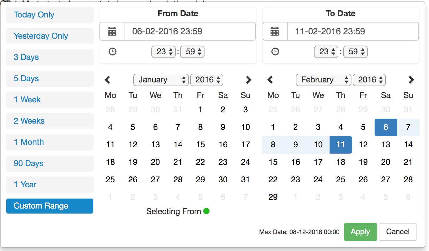
See the working demo over at codesandbox.io
React 15 Demo
https://codesandbox.io/s/zxoo178m03?fontsize=14&module=%2Fsrc%2FApp.js
React 16 Demo
https://codesandbox.io/s/v6z8l7nr8y?fontsize=14&module=%2Fsrc%2FApp.js
This is a fully rewritten, keyboard friendly implementation of a date time range picker. It has been designed for selecting date ranges and does not currently include a single date picker.
It has been designed currently to work with React Version 15
The current version is compatible with Firefox 34+ and Chrome 40+ (May work but not widely tests on earlier versions)
Version 1.0.1 Release (30-06-19) -- Major Change
With the release of this version comes a major change to the default vanilla behaviour of the date time picker. Default behaviour is now
non smart mode. Smart mode must be enabled via the use of the smart mode property. Also by default smart mode will be optimised for forward
searching. Use pastSearchFriendly to optimise for past searching.
Setup
Run the following command:
npm install react-advanced-datetimerange-picker
Requirements
This component is best used alongside bootstrap e.g. the below line of code in index.html
<link rel="stylesheet" href="https://maxcdn.bootstrapcdn.com/bootstrap/3.3.7/css/bootstrap.min.css" integrity="sha384-BVYiiSIFeK1dGmJRAkycuHAHRg32OmUcww7on3RYdg4Va+PmSTsz/K68vbdEjh4u" crossorigin="anonymous">
General Info
This project is based upon dangrossman daterangepicker (https://github.com/dangrossman/daterangepicker)
The project has been rewritten in React, this is not a JQuery wrap around.
It is based off of the V2 UI with some slight adjustments and added keyboard accessibility such as Keyboard arrow key navigation and Tab navigation.
Properties Required
ranges {React.Object}
Object of ranges that will be you default ranges. Example:
let ranges = {
            "Today Only": [moment(start), moment(end)],
            "Yesterday Only": [moment(start).subtract(1, "days"), moment(end).subtract(1, "days")],
            "3 Days": [moment(start).subtract(3, "days"), moment(end)]
        }
start (Required) {Moment Object}
Initial Start Date that will be selected, should be a moment object
end (Required) {Moment Object}
Initial End Date that will be selected, should be a moment object
local (Required) {Object}
Defines a local format for date labels to be shown as. Can also set Sunday to be first day or Monday. Local object accepts format and sunday first params.
--> format: moment display format
--> sundayFirst: True Sunday the first day of the week. False, Monday first day of the week.
--> From release version 1.0.7+: days, months, fromDate, toDate, selectingFrom, selectingTo, MaxDate, close, apply, cancel
let local = {
    "format":"DD-MM-YYYY HH:mm",
    "sundayFirst" : false,
    days: ['Mo', 'Tu', 'We', 'Th', 'Fr', 'Sa', 'So'],
    months: [
        'January',
        'February',
        'March',
        'April',
        'May',
        'June',
        'July',
        'August',
        'September',
        'October',
        'November',
        'December',],
    fromDate: 'From Date',
    toDate: 'To Date',
    selectingFrom: 'Selecting From',
    selectingTo: 'Selecting To',
    maxDate: 'Max Date',
    close: 'Close',
    apply: 'Apply',
    cancel: 'Cancel'
}
applyCallback (Required) {React.func}
Function which is called when the apply button is clicked/pressed. Takes two params, that start date and the end date.
func applyCallback(startDate, endDate){
    ...
}
maxDate (optional) {Moment Object}
Maximum date that can be selected.
rangeCallback (optional) {React.func}
func rangeCallback(index, value) {
    ...
}
autoApply (optional) {bool}
When set there will only be one button in the bottom right to close the screen.
Whenever a button is clicked in the date picker the apply callback
function will be called for you.
descendingYears (optional) {bool}
When set the years will be displayed in descending order on the picker instead of ascending order.
years (optional) {array}
years={[2010, 2020]}
Takes an array where the first value is the start year and the second values is the end year. This will
update the dropdown years to only show these years.
WARNING: This does not affect the ability to type in years in the text box and go beyond the values set here.
smartMode (optional) {bool}
The date time picker will switch the month on the RHS when two dates in the same month are selected. Can be used in
conjunction with pastSearchFriendly to switch the month on the LHS when the two dates are from the same month.
pastSearchFriendly (optional) {bool}
Requires: Smart Mode enabled
Changes the mode of the date time picker to be optimised for past searches.
Where possible the start and end time will be shown on the RHS
when the month and year are equal. This allows for the previous month to be
shown on the LHS to allow easier backwards searching.
This setting is false by default meaning that the LHS is used when dates are selected in the same month & year
style (optional) {Object}
Allows custom styling of some of the elements of the date time picker. The following can be added:
{
    fromDot: {backgroundColor: 'rgb(100, 0, 34)'},
    toDot: {backgroundColor: 'rgb(0, 135, 255)'},
    fromDate: {color: 'rgb(0, 255, 100)', backgroundColor: 'rgb(255, 100, 100)'},
    toDate: {backgroundColor: 'rgb(40, 90, 75)'},
    betweenDates: {color: 'rgb(200, 0, 34)', backgroundColor: 'rgb(200, 150, 100)'},
    hoverCell: {color: 'rgb(200, 0, 34)'},
    customRangeButtons: {backgroundColor: 'rgb(40, 90, 75)'},
    customRangeSelected: {backgroundColor: 'rgb(100, 90, 200)'},
    standaloneLayout:{display:'flex', maxWidth:'fit-content'}
}
darkMode (optional) {bool}
Changes the DateTimePicker to be in Dark Mode, default is Light Mode
noMobileMode (optional) {bool}
Release Version: 1.0.6+
When set the mobile/condense breakpoint will be ignored meaning the component will stay
in full screen mode all the time.
forceMobileMode (optional) {bool}
Release Version: 1.0.9+
When set the mobile/condense breakpoint will be ignored meaning the component will stay
in condensed mode all the time.
twelveHoursClock (optional) {bool}
Release Version: 1.0.13+
When set the picker time values will be in 12 hour mode not 24 hour mode
standaloneMode (optional) {bool}
Release Version: 1.0.9+ (BETA)
When set the picker will be open by default and follow the styling given. This config option
requires the below config styling to also be present in order
to style the div
style={{
    standaloneLayout:{display:'flex', maxWidth:'fit-content'}
}}
leftMode (optional) {bool}
Release Version: 1.0.6+ (BETA)
When set and changed the picker will open to the left (right to left) instead of the default which is to open to the right (left to right)
Getting Started
import React from 'react';
import DateTimeRangeContainer from 'react-advanced-datetimerange-picker'
import {FormControl} from 'react-bootstrap'
import moment from "moment"

class Wrapper extends React.Component {

    constructor(props){
        super(props);
        let now = new Date();
        let start = moment(new Date(now.getFullYear(), now.getMonth(), now.getDate(), 0,0,0,0));
        let end = moment(start).add(1, "days").subtract(1, "seconds");
        this.state = {
            start : start,
            end : end
        }

        this.applyCallback = this.applyCallback.bind(this);
    }

    applyCallback(startDate, endDate){
        this.setState({
                start: startDate,
                end : endDate
            }
        )
    }

    render(){
            let now = new Date();
            let start = moment(new Date(now.getFullYear(), now.getMonth(), now.getDate(), 0,0,0,0));
            let end = moment(start).add(1, "days").subtract(1, "seconds");
            let ranges = {
                "Today Only": [moment(start), moment(end)],
                "Yesterday Only": [moment(start).subtract(1, "days"), moment(end).subtract(1, "days")],
                "3 Days": [moment(start).subtract(3, "days"), moment(end)]
            }
            let local = {
                "format":"DD-MM-YYYY HH:mm",
                "sundayFirst" : false
            }
            let maxDate = moment(start).add(24, "hour")
            return(
                <div>
                    <DateTimeRangeContainer
                        ranges={ranges}
                        start={this.state.start}
                        end={this.state.end}
                        local={local}
                        maxDate={maxDate}
                        applyCallback={this.applyCallback}
                    >
                        <FormControl
                        id="formControlsTextB"
                        type="text"
                        label="Text"
                        placeholder="Enter text"
                        />
                    </DateTimeRangeContainer>
                </div>
            );
        }
}
Available Scripts
In the project directory, you can run:
npm start
Runs the app in the development mode.
Open http://localhost:3000 to view it in the browser.
The page will reload if you make edits.
You will also see any lint errors in the console.
npm test
Launches the test runner in the interactive watch mode.
See the section about running tests for more information.
npm run build
Builds the app for production to the build folder.
It correctly bundles React in production mode and optimizes the build for the best performance.
npm test -- --coverage
Gets test coverage when running tests to see how much of the code is covered by your tests.


