
yarn add @smashing/button

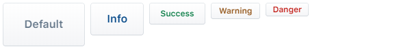
Default appearance

<Button>Default</Button>
<Button intent="info">Info</Button>
<Button intent="success">Success</Button>
<Button intent="warning">Warning</Button>
<Button intent="danger">Danger</Button>
Primary appearance

<Button appearance="primary">Default</Button>
<Button appearance="primary" intent="info">
  Info
</Button>
<Button appearance="primary" intent="success">
  Success
</Button>
<Button appearance="primary" intent="warning">
  Warning
</Button>
<Button appearance="primary" intent="danger">
  Danger
</Button>
Subtle appearance

<Button appearance="subtle">Default</Button>
<Button appearance="subtle" intent="info">
  Info
</Button>
<Button appearance="subtle" intent="success">
  Success
</Button>
<Button appearance="subtle" intent="warning">
  Warning
</Button>
<Button appearance="subtle" intent="danger">
  Danger
</Button>
Flat appearance

<Button appearance="flat">Default</Button>
<Button appearance="flat" intent="info">
  Info
</Button>
<Button appearance="flat" intent="success">
  Success
</Button>
<Button appearance="flat" intent="warning">
  Warning
</Button>
<Button appearance="flat" intent="danger">
  Danger
</Button>
Minimal appearance

<Button appearance="minimal">Default</Button>
<Button appearance="minimal" intent="info">
  Info
</Button>
<Button appearance="minimal" intent="success">
  Success
</Button>
<Button appearance="minimal" intent="warning">
  Warning
</Button>
<Button appearance="minimal" intent="danger">
  Danger
</Button>
Height
<Button height={64}>Default</Button>
<Button height={48} intent="info">
  Info
</Button>
<Button height={32} intent="success">
  Success
</Button>
<Button height={24} intent="warning">
  Warning
</Button>
<Button height={20} intent="danger">
  Danger
</Button>
Border radius

<Button borderRadius={30}>Default</Button>
<Button borderRadius={30} intent="info">
  Info
</Button>
<Button borderRadius={30} intent="success">
  Success
</Button>
<Button borderRadius={30} intent="warning">
  Warning
</Button>
<Button borderRadius={30} intent="danger">
  Danger
</Button>


