Security Fundamentals
Turtles, Clams, and Cyber Threat Actors: Shell Usage
The Socket Threat Research Team uncovers how threat actors weaponize shell techniques across npm, PyPI, and Go ecosystems to maintain persistence and exfiltrate data.
@smui/button
Advanced tools
An interactive button or link.
npm install --save-dev @smui/button
https://sveltematerialui.com/demo/button
A button.
component: href == null ? Button : A - A component to use as the root element.use: [] - An array of Svelte actions and/or arrays of an action and its options.class: '' - A CSS class string.ripple: true - Whether to implement a ripple for when the component is interacted with.color: 'primary' - The button's color. ('primary' or 'secondary')variant: 'text' - The button's style variant. ('text', 'raised', 'unelevated', or 'outlined')touch: false - Increase the touch target.href: undefined - If the href property is set, the button will use an anchor element, instead of a button element.action: 'close' - Used in the context of a dialog. This sets the button's action.default: false - Used in the context of a dialog. This makes the button the default for the dialog.secondary: false - Used in the context of a banner. This makes the button the secondary action for the banner.A button group.
use: [] - An array of Svelte actions and/or arrays of an action and its options.class: '' - A CSS class string.variant: 'text' - The button group's style variant. ('text', 'raised', 'unelevated', or 'outlined')A Svelte action for a group item. Used for containing a button in a group. This can be useful for containing menus along with the button. If you are using this on an element that you are also defining classes on (or a component that defines classes internally), you need to provide addClass and removeClass functions.
addClass: (className) => node.classList.add(className) - A function to add a class to the element.removeClass: (className) => node.classList.remove(className) - A function to remove a class to the element.A text label.
See the common label readme.
A graphic icon.
See the common icon readme.
See Buttons in the Material design spec.
See Button in MDC-Web for information about the upstream library's architecture.
8.0.0-beta.3 (2024-12-22)
FAQs
Did you know?

Socket for GitHub automatically highlights issues in each pull request and monitors the health of all your open source dependencies. Discover the contents of your packages and block harmful activity before you install or update your dependencies.

Security Fundamentals
The Socket Threat Research Team uncovers how threat actors weaponize shell techniques across npm, PyPI, and Go ecosystems to maintain persistence and exfiltrate data.

Security News
At VulnCon 2025, NIST scrapped its NVD consortium plans, admitted it can't keep up with CVEs, and outlined automation efforts amid a mounting backlog.

Product
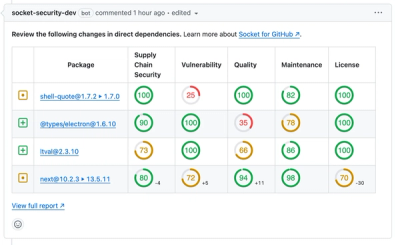
We redesigned our GitHub PR comments to deliver clear, actionable security insights without adding noise to your workflow.