Product
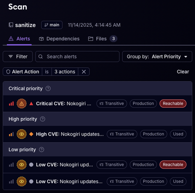
Reachability for Ruby Now in Beta
Reachability analysis for Ruby is now in beta, helping teams identify which vulnerabilities are truly exploitable in their applications.
@solidexpert/ngx-query-builder
Advanced tools
A modern Angular (v15+) query builder inspired by jQuery QueryBuilder and rebuilt with standalone components. It ships sensible defaults, rich templating hooks, and full forms support so you can compose visual query editors that match your domain.
QueryBuilderComponent that works with ngModel or Reactive Forms (ControlValueAccessor + Validator)queryInput, queryButtonGroup, querySwitchGroup, etc.)classNames| Angular version | Library tag | Notes |
|---|---|---|
| 20.x | @solidexpert/ngx-query-builder@^20 | Default release line (current) |
| 19.x | @solidexpert/ngx-query-builder@^19 | Install explicitly when targeting Angular 19 |
| 18.x | @solidexpert/ngx-query-builder@^18 | Legacy support branch |
| 15.x – 17.x | @solidexpert/ngx-query-builder@^15 | Final Ivy-era compatible build |
ℹ️ Each major version aligns with the matching Angular major. Pin the library to the major that matches your workspace in
package.json.
npm install @solidexpert/ngx-query-builder
import { Component } from '@angular/core';
import { FormsModule } from '@angular/forms';
import {
  QueryBuilderComponent,
  QueryBuilderConfig,
  RuleSet
} from '@solidexpert/ngx-query-builder';

@Component({
  selector: 'app-query-builder-demo',
  standalone: true,
  imports: [FormsModule, QueryBuilderComponent],
  template: `
    <query-builder
      [(ngModel)]="query"
      [config]="config"
      [allowCollapse]="true"
      [persistValueOnFieldChange]="true"
    ></query-builder>
  `
})
export class QueryBuilderDemoComponent {
  query: RuleSet = {
    condition: 'and',
    rules: [{ field: 'age', operator: '>=', value: 21 }]
  };

  config: QueryBuilderConfig = {
    fields: {
      age: { name: 'Age', type: 'number', defaultOperator: '>=', defaultValue: 18 },
      gender: {
        name: 'Gender',
        type: 'category',
        options: [
          { name: 'Male', value: 'm' },
          { name: 'Female', value: 'f' }
        ]
      }
    },
    allowEmptyRulesets: false
  };
}
Because the component is standalone, add it to the imports array of any traditional NgModule:
import { NgModule } from '@angular/core';
import { FormsModule } from '@angular/forms';
import { QueryBuilderComponent } from '@solidexpert/ngx-query-builder';
import { DemoHostComponent } from './demo-host.component';

@NgModule({
  declarations: [DemoHostComponent],
  imports: [FormsModule, QueryBuilderComponent]
})
export class DemoModule {}
RuleSet: { condition: 'and' | 'or', rules: Array<Rule | RuleSet>, collapsed?: boolean }Rule: { field: string; operator?: string; value?: any; entity?: string }Either bind via [(ngModel)] or plug the component into a reactive form control using formControlName.
QueryBuilderConfig| Property | Type | Description |
|---|---|---|
fields | { [key: string]: Field } | Required field registry. Keys map to Rule.field values. |
entities | { [key: string]: Entity } | Optional entity registry to scope visible fields per rule. |
allowEmptyRulesets | boolean | Allow rule sets to be empty. When false, empty sets are flagged as invalid. |
getOperators(fieldName, field) | (string, Field) => string[] | Override operator list resolution. Falls back to operators on the field definition or the component’s default map. |
getInputType(fieldName, operator) | (string, string) => string | Map a field/operator to a custom template type. |
getOptions(fieldName) | (string) => Option[] | Provide runtime option lists (async ready if paired with async pipe). |
addRuleSet(parent) / addRule(parent) | (RuleSet) => void | Override default rule creation logic. Useful when pairing with server-driven defaults. |
removeRuleSet(ruleset, parent?) / removeRule(rule, parent) | Custom removal handlers. | |
coerceValueForOperator(operator, value, rule) | (string, any, Rule) => any | Override built-in coercion logic (e.g. normalise between string/number types). |
calculateFieldChangeValue(currentField, nextField, value) | (Field, Field, any) => any | Decide how to migrate a rule’s value when the field changes. |
QueryBuilderClassNamesEvery visual element exposes a class token that can be replaced. The defaults ship with the q-* prefix. Override selectively through the [classNames] input, e.g.:
classNames = {
  button: 'btn btn-sm btn-secondary',
  addIcon: 'fa fa-plus',
  removeIcon: 'fa fa-minus text-danger'
};
| Input | Type | Default | Description |
|---|---|---|---|
disabled | boolean | false | Disables user interaction and propagates ControlValueAccessor state. |
allowRuleset | boolean | true | Shows the “+ Ruleset” button when true. |
allowCollapse | boolean | false | Enables collapse/expand controls on the outer ruleset. |
emptyMessage | string | "A ruleset cannot be empty..." | Message rendered when an empty ruleset is invalid. |
classNames | QueryBuilderClassNames | {} | Override CSS class tokens. |
config | QueryBuilderConfig | { fields: {} } | Core configuration object for fields, entities, and hooks. |
operatorMap | { [type: string]: string[] } | See source defaults | Extend or replace the built-in operator map used when a field has no explicit operators. |
persistValueOnFieldChange | boolean | false | When toggled, keeps a rule’s value if the new field shares the same type (string/number/time/date/boolean). Ignored if calculateFieldChangeValue is supplied. |
parent* inputs | — | — | Internal plumbing used when rendering nested instances. They can generally be ignored by consumers. |
[(ngModel)], formControl, and [value]/(valueChange) bindings all use the same RuleSet shape; prefer ngModel / formControl for automatic change detection and validation.
All template overrides are standalone directives exported alongside the component. Use *directive="..." syntax to redefine specific UI fragments.
| Directive | Purpose | Context (let- variables) |
|---|---|---|
queryInput | Replace the value editor. | let rule, let field=field, let options=options, let onChange=onChange |
queryOperator | Replace the operator selector. | let rule, let operators=operators, let onChange=onChange |
queryField | Replace the field selector. | let rule, let fields=fields, let onChange=onChange, let getFields=getFields |
queryEntity | Replace the entity selector. | let rule, let entities=entities, let onChange=onChange |
querySwitchGroup | Redefine the AND/OR toggle block. | let ruleset, let onChange=onChange, let getDisabledState=getDisabledState |
queryButtonGroup | Customise the add/remove buttons. | let ruleset, let addRule=addRule, let addRuleSet=addRuleSet, let removeRuleSet=removeRuleSet, let getDisabledState=getDisabledState |
queryRemoveButton | Override the per-rule remove button. | let rule, let removeRule=removeRule, let getDisabledState=getDisabledState |
queryEmptyWarning | Custom empty warning content. | let ruleset, let message=message, let getDisabledState=getDisabledState |
queryArrowIcon | Swap the collapse caret icon. | let ruleset, let getDisabledState=getDisabledState |
Specify a type when using queryInput to target specific field types: *queryInput="let rule; type: 'date'".
<query-builder [(ngModel)]="query" [config]="config" [classNames]="bootstrapClassNames">
  <ng-container *queryButtonGroup="let addRule=addRule; let addRuleSet=addRuleSet">
    <div class="btn-group">
      <button class="btn btn-outline-primary btn-sm" type="button" (click)="addRule()">+ Rule</button>
      <button class="btn btn-outline-primary btn-sm" type="button" (click)="addRuleSet()">+ Group</button>
    </div>
  </ng-container>
</query-builder>
bootstrapClassNames = {
  button: 'btn btn-outline-secondary btn-sm',
  addIcon: 'fa fa-plus me-1',
  removeIcon: 'fa fa-times text-danger',
  rule: 'card card-body p-3 mb-2'
};
<query-builder [(ngModel)]="query" [config]="config">
  <ng-container *queryField="let rule; let fields=fields; let onChange=onChange">
    <mat-form-field appearance="outline">
      <mat-label>Field</mat-label>
      <mat-select [(ngModel)]="rule.field" (ngModelChange)="onChange($event, rule)">
        <mat-option *ngFor="let field of fields" [value]="field.value">{{ field.name }}</mat-option>
      </mat-select>
    </mat-form-field>
  </ng-container>
  <ng-container *queryOperator="let rule; let operators=operators">
    <mat-form-field appearance="outline">
      <mat-label>Operator</mat-label>
      <mat-select [(ngModel)]="rule.operator">
        <mat-option *ngFor="let operator of operators" [value]="operator">{{ operator }}</mat-option>
      </mat-select>
    </mat-form-field>
  </ng-container>
  <ng-container *queryInput="let rule; let options=options; type: 'category'">
    <mat-form-field appearance="outline">
      <mat-label>Value</mat-label>
      <mat-select [(ngModel)]="rule.value" multiple>
        <mat-option *ngFor="let opt of options" [value]="opt.value">{{ opt.name }}</mat-option>
      </mat-select>
    </mat-form-field>
  </ng-container>
</query-builder>
config.entities and set entity on fields. The default UI shows an entity dropdown when at least one entity is configured.[persistValueOnFieldChange]="true" or implement calculateFieldChangeValue to migrate values between fields with custom logic.getOperators or augment [operatorMap] to align operators with your backend semantics.validator functions on individual fields. Returning a string (or any truthy value) marks the rule invalid and surfaces through Angular’s form validation.addRule, addRuleSet, removeRule, or removeRuleSet in the config to bridge to remote defaults or analytics.The component implements both ControlValueAccessor and Validator. When registered inside a reactive form, any validation errors produced by field validators flow into FormControl.errors.rules. Use native Angular form APIs (statusChanges, ngModelChange, etc.) to react to updates.
this.form = new FormGroup({
  filter: new FormControl<RuleSet | null>(null, Validators.required)
});
<form [formGroup]="form">
  <query-builder formControlName="filter" [config]="config"></query-builder>
  <pre *ngIf="form.controls.filter.errors as errors">{{ errors | json }}</pre>
</form>
Run the unit suite to ensure regressions are caught before publishing:
npm install
npm run test   # or: ng test
The specs cover default rule creation, field change behaviour, multi-select coercion, and validator integration.
MIT © Solidexpert
FAQs
Angular library for building query strings
We found that @solidexpert/ngx-query-builder demonstrated a healthy version release cadence and project activity because the last version was released less than a year ago. It has 2 open source maintainers collaborating on the project.
Did you know?

Socket for GitHub automatically highlights issues in each pull request and monitors the health of all your open source dependencies. Discover the contents of your packages and block harmful activity before you install or update your dependencies.

Product
Reachability analysis for Ruby is now in beta, helping teams identify which vulnerabilities are truly exploitable in their applications.

Research
/Security News
Malicious npm packages use Adspect cloaking and fake CAPTCHAs to fingerprint visitors and redirect victims to crypto-themed scam sites.

Security News
Recent coverage mislabels the latest TEA protocol spam as a worm. Here’s what’s actually happening.