Product
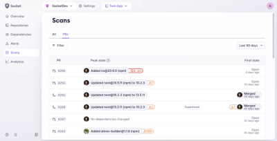
Introducing Pull Request Stories to Help Security Teams Track Supply Chain Risks
Socket’s new Pull Request Stories give security teams clear visibility into dependency risks and outcomes across scanned pull requests.
@solvprotocol/ui-v2
Advanced tools
A modern React UI component library built on Radix UI and Tailwind CSS, providing rich accessibility and customizable components.
A modern React UI component library built on Radix UI and Tailwind CSS, providing rich accessibility and customizable components.
npm i @solvprotocol/ui-v2
# or
yarn add @solvprotocol/ui-v2
# or
pnpm add @solvprotocol/ui-v2
import { Button, Card, Input } from '@solvprotocol/ui-v2';
import '@solvprotocol/ui-v2/dist/assets/style.css'

function App() {
  return (
    <div className="p-4">
      <Card className="w-80">
        <CardHeader>
          <CardTitle>Login</CardTitle>
        </CardHeader>
        <CardContent className="space-y-4">
          <Input placeholder="Username" />
          <Input type="password" placeholder="Password" />
          <Button className="w-full">Login</Button>
        </CardContent>
      </Card>
    </div>
  );
}
Accordion - Accordion componentAspectRatio - Aspect ratio componentCard - Card componentCollapsible - Collapsible componentDrawer - Drawer componentResizable - Resizable componentScrollArea - Scroll areaSeparator - SeparatorSheet - Sidebar componentSidebar - SidebarButton - Button componentCheckbox - CheckboxForm - Form componentInput - Input fieldInputOTP - OTP input fieldLabel - LabelRadioGroup - Radio button groupSelect - SelectorSlider - SliderSwitch - SwitchTextarea - Text areaToggle - Toggle buttonToggleGroup - Toggle button groupBreadcrumb - Breadcrumb navigationCommand - Command paletteContextMenu - Context menuDropdownMenu - Dropdown menuHoverCard - Hover cardMenubar - Menu barNavigationMenu - Navigation menuPagination - PaginationPopover - PopoverTabs - TabsAlert - Alert notificationAlertDialog - Alert dialogBadge - BadgeDialog - DialogProgress - Progress barSkeleton - Skeleton screenSonner - Notification componentTooltip - TooltipAvatar - AvatarCalendar - CalendarCarousel - CarouselChart - Chart componentTable - Tablenpm install
# or
yarn install
# or
pnpm install
npm run dev
# or
yarn dev
# or
pnpm dev
npm run build
# or
yarn build
# or
pnpm build
npm run lint
# or
yarn lint
# or
pnpm lint
The component library supports CSS variables for theme customization:
:root {
  --background: 0 0% 100%;
  --foreground: 222.2 84% 4.9%;
  --primary: 222.2 47.4% 11.2%;
  --primary-foreground: 210 40% 98%;
  /* More variables... */
}

.dark {
  --background: 222.2 84% 4.9%;
  --foreground: 210 40% 98%;
  --primary: 210 40% 98%;
  --primary-foreground: 222.2 47.4% 11.2%;
  /* More variables... */
}
Welcome to submit Issues and Pull Requests to improve this component library!
MIT License
FAQs
A modern React UI component library built on Radix UI and Tailwind CSS, providing rich accessibility and customizable components.
The npm package @solvprotocol/ui-v2 receives a total of 0 weekly downloads. As such, @solvprotocol/ui-v2 popularity was classified as not popular.
We found that @solvprotocol/ui-v2 demonstrated a healthy version release cadence and project activity because the last version was released less than a year ago. It has 12 open source maintainers collaborating on the project.
Did you know?

Socket for GitHub automatically highlights issues in each pull request and monitors the health of all your open source dependencies. Discover the contents of your packages and block harmful activity before you install or update your dependencies.

Product
Socket’s new Pull Request Stories give security teams clear visibility into dependency risks and outcomes across scanned pull requests.

Research
/Security News
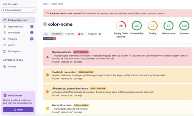
npm author Qix’s account was compromised, with malicious versions of popular packages like chalk-template, color-convert, and strip-ansi published.

Research
Four npm packages disguised as cryptographic tools steal developer credentials and send them to attacker-controlled Telegram infrastructure.