
Product
A New Overview in our Dashboard
We redesigned Socket's first logged-in page to display rich and insightful visualizations about your repositories protected against supply chain threats.
By André Staltz - Apr 29, 2025
@stianlarsen/react-fade-effects
Advanced tools
A collection of React components for smooth fade-in animations, starting with FadeWords. Easily add fade effects to your UI elements with customizable options.
A versatile React library for applying various fade-in effects to your UI components. Starting with the FadeWords component, this library will grow to include multiple fade-related components, such as fading text, images, children elements, and more.

_A preview of @stianlarsen/react-face-effects
Website coming soon with examples and demos
Install the package using npm:
npm install @stianlarsen/react-fade-effects
Or using yarn:
yarn add @stianlarsen/react-fade-effects
The FadeWords component allows you to create smooth fade-in effects for text.
import { FadeWords } from "@stianlarsen/react-fade-effects";

function App() {
  return (
    <FadeWords
      words="Effortless Task Management with TaskBuddy"
      duration={1}
      delay={0.2}
      variant="up"
      scaleSize={1.05}
    />
  );
}
FadeWords Component PropsThe FadeWords component accepts several props to customize its behavior and appearance:
| Prop | Type | Description |
|---|---|---|
words | string or string[] | The text or array of words to be displayed with the fade effect. |
className | string | Additional CSS classes to apply to the component. |
filter | boolean | Apply a blur filter during the animation. Defaults to true. |
duration | number | Duration of the animation in seconds. Defaults to 1. |
staggerTime | number | Time in seconds to stagger the animation between words. Defaults to 0.1. |
delay | number | Delay before the animation starts in seconds. Defaults to 0.2. |
variant | default, up, down, left, or right | The direction of the animation. Defaults to default. |
scaleSize | number | Scale size for the words during the animation. Defaults to 1. |
once | boolean | Whether the animation should occur only once. Defaults to true. |
translateAmount | number | Custom translate value for the animation. Defaults to 15 for up/down and 15 for left/right. |
This package is designed to expand with additional fade components, such as:
Each future component will come with its own set of customizable props, following the same flexible design as FadeWords.
Contributions are always welcome! Please feel free to open issues or submit pull requests.
@stianlarsen/react-fade-effects is MIT licensed.
For any questions or suggestions, feel free to reach out.
FAQs
A collection of React components for smooth fade-in animations, starting with FadeWords. Easily add fade effects to your UI elements with customizable options.
We found that @stianlarsen/react-fade-effects demonstrated a healthy version release cadence and project activity because the last version was released less than a year ago. It has 0 open source maintainers collaborating on the project.
Did you know?

Socket for GitHub automatically highlights issues in each pull request and monitors the health of all your open source dependencies. Discover the contents of your packages and block harmful activity before you install or update your dependencies.
Product
We redesigned Socket's first logged-in page to display rich and insightful visualizations about your repositories protected against supply chain threats.
Product
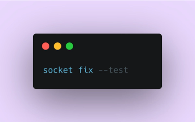
Automatically fix and test dependency updates with socket fix—a new CLI tool that turns CVE alerts into safe, automated upgrades.

Security News
CISA denies CVE funding issues amid backlash over a new CVE foundation formed by board members, raising concerns about transparency and program governance.