Product
Announcing Socket Certified Patches: One-Click Fixes for Vulnerable Dependencies
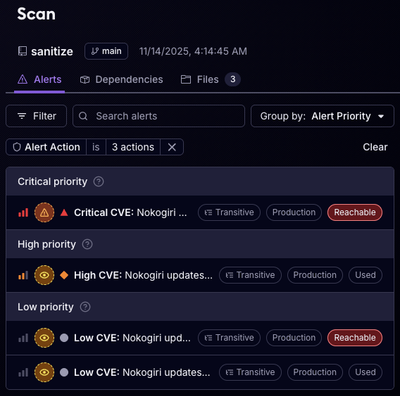
A safer, faster way to eliminate vulnerabilities without updating dependencies
@storybook/addon-designs
Advanced tools
Storybook addon for embedding your design preview in addon panel
A Storybook addon that embed Figma or websites in the addon panel for better design-development workflow.
| Addon designs version | Storybook version |
|---|---|
| ^11.0.0 | ^10.0.0 |
| ^10.0.0 | ^9.0.0 |
| ^9.0.0 | ^9.0.0 |
| ^8.0.0 | ^8.0.0 |
| ^7.0.0 | ^7.0.0 |
npm install -D @storybook/addon-designs
yarn add -D @storybook/addon-designs
pnpm add -D @storybook/addon-designs
main.jsexport default {
addons: ["@storybook/addon-designs"],
};
const meta = {
  title: "My stories",
  component: Button,
};
export default meta;

export const MyStory = {
  parameters: {
    design: {
      type: "figma",
      url: "https://www.figma.com/file/LKQ4FJ4bTnCSjedbRpk931/Sample-File",
    },
  },
};
storybook-addon-a11y helps you test the accessibility of your components. It provides tools to check for accessibility issues, whereas @storybook/addon-designs is focused on embedding design resources.
FAQs
Storybook addon for embedding your design preview in addon panel
The npm package @storybook/addon-designs receives a total of 772,343 weekly downloads. As such, @storybook/addon-designs popularity was classified as popular.
We found that @storybook/addon-designs demonstrated a healthy version release cadence and project activity because the last version was released less than a year ago. It has 12 open source maintainers collaborating on the project.
Did you know?

Socket for GitHub automatically highlights issues in each pull request and monitors the health of all your open source dependencies. Discover the contents of your packages and block harmful activity before you install or update your dependencies.

Product
A safer, faster way to eliminate vulnerabilities without updating dependencies

Product
Reachability analysis for Ruby is now in beta, helping teams identify which vulnerabilities are truly exploitable in their applications.

Research
/Security News
Malicious npm packages use Adspect cloaking and fake CAPTCHAs to fingerprint visitors and redirect victims to crypto-themed scam sites.