Research
/Security News
DuckDB npm Account Compromised in Continuing Supply Chain Attack
Ongoing npm supply chain attack spreads to DuckDB: multiple packages compromised with the same wallet-drainer malware.
@storybook/design-system
Advanced tools

Note: this design system is not used in Storybook's UI. The stack is different and theming requirements of Storybook add complexity beyond the scope of this project. However, Storybook's visual design is identical to what's here.
Building components
Maintaining the system
The Storybook design system codifies existing UI components into a central, well-maintained repository. It is built to address having to paste the same components into multiple projects again and again. This simplifies building UI's with Storybook's design patterns.
npm install --save @storybook/design-system
Components within the design system assume that a set of global styles have been configured. Depending upon the needs of the application, this can be done several ways:
GlobalStyle componentUseful when you don't need any custom body styling in the application, typically this would be placed in a layout component that wraps all pages, or a top-level App component.
import { global } from '@storybook/design-system';
const { GlobalStyle } = global;
/* Render the global styles once per page */
<GlobalStyle />
bodyStyles to apply stylingUseful when you want build upon the shared global styling.
import { Global, css } from '@storybook/theming';
import { global } from '@storybook/design-system';
const { bodyStyles } = global;

const customGlobalStyle = css`
  body {
    ${bodyStyles}// Custom body styling for the app
  }
`;

const CustomGlobalStyle = () => <Global styles={customGlobalStyle} />;
/* Render the global styles once per page */
<CustomGlobalStyle />
Rather than @import fonts in the GlobalStyle component, the design system's font URL is exported with the intention of using it in a <link> tag as the href. Different frameworks and environments handle component re-renders in their own way (a re-render would cause the font to be re-fetched), so this approach allows the design system consumers to choose the font loading method that is most appropriate for their environment.
import { global } from '@storybook/design-system';

const fontLink = document.createElement('link');

fontLink.href = global.fontUrl;
fontLink.rel = 'stylesheet';

document.head.appendChild(fontLink);
import React from 'react';
import { global } from '@storybook/design-system';

const Layout = ({ children }) => (
  <html>
    <head>
      <link href={global.fontUrl} rel="stylesheet" />
    </head>

    <body>{children}</body>
  </html>
);

export default Layout;
yarn releaseBump the version
Push a release to GitHub and npm
Push a changelog to GitHub
Notes:
npm adduserauto is used to generate a changelog and push it to GitHub. In order for this to work correctly, environment variables called GH_TOKEN and NPM_TOKEN are needed that reference a GitHub personal access token and a NPM "Publish" token with the appropriate permissions to update the repo.MIT © shilman
FAQs
Storybook design system
We found that @storybook/design-system demonstrated a healthy version release cadence and project activity because the last version was released less than a year ago. It has 12 open source maintainers collaborating on the project.
Did you know?

Socket for GitHub automatically highlights issues in each pull request and monitors the health of all your open source dependencies. Discover the contents of your packages and block harmful activity before you install or update your dependencies.

Research
/Security News
Ongoing npm supply chain attack spreads to DuckDB: multiple packages compromised with the same wallet-drainer malware.

Security News
The MCP Steering Committee has launched the official MCP Registry in preview, a central hub for discovering and publishing MCP servers.

Product
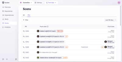
Socket’s new Pull Request Stories give security teams clear visibility into dependency risks and outcomes across scanned pull requests.