Security News
MCP Steering Committee Launches Official MCP Registry in Preview
The MCP Steering Committee has launched the official MCP Registry in preview, a central hub for discovering and publishing MCP servers.
@storybook/manager
Advanced tools
The @storybook/manager package is part of the Storybook ecosystem, which is a tool for developing UI components in isolation for React, Vue, Angular, and more. This particular package is responsible for managing the Storybook UI, including the navigation, toolbar, and addons panel. It allows developers to customize and extend the Storybook interface to better suit their development workflow.
Customizing Storybook's UI
This code demonstrates how to customize the Storybook UI by applying a custom theme. Developers can create a theme that matches their branding or preferences and apply it using the `addons.setConfig` method.
import { addons } from '@storybook/addons';
import yourTheme from './yourTheme';
addons.setConfig({
theme: yourTheme,
});Adding Toolbar Items
This code snippet shows how to add a custom button to the Storybook toolbar. Developers can use this to add tools or actions that are specific to their development process, enhancing productivity.
import { addons } from '@storybook/addons';
import { types } from '@storybook/addons';

addons.register('my-addon', () => {
  addons.add('my-addon/button', {
    type: types.TOOL,
    title: 'My button',
    match: ({ viewMode }) => !!(viewMode && viewMode.match(/^(story|docs)$/)),
    render: () => (
      /* render your button here */
    ),
  });
});This package allows developers to log actions as users interact with the UI components in Storybook. It's similar to @storybook/manager in that it extends Storybook's functionality, but it focuses more on capturing and displaying UI interactions rather than managing the UI.
The addon-knobs package lets developers add controls to their components in Storybook, allowing them to dynamically change props, functions, and other inputs. It complements @storybook/manager by enhancing the interactive capabilities of the Storybook UI, rather than managing its layout or appearance.
8.6.14
FAQs
Core Storybook UI
We found that @storybook/manager demonstrated a healthy version release cadence and project activity because the last version was released less than a year ago. It has 12 open source maintainers collaborating on the project.
Did you know?

Socket for GitHub automatically highlights issues in each pull request and monitors the health of all your open source dependencies. Discover the contents of your packages and block harmful activity before you install or update your dependencies.

Security News
The MCP Steering Committee has launched the official MCP Registry in preview, a central hub for discovering and publishing MCP servers.

Product
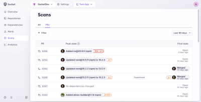
Socket’s new Pull Request Stories give security teams clear visibility into dependency risks and outcomes across scanned pull requests.

Research
/Security News
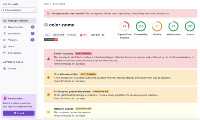
npm author Qix’s account was compromised, with malicious versions of popular packages like chalk-template, color-convert, and strip-ansi published.