Product
Introducing Reachability for PHP
Reachability analysis for PHP is now available in experimental, helping teams identify which vulnerabilities are actually exploitable.
@strapi/design-system
Advanced tools
[](https://www.npmjs.com/package/@strapi/design-system) [ {
return (
<DesignSystemProvider locale="en-GB" theme={lightTheme}>
{children}
</DesignSystemProvider>
);
}
export default App;
Then, checkout the complete Storybook documentation to find the components you want to use and how to use them.
Please follow our CONTRIBUTING guidelines.
Licensed under the MIT License, Copyright © 2015-present Strapi Solutions SAS.
See LICENSE for more information.
Material-UI is a popular React UI framework that implements Google's Material Design. It offers a wide range of components and customization options, making it a versatile choice for building modern web applications. Compared to @strapi/design-system, Material-UI is more general-purpose and widely adopted.
Chakra UI is a simple, modular, and accessible component library that gives you the building blocks to build React applications with speed. It focuses on ease of use and accessibility, similar to @strapi/design-system, but is not tied to any specific CMS.
Ant Design is a comprehensive design system and React UI library developed by Alibaba. It provides a wide range of high-quality components and design guidelines. Ant Design is more feature-rich and enterprise-focused compared to @strapi/design-system.
FAQs
[](https://www.npmjs.com/package/@strapi/design-system) [
Socket for GitHub automatically highlights issues in each pull request and monitors the health of all your open source dependencies. Discover the contents of your packages and block harmful activity before you install or update your dependencies.

Product
Reachability analysis for PHP is now available in experimental, helping teams identify which vulnerabilities are actually exploitable.

Product
Export Socket alert data to your own cloud storage in JSON, CSV, or Parquet, with flexible snapshot or incremental delivery.

Research
/Security News
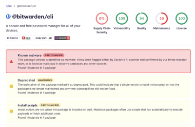
Bitwarden CLI 2026.4.0 was compromised in the Checkmarx supply chain campaign after attackers abused a GitHub Action in Bitwarden’s CI/CD pipeline.