Angular Calendars Components
The Angular Calendars package contains date and time components such as calendar, date picker, date range picker, date time picker, and time picker. These components come with options to disable dates, restrict selection, and show custom events.
What's Included in the Angular Calendars Package
The Angular Calendars package includes the following list of components.
Angular Calendar
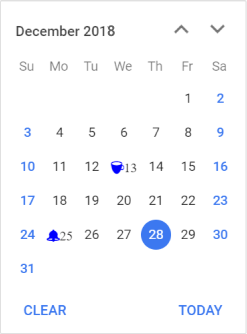
The Angular Calendar component is a graphical user interface component that displays a Gregorian or Islamic Calendar and allows selection of a date.
Getting Started .
Online demos .
Learn more
Key features
- Date range - Restricts the range of dates that can be selected by using the
min and max properties.
- Customization - Allows complete control over the appearance of the calendar component.
- Month or year selection - Provides a flexible option to select only a month or year as the date value.
- First day of week - Changes the first day of all weeks in every month.
- Week number - Displays the week number of the selected date in the calendar by enabling the week number option.
- Disabled dates - Disables any date to prevent the user from selecting that date.
- Start and depth view - The Calendar has
month, year, and decade views that provide flexibility to select dates.
- Highlight weekends - The calendar supports to highlighting every weekend in a month.
- Globalization - Supports globalization (internationalization and localization) to translate the names of months, days, and the today button text to any supported language.
Angular DatePicker
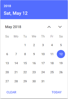
The Angular DatePicker component is a graphical user interface component that allows selection or entry of a date value.
Getting Started .
Online demos .
Learn more
Key features
- Placeholders - Placeholder is a hint text that is displayed in the DatePicker; it is used to indicate the format of the date that the user should enter, such as mm/dd/yyyy or dd/mm/yyyy.
- Mask date input - The mask date input restricts the user from typing unwanted characters in the text input, allowing only eligible date format to be typed.
- Disabled date - To disable a specific date in the picker calendar and restrict it from being set or selected in the DatePicker.
- Date format - The DatePicker control’s input value can be custom formatted apart from the default culture’s specific date format.
- Incomplete date validation - The strictMode is an act that allows entry only of valid dates within the specified min or max range in a text box.
- Globalization - Support globalization (also known as internationalization and localization) to allow you to translate the names of months, days, and other text elements in the calendar to any supported language. This can be useful in cases where you want to display the calendar in a language other than the default language.
Angular TimePicker
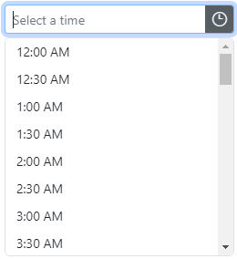
The Angular TimePicker component is a simple and intuitive interface component that allows selection of a time value from the popup list or setting a desired time value.
Getting Started .
Online demos .
Learn more
Key features
- Time range - Restricts the entry or selection of time values within a specific range of time by using
min and max properties.
- Time format - Apart from the default culture specific time format, the time picker control’s input value can also be custom formatted.
- Strict mode - The strictMode is an act that allows entry of only valid time values within the specified min and max range in a text box.
- Disabled time - Any number of time values can be disabled in the popup list items to prevent selection of those times.
- Time intervals - Allows populating the time list with intervals between the times in the popup list to enable selection of proper time value.
- Customization - The appearance of the time picker can be customized completely.
- Time list with duration - Supports customization of the control’s popup list items with time duration.
- Mask time input - The mask time input restricts the user from typing unwanted characters in the text input, allowing only eligible time format to be typed.
- Globalization - Supports globalization (internationalization and localization) to update time popup list values to match any specified culture.
Angular DateTimePicker
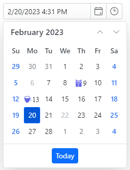
The Angular DateTimePicker component is a graphical user interface component that allows an end user to enter or select a date and time values from a pop-up calendar and time list pop-up.
Getting Started .
Online demos .
Learn more
Key features
- Date time range - Restricts the entry or selection of values within a specific range of dates and times by using
min and max properties.
- Date time format - The control’s input value can be custom formatted apart from the default culture’s specific date time format.
- Mask date time input - The mask date time input restricts the user from typing unwanted characters in the text input, allowing only eligible date and time format to be typed.
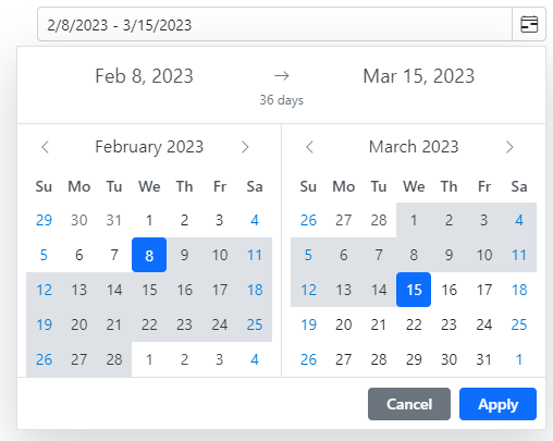
Angular DateRangePicker
The Angular DateRangePicker component is a graphical user interface control that allows an end user to select start and end date values as a range from a calendar pop-up or by entering the value directly in the input element.
Getting Started .
Online demos .
Learn more
Key features
- Preset ranges - Defines the preset ranges to select the frequently used date range by the end users.
- Range restriction - This control restricts the entry or selection of values within a specific range of date by defining the min and max properties.
- Limit the selection range - Directs the end user to select only the date range with specific minimum and maximum number of days’ count by setting the minDays and maxDays options.
- First day of week - Changes the first day of weeks in every month.
- Strict mode - The strictMode is an act that allows entry only of a valid date within the specified min and max range in a textbox.
- Customization - The appearance of the component can be customized completely.
- Format - The control’s input value can be custom formatted apart from the default culture’s specific date range format.
- Globalization - Supports globalization (internationalization and localization) to translate the names of months, days, and button text to any supported language.
Trusted by the world's leading companies

Setup
To install calendars and its dependent packages, use the following command.
npm install @syncfusion/ej2-angular-calendars
Supported frameworks
Calendar components are also offered in the following list of frameworks.
Showcase samples
Resources
Support
Product support is available through the following mediums.
Changelog
Check the changelog here. Get minor improvements and bug fixes every week to stay up to date with frequent updates.
License and copyright
This is a commercial product and requires a paid license for possession or use. Syncfusion® licensed software, including this component, is subject to the terms and conditions of Syncfusion® EULA. To acquire a license for 140+ Angular UI components, you can purchase or start a free 30-day trial.
A free community license is also available for companies and individuals whose organizations have less than $1 million USD in annual gross revenue and five or fewer developers.
See LICENSE FILE for more info.
© Copyright 2026 Syncfusion® Inc. All Rights Reserved. The Syncfusion® Essential Studio® license and copyright applies to this distribution.


