Vue Inputs Components
A package of Vue Input components. It comes with a collection of form components which is useful to get different input values from the users such as text, numbers, patterns, color and file inputs.
What's Included in the Vue Inputs Package
The Vue Inputs package includes the following list of components.
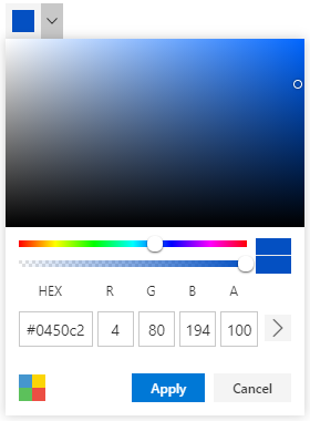
Vue ColorPicker
The Vue ColorPicker component is a user interface that is used to select and adjust color values.
Getting Started .
Online demos .
Learn more
Key features
- Color specification - Supports
Red Green Blue, Hue Saturation Value and Hex codes.
- Mode - Supports
Picker and Palette mode.
- Inline - Supports inline type rendering of color picker.
- Custom palettes - Allows to customize palettes and supports multiple palette groups rendering.
- Opacity - Allows to set and change the
opacity of the selected color.
- Accessibility - Built-in accessibility features to access color picker using the keyboard, screen readers, or other assistive technology devices.
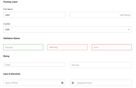
Vue TextBox
The Vue TextBox component is an extended version of the HTML input control which is used to edit or display text input on a form.
Getting Started .
Online demos .
Learn more
Key features
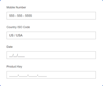
Vue MaskedTextBox
The Vue MaskedTextBox component allows the user to enter the valid input only based on the provided mask.
Getting Started .
Online demos .
Learn more
Key features
- Custom characters - allows you to use your own characters as the mask elements.
- Regular expression - can be used as a mask element for each character of the MaskedTextBox.
- Accessibility - provides built-in accessibility support which helps to access all the MaskedTextBox component features through keyboard, on-screen readers, or other assistive technology devices.
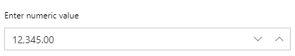
Vue NumericTextBox
The Vue NumericTextBox component is used to get the number inputs from the user. The input values can be incremented or decremented by a predefined step value.
Getting Started .
Online demos .
Learn more
Key features
- Range validation - allows to set the minimum and maximum range of values in the NumericTextBox.
- Number formats - supports the number display formatting with MSDN standard and custom number formats.
- Precision Of numbers - allows to restrict the number precision when enters the value.
- Keyboard interaction - allows users to interact with the NumericTextBox using the keyboard.
- Accessibility - provides built-in accessibility support which helps to access all the NumericTextBox component features through keyboard, on-screen readers or other assistive technology devices.
- Internationalization - library provides support for formatting and parsing number using the official Unicode CLDR JSON data.
- Localization - Supports to localize spin up and down buttons title for the tooltip to different cultures.
Vue Signature
The Vue Signature component allows user to draw smooth signatures as vector outline of strokes using variable width bezier curve interpolation. It allows to save signature as image.
Getting Started .
Online demos .
Learn more

Key features
- Customization - Support various customization options like background color, background image, stroke color, stroke width, save with background, undo, redo, clear, readonly, and disabled.
- Save - Support to save the signature as image like PNG, JPEG, and SVG.
- Load - Support to load the signature as base64 url of the image.
- Draw - Support to draw the text with the different font family and font size.
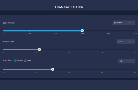
Vue Slider
The Vue slider component allows you to select a value or range of values between the min and max range.
Getting Started .
Online demos .
Learn more
Key features
- Types - Provided three types of Slider.
- Orientation - Displays the Slider in horizontal or vertical direction.
- Buttons - Provided built-in support to render the buttons in both edges of the Slider.
- Tooltip - Displays a tooltip to show the currently selected value.
- Ticks - Displays a scale with small and big ticks.
- Format - Customize the slider values into various format.
- Limits - Slider thumb movement restriction enabled with interval dragging in range-slider.
- Accessibility - Built-in compliance with the WAI-ARIA specifications.
- Keyboard interaction - The Slider can be intractable through the keyboard.
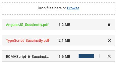
Vue File Upload
The Vue File Upload component is an extended version of the HTML5 upload control which is used to upload images, documents, and other files to a server.
Getting Started .
Online demos .
Learn more
Key features
- Chunk upload – used to upload large files as chunks
- Drag-and-drop – drag the files and drop into component to upload them.
- Template – the file list and buttons can be customize using template.
- Validation – validate extension and size of upload file.
- Auto upload – Process the file to upload without interaction.
- Preload files – View and manipulate previously uploaded files.
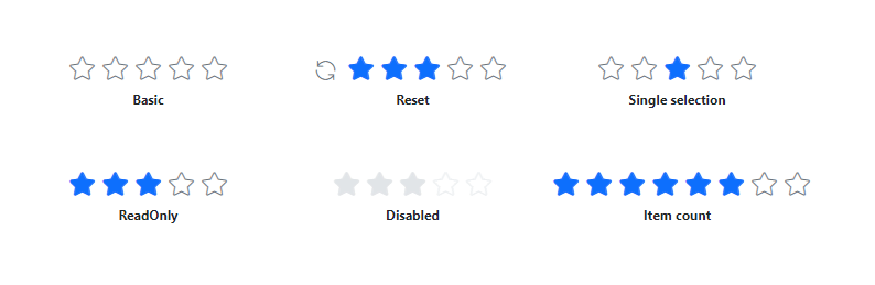
Vue Rating
The Vue Rating component is used to provide a star rating or view other people’s ratings on a numeric scale for any service provided, such as for movies, applications, or products. It has several built-in features such as support for precision modes, labels, tooltip, and UI customization.
Getting Started .
Online demos .
Learn more
Key features
- Precision modes - Provides different precision modes for more accurate rating.
- Labels - Displays current value of the rating.
- Tooltip - Displays additional information of the rating items.
- Selection - Customization options for the selected rating value and selection behavior.
- Appearance - Customize the rating items appearance.
- Templates - Customize the rating item with a heart, SVG, or any content that precisely matches unique needs.
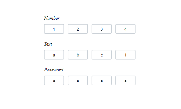
Vue OTP Input
The Vue OTP Input component is designed to securely enter and verify single-use passwords for multi-factor authentication purposes in various applications, such as banking, e-commerce, or account login processes. It has several built-in features such as support for input types, styling modes, placeholder, seperators, and customization.
Getting Started .
Online demos .
Learn more
Key features
- Input types - Allow specifying the input type as text, number, or password for the OTP input..
- Styling modes - Offer built-in styling options such as underline, outline, or fill.
- Placeholders - Allow setting a hint character for each input field, indicating the expected value.
- Separators - Specify a character to be placed between input fields.
- Customization - Allows customizing the default appearance, including input field styling, input length, and more.
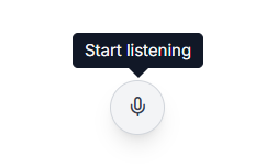
Vue SpeechToText
The Vue SpeechToText component provides seamless voice-to-text conversion in the web applications. It features real-time transcription with interim results, multilingual recognition, customizable buttons and tooltips, and error handling, ensuring an intuitive and accessible speech recognition experience.
Getting Started .
Online demos .
Learn more
Explore the demo here
Key Features
- Real-time transcription: Instantly captures spoken input and converts it into text ensuring smooth speech recognition.
- Interim results: Provides partial transcriptions as the user speaks, offering dynamic real-time experience before updates before finalizing the text.
- Multilingual recognition: Supports multiple languages and regional variations, allowing users to transcribe speech in their preferred language.
- Tooltips: Displays informative tooltips for start and stop actions, guiding users throughout the speech recognition process.
- Appearance: Supports predefined styles and allows customization of content and icons to meet the application design and user preferences.
Trusted by the world's leading companies

Setup
To install inputs and its dependent packages, use the following command
npm install @syncfusion/ej2-vue-inputs
Supported frameworks
Inputs components are also offered in following list of frameworks.
Showcase samples
Support
Product support is available through following mediums.
Changelog
Check the changelog here. Get minor improvements and bug fixes every week to stay up to date with frequent updates.
License and copyright
This is a commercial product and requires a paid license for possession or use. Syncfusion’s licensed software, including this component, is subject to the terms and conditions of Syncfusion's EULA. To acquire a license for 80+ Vue UI components, you can purchase or start a free 30-day trial.
A free community license is also available for companies and individuals whose organizations have less than $1 million USD in annual gross revenue and five or fewer developers.
See LICENSE FILE for more info.
© Copyright 2025 Syncfusion® Inc. All Rights Reserved. The Syncfusion® Essential Studio® license and copyright applies to this distribution.


