
Research
PyPI Package Disguised as Instagram Growth Tool Harvests User Credentials
A deceptive PyPI package posing as an Instagram growth tool collects user credentials and sends them to third-party bot services.
By Kush Pandya - Jun 06, 2025
@syncfusion/ej2-vue-navigations
Advanced tools
A package of Essential JS 2 navigation components such as Tree-view, Tab, Toolbar, Context-menu, and Accordion which is used to navigate from one page to another for Vue
Following list of components are available in the package.
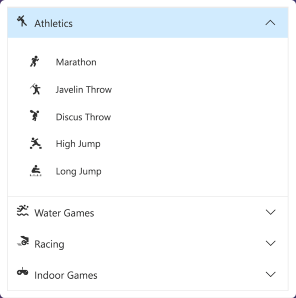
The Vue Accordion component is a container-based control with vertically collapsible panels (vertical accordion) and stacked headers that expand or collapse one or more panels at a time within the available space.
Getting Started . Online demos . Learn more
The Vue AppBar component displays information and actions related to the current application screen. It is used to show branding, screen titles, navigation, and actions.
Getting Started . Online demos . Learn more
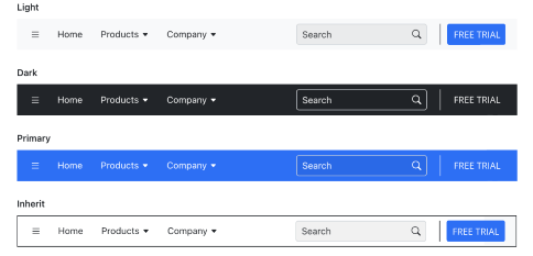
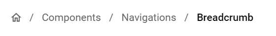
Regular, Prominent, and Dense modes that define the AppBar height.Primary, Light, Dark, and Inherit options to customize the AppBar color.The Vue Breadcrumb component is a graphical user interface that serves as a navigation header for your web application or site. It helps to identify or highlight the current location within the hierarchical structure of a website. It has several built-in features such as templates, icons, binding to location, overflow mode, and UI customizations.
Getting Started . Online demos . Learn more
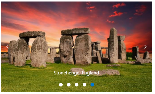
The Vue Carousel component allows users to display images with content, links, etc., like a slide show. Typical uses of carousels include scrolling news headlines, featured articles on home pages, and image galleries.
Getting Started . Online demos . Learn more
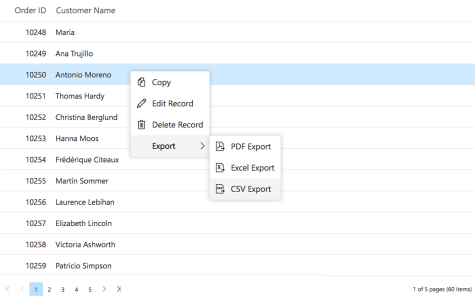
WAI-ARIA specifications and it is achieved through attributes.The Vue ContextMenu component is a graphical user interface control that appears when the user right-clicks or performs a touch and hold action.
Getting Started . Online demos . Learn more
The Vue Sidebar component is an expandable and collapsible component that typically acts as a side container to place primary or secondary content alongside the main content.
Getting Started . Online demos . Learn more
The Vue Tab component is a simple user interface (tabs UI) for organizing related content and occupying a compact space. The tabs are aligned horizontally, and each tab is associated with its header.
Getting Started . Online demos . Learn more
The Vue Toolbar component is a feature-rich control that provides an interface for selecting a command from a collection of commands.
Getting Started . Online demos . Learn more

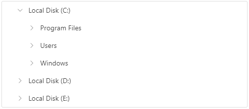
The Vue TreeView component is a graphical user interface control that to represents hierarchical data in a tree structure.
Getting Started . Online demos . Learn more
The Vue Menu component is a graphical user interface control that serves as a navigation header for your web application or site. It supports data binding, templates, icons, multilevel nesting, and horizontal and vertical menus.
Getting Started . Online demos . Learn more
The Vue Stepper component enables users to navigate through a series of steps or stages in a process within a web application. Stepper displays a list of steps with the current step highlighted, allowing users to move between steps. It includes several built-in features, such as different step types, orientation, linear flow, label positions, and template customization.
Getting Started . Online demos . Learn more
Trusted by the world's leading companies

To install navigations and its dependent packages, use the following command.
npm install @syncfusion/ej2-vue-navigations
Navigation components are also offered in following list of frameworks.
 JavaScript |  React |  Angular |  ASP.NET Core |  ASP.NET MVC |
|---|
Product support is available for through following mediums.
Check the changelog here. Get minor improvements and bug fixes every week to stay up to date with frequent updates.
This is a commercial product and requires a paid license for possession or use. Syncfusion® licensed software, including this component, is subject to the terms and conditions of Syncfusion® EULA. To acquire a license for 80+ Vue UI components, you can purchase or start a free 30-day trial.
A free community license is also available for companies and individuals whose organizations have less than $1 million USD in annual gross revenue and five or fewer developers.
See LICENSE FILE for more info.
© Copyright 2025 Syncfusion® Inc. All Rights Reserved. The Syncfusion® Essential Studio® license and copyright applies to this distribution.
FAQs
Did you know?

Socket for GitHub automatically highlights issues in each pull request and monitors the health of all your open source dependencies. Discover the contents of your packages and block harmful activity before you install or update your dependencies.
Research
A deceptive PyPI package posing as an Instagram growth tool collects user credentials and sends them to third-party bot services.

Product
Socket now supports pylock.toml, enabling secure, reproducible Python builds with advanced scanning and full alignment with PEP 751's new standard.

Security News
Research
Socket uncovered two npm packages that register hidden HTTP endpoints to delete all files on command.