Security News
AI Slop Is Polluting Bug Bounty Platforms with Fake Vulnerability Reports
AI-generated slop reports are making bug bounty triage harder, wasting maintainer time, and straining trust in vulnerability disclosure programs.
@tasiodev/react-places-autocomplete
Advanced tools
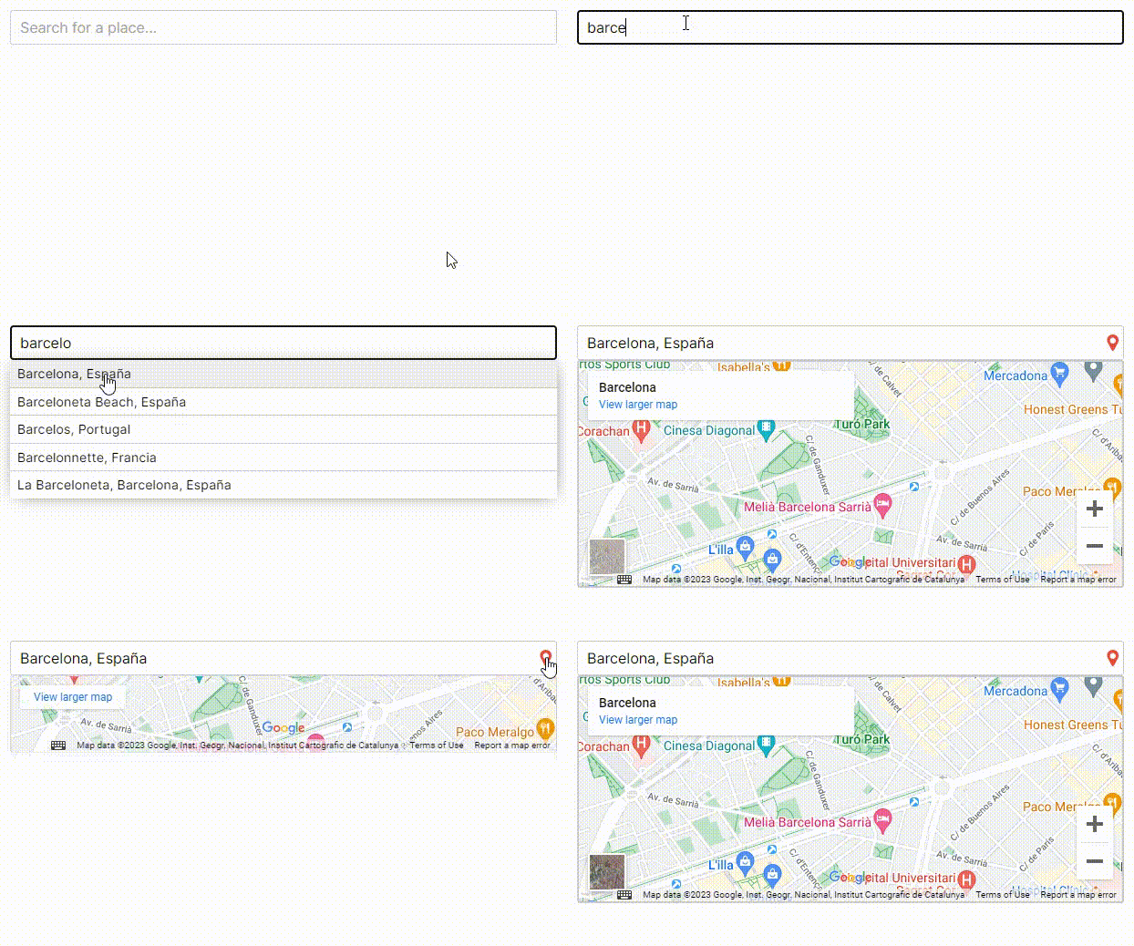
Component used as a field in a form to autocomplete a place, using the Google Maps API.
Component used as a field in a form to autocomplete a place, using the Google Maps API.
The place can be a city, a country, a street, or even an establishment.

https://react-places-autocomplete-demo.up.railway.app
To use this component, you will need a Google API key. Here is more information on how to obtain it: https://developers.google.com/maps/documentation/javascript/get-api-key
You will also need to enable these two APIs:
Exposing your API key in the front-end code of your application can pose significant security risks. Unauthorized access to your API key may lead to unauthorized usage.
Is highly recommended to store it in a separate configuration file, such as the .env file.
Additionally, we strongly recommend that you restrict the usage of your API key using the available configuration options. https://developers.google.com/maps/api-security-best-practices#restrict_apikey
npm install @tasiodev/react-places-autocomplete
import { useState } from 'react'
import PlacesPicker from '@tasiodev/react-places-autocomplete'

function App() {
  const [value, setValue] = useState(null)
  return  <PlacesPicker
        gMapsKey='*******************'
        placeId={value}
        onChange={setValue}
      />
}
| Parameter | Type | Description |
|---|---|---|
gMapsKey | string | Required. Your API key |
placeId | string | Id used to load an initial or stored place |
onChange | func | Event triggered when user select a place or when user starts typing to search a place |
onSelectPlace | func | Event triggered when user select a place |
placeholder | string | Placeholder for input |
searchTypes | array[string] | Limit the place types return in a search. See: https://developers.google.com/maps/documentation/places/web-service/supported_types |
language | string | ISO code for map and results language. Default: "en" |
disableMap | bool | Boolean to disable place Map. Default: false |
mapExpanded | bool | If true, the map is always visible. Default: false |
disabled | bool | Boolean to disable input |
customStyles | object | Object to override styles of each element. See definitions |
{
    container: { backgroundColor: 'black' },
    fieldInput: { color: 'red' },
    searchResultsContainer: { marginTop: 12 },
    searchResult: { padding: 6 },
    gmapContainer: { padding: 8, height: 400 },
}
FAQs
Component used as a field in a form to autocomplete a place, using the Google Maps API.
We found that @tasiodev/react-places-autocomplete demonstrated a not healthy version release cadence and project activity because the last version was released a year ago. It has 1 open source maintainer collaborating on the project.
Did you know?

Socket for GitHub automatically highlights issues in each pull request and monitors the health of all your open source dependencies. Discover the contents of your packages and block harmful activity before you install or update your dependencies.

Security News
AI-generated slop reports are making bug bounty triage harder, wasting maintainer time, and straining trust in vulnerability disclosure programs.

Research
Security News
The Socket Research team investigates a malicious Python package disguised as a Discord error logger that executes remote commands and exfiltrates data via a covert C2 channel.

Research
Socket uncovered npm malware campaign mimicking popular Node.js libraries and packages from other ecosystems; packages steal data and execute remote code.