Security Fundamentals
Turtles, Clams, and Cyber Threat Actors: Shell Usage
The Socket Threat Research Team uncovers how threat actors weaponize shell techniques across npm, PyPI, and Go ecosystems to maintain persistence and exfiltrate data.
@telegraph/button
Advanced tools
A button component
npm install @telegraph/button
@import "@telegraph/button"
Shorthand button component that adheres to the telegraph design system
<Button/>import { Button } from "@telegraph/button"
...
<Button>Button</Button>
| Name | Type | Default | Options |
|---|---|---|---|
| variant | string | "solid" | "solid", "soft", "outline", "ghost" |
| size | string | "2" | "1", "2", "3" |
| color | string | "gray" | "accent", "gray", "red" |
| leadingIcon | IconProps | {icon: undefined, alt: undefined} | See @telegraph/icon exported icons |
| trailingIcon | IconProps | {icon: undefined, alt: undefined} | See @telegraph/icon exported icons |
| icon | IconProps | {icon: undefined, alt: undefined} | See @telegraph/icon exported icons |
Individual parts of the button component that can be composed in configurations different from the default telegraph design system styles. This can be used to create modifications to one-off button components without the need to modify the button exported from this package.
<Button.Root/>Contains all the individual parts of the button component, relays props to children, and handles defining styles for the layout of the button.
import { Button } from "@telegraph/button"

...

<Button.Root></Button.Root>
| Name | Type | Default | Options |
|---|---|---|---|
| variant | string | "solid" | "solid", "soft", "outline", "ghost" |
| size | string | "2" | "1", "2", "3" |
| color | string | "gray" | "accent", "gray", "red" |
<Button.Text/>A component built on top of the Text component from @telegraph/typography with translated props to adhere to the telegraph design system
import { Button } from "@telegraph/button"

...

<Button.Text>Text</Button.Text>
Note:
<Button.Root/>handles setting the styles of the text component. These props can be overriden by passing the props available to @telegraph/typography directly to<Button.Text/>, i.e.<Button.Text size="9" weight="medium" color="beige" align="right">Text</Button.Text>
<Button.Icon/>A component built on top of the Icon component from @telegraph/icon with translated props to adhere to the telegraph design system
import { Button } from "@telegraph/button"
import { checkmark } from "@telegraph/icon"

...

<Button.Icon icon={checkmark} alt="item is selected"/>
| Name | Type | Default | Options |
|---|---|---|---|
| icon | string | undefined | See @telegraph/icon exported icons |
| alt | string | undefined | |
| color | string | "gray" | "accent", "gray", "red" |
Note:
<Button.Root/>handles setting the styles of the icon component. These props can be overriden by passing the props available to @telegraph/icon directly to<Button.Icon/>, i.e.<Button.Icon size="4" variant="secondary" color="blue"/>
import { Button } from "@telegraph/button"
import { checkmark } from "@telegraph/icon"

<Button.Root color="accent" variant="soft">
    <Button.Icon icon={checkmark} alt="item is selected">
    <Button.Text>Text</Button.Text>
</Button.Root>
FAQs
Did you know?

Socket for GitHub automatically highlights issues in each pull request and monitors the health of all your open source dependencies. Discover the contents of your packages and block harmful activity before you install or update your dependencies.

Security Fundamentals
The Socket Threat Research Team uncovers how threat actors weaponize shell techniques across npm, PyPI, and Go ecosystems to maintain persistence and exfiltrate data.

Security News
At VulnCon 2025, NIST scrapped its NVD consortium plans, admitted it can't keep up with CVEs, and outlined automation efforts amid a mounting backlog.

Product
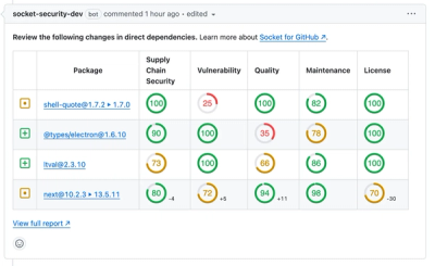
We redesigned our GitHub PR comments to deliver clear, actionable security insights without adding noise to your workflow.