开发环境要求
- TypeScript
- sass(sass-loader 版本 ≤ 10.1.1)
- node(12.13.0 ≤ node 版本 ≤ 17.0.0, 推荐使用 Node.js 官方 LTS 版本 16.17.0)
- npm(版本请与 node 版本匹配)
步骤1:创建项目
推荐使用 vue-cli 方式创建项目, 配置 Vue3 + TypeScript + sass。
如果您尚未安装 vue-cli ,可以在 terminal 或 cmd 中采用如下方式进行安装:
npm install -g @vue/cli@4.5.0 sass sass-loader@10.1.1
通过 vue-cli 创建项目,并选择下图中所选配置项。
vue create chat-example

创建项目完成后,切换到项目所在目录
cd chat-example
步骤2:下载 UIKit 组件
通过 npm 方式下载 UIKit 组件
npm install @tencentcloud/chat-cs-vue
修改main.ts
在 main.ts 中,引入chatCsVueUIKit并抛出app实例
import { createApp } from 'vue'
import App from './App.vue'
import router from './router'
import { chatCsVueUIKit } from "@tencentcloud/chat-cs-vue"

const app = createApp(App);

app.use(router).use(chatCsVueUIKit).mount('#app');

export default app;
步骤4:调用 UIKit 组件
在需要展示的页面,调用 UIKit 的组件即可使用。
例如:在 Home.vue 页面中,使用 UIKit 快速搭建聊天界面(以下示例代码同时支持 Web 端与 H5 端)。
<template>
  <TCCCWebChat></TCCCWebChat>
</template>

<script lang="ts">
import { defineComponent } from "vue";
export default defineComponent({
  data() {
    return {};
  },
});
</script>
步骤5:启动项目
执行以下命令启动项目:
npm run serve
步骤6:在url中输入webAppId即可使用

自定义UIKit消息渲染
为了满足用户自定义不同种类消息的需求,我们在UIKit中提供了不同种类的slot,便于用户自定义消息的渲染样式。
UIKit提供的slot类型与消息类型的对应关系如下表所示:
| tcccText | 文本消息 |
| tcccImage | 图片消息 |
| tcccVideo | 视频消息 |
| tcccAudio | 语言消息 |
| tcccFile | 文件消息 |
| tcccFace | 表情消息 |
| slotTcccLocation | 位置消息 |
| tcccCustom | 自定义消息 |
| tcccMerger | 合并消息 |
| tcccMultiple | 多element消息(message中_elements的长度大于1的消息) |
使用案例
自定义UIKit的文本消息渲染的代码案例如下所示:
<template>
  <TCCCWebChat>
    <template #tcccText="{ message,conversation }">
      <p :style="{ color: 'blue' }">{{ message.payload.text }}</p>
    </template>
  </TCCCWebChat>
</template>

<script lang="ts">
import { defineComponent } from "vue";
export default defineComponent({
  name: "Home",
});
</script>
效果图如下所示:
- slot的参数提供了当前message与当前conversation的属性。
- 您可以根据此案例的代码对其他类型的消息进行自定义渲染,
在使用Vue UIKit时的快速接入
快速接入TcccMessageItem
在您使用了Vue UIKit时,我们提供了配套解析Tccc消息的组件,以帮助您快速在项目中完成对Tccc消息的渲染。
您可以使用tccc-vue-uikit中的TcccMessageItem组件进行快速渲染。
您需要在项目中根据项目情况,在打开Tccc聊天会话时使用TcccMessageItem渲染message即可。
代码示例如下:
        <li
          v-for="(item, index) in messages"
          :key="index"
          :id="item?.ID"
          ref="messageAimID"
        >
          <TcccMessageItem
            :message="item"
            :messages="messages"
            :isSupportGroupReceipt="true"
            :conversation="conversation"
            @jumpID="jumpID"
            @resendMessage="resendMessage"
            @showReadReceiptDialog="showReadReceiptDialog"
            @dropDownOpen="handleDropDownOpen"
            @handleMseeage="handleMseeage"
            @submitRating="scrollToTarget('bottom')"
          ></TcccMessageItem>
        </li>
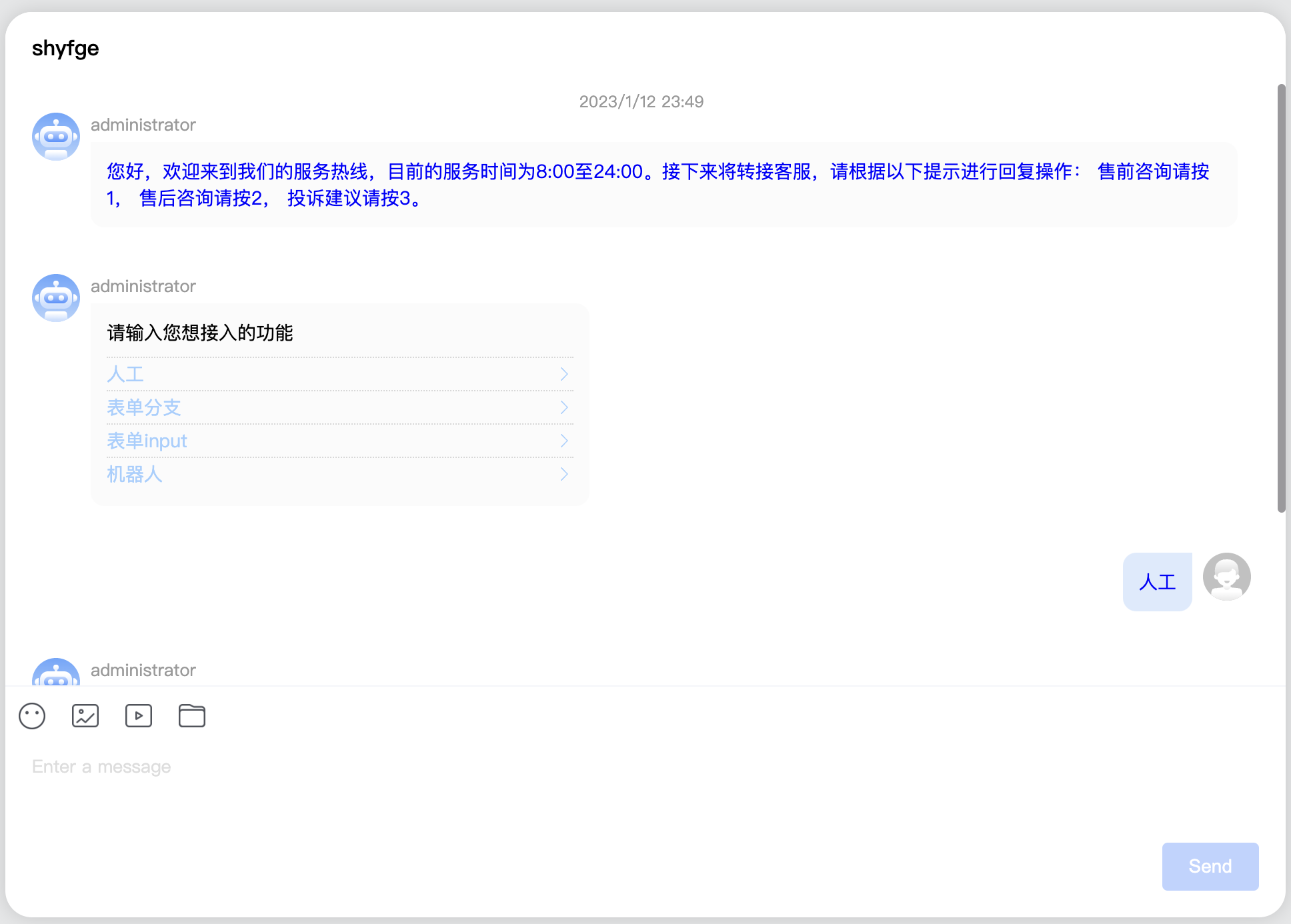
渲染效果如下图所示:
用户自定义
为了方便用户自定义不同类型消息的渲染,我们也为TcccMessageItem组件提供了slot以便用户进行消息自定义渲染
TcccMessageItem提供的slot类型与消息类型的对应关系如下表所示:
| itemSlotText | 文本消息 |
| itemSlotImage | 图片消息 |
| itemSlotVideo | 视频消息 |
| itemSlotAudio | 语言消息 |
| itemSlotFile | 文件消息 |
| itemSlotFace | 表情消息 |
| itemSlotLocation | 位置消息 |
| itemSlotCustom | 自定义消息 |
| itemSlotMerger | 合并消息 |
| itemSlotMultiple | 多element消息(message中_elements属性的长度大于1的消息) |
使用案例
自定义TcccMessageItem的文本消息渲染的代码案例如下所示:
        <li
          v-for="(item, index) in messages"
          :key="index"
          :id="item?.ID"
          ref="messageAimID"
        >
          <TcccMessageItem
            :message="item"
            :messages="messages"
            :isSupportGroupReceipt="true"
            :conversation="conversation"
            @jumpID="jumpID"
            @resendMessage="resendMessage"
            @showReadReceiptDialog="showReadReceiptDialog"
            @dropDownOpen="handleDropDownOpen"
            @handleMseeage="handleMseeage"
            @submitRating="scrollToTarget('bottom')"
          >
            <template #itemSlotText="{ message }">
              <p :style="{ color: 'blue' }">{{ message.payload.text }}</p>
            </template>
          </TcccMessageItem>
        </li>
渲染效果如下图所示:
- slot的参数提供了当前message与当前conversation的属性。
- 您可以根据此案例的代码对其他类型的消息进行自定义渲染,
- 若您已经在当前的web UIKit 中进行大量自定义操作,我们建议您使用插槽传入修改后的messageItem组件以保证兼容使用。


