Product
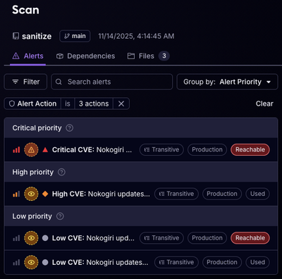
Reachability for Ruby Now in Beta
Reachability analysis for Ruby is now in beta, helping teams identify which vulnerabilities are truly exploitable in their applications.
@threekit/polaris
Advanced tools
This is Threekit's fork of Polaris
Polaris React is a component library designed to help developers create the best experience for merchants who use Shopify. Visit the Polaris style guide to learn more.
For more information about creating apps for the Shopify App Store, take a look at the app development documentation.
While we do offer a CSS-only version, we strongly recommend using the React versions of our components. It’s the version that we’ll be using at Shopify. It allows for rich, complex components like Tabs and Popovers, and will not have as many breaking changes as the CSS-only version.
Run the following command using npm:
npm install @shopify/polaris --save
If you prefer Yarn, use the following command instead:
yarn add @shopify/polaris
<link
  rel="stylesheet"
  href="https://sdks.shopifycdn.com/polaris/3.7.1/polaris.min.css"
/>
Note: you can import the CSS directly into your project if your asset packager supports it:
import '@shopify/polaris/styles.css';
import {AppProvider, Page, Card, Button} from '@shopify/polaris';
ReactDOM.render(
  <AppProvider>
    <Page title="Example app">
      <Card sectioned>
        <Button onClick={() => alert('Button clicked!')}>Example button</Button>
      </Card>
    </Page>
  </AppProvider>,
  document.querySelector('#app'),
);
We provide React wrappers around the Shopify App Bridge (formerly known as the EASDK). You don’t need to go through the initialization of the Shopify App Bridge as described in the docs. Instead, configure the connection to the Shopify admin through the app provider component.
If React doesn’t make sense for your application, you can use a CSS-only version of our components. This includes all the styles you need for every component in the library, but you’ll be responsible for writing the correct markup and updating classes and DOM attributes in response to user events.
<link
  rel="stylesheet"
  href="https://sdks.shopifycdn.com/polaris/3.7.1/polaris.min.css"
/>
<button class="Polaris-Button">Example button</button>
We have created example applications to document some of the ways you could include Polaris in one of your own applications. Each of these examples includes further documentation on how to install dependencies and run the app:
We use Storybook to create a simple, hot-reloading playground for development on these components. You can edit the playground/Playground.tsx file to import the components you are working on, and run yarn dev in order to start the development server. Please do not commit your work on the playground so that it remains pristine for other developers to work on.
yarn devyarn run build-consumer PROJECT_DIRECTORYPROJECT_DIRECTORY is where the build will be copied, which must be a sibling of the polaris-react directory.
# Example
yarn run build-consumer polaris-styleguide
In the example above, the build is copied to polaris-styleguide/node_modules/@shopify/polaris. And in this case, a rebuild of polaris-styleguide is required after copying the polaris-react build, but may not be the case for all consuming projects.
# Example
cd ../polaris-styleguide/
yarn run build:development
Also, when running yarn install, copied builds will be overwritten and will require running yarn run build-consumer PROJECT_DIRECTORY again.
Percy runs for every pull request. Percy is a tool that compares screenshots for every single component we have in the library.
Percy is not always 100% accurate. Since it uses screenshot comparison, even browser sub-pixel rendering differences can cause Percy to ask for user confirmation of whether a change was intended or not. In cases like that, use your best judgement to determine whether you need to address it or not. This is why the choice to approve something or not is always manual. While everyone can view changes, only members of the Shopify team an approve changes.
To start a server for manually viewing the visual regression testing examples, run yarn run dev.
If you’re new to React, we recommend you start with the official React Getting Started documentation. As you read through the topics we suggest you follow along using their React Hello World CodePen example.
Additional resources:
We set out to make our components easy to use. Each of our components has a well-documented (and fully typed) public interface with strong, consistently-applied conventions. This way, developers don’t need to worry about the underlying implementation. Instead, they can focus on creating amazing merchant experiences.
We ensure that our components are made for everyone. They meet accessibility standards and are responsive to any screen or device. We also put a lot of effort into optimizing the performance of the components, so everyone can build inclusive experiences that work.
We make our components flexible enough to meet diverse needs. They present the information you pass in and give you smart callbacks when something has changed, but they don’t enforce any structure beyond that. No matter what type of experience you’re creating, you can use components as the building blocks of your product or feature.
Pull requests are welcome. See the contribution guidelines for more information.
FAQs
Shopify’s product component library
The npm package @threekit/polaris receives a total of 37 weekly downloads. As such, @threekit/polaris popularity was classified as not popular.
We found that @threekit/polaris demonstrated a not healthy version release cadence and project activity because the last version was released a year ago. It has 19 open source maintainers collaborating on the project.
Did you know?

Socket for GitHub automatically highlights issues in each pull request and monitors the health of all your open source dependencies. Discover the contents of your packages and block harmful activity before you install or update your dependencies.

Product
Reachability analysis for Ruby is now in beta, helping teams identify which vulnerabilities are truly exploitable in their applications.

Research
/Security News
Malicious npm packages use Adspect cloaking and fake CAPTCHAs to fingerprint visitors and redirect victims to crypto-themed scam sites.

Security News
Recent coverage mislabels the latest TEA protocol spam as a worm. Here’s what’s actually happening.