
Security News
Another Round of TEA Protocol Spam Floods npm, But It’s Not a Worm
Recent coverage mislabels the latest TEA protocol spam as a worm. Here’s what’s actually happening.
By Philipp Burckhardt - Nov 14, 2025
@transcend-io/consent-manager-ui
Advanced tools
See creating your own UI.
The default consent interface is built with flexibility to choose between different "view states". These can be viewed in the Consent Manager UI playground here.

You can also run the playground locally with
yarn playground
The default consent interface is built with flexibility to choose between different "view states". The following view states are supported:
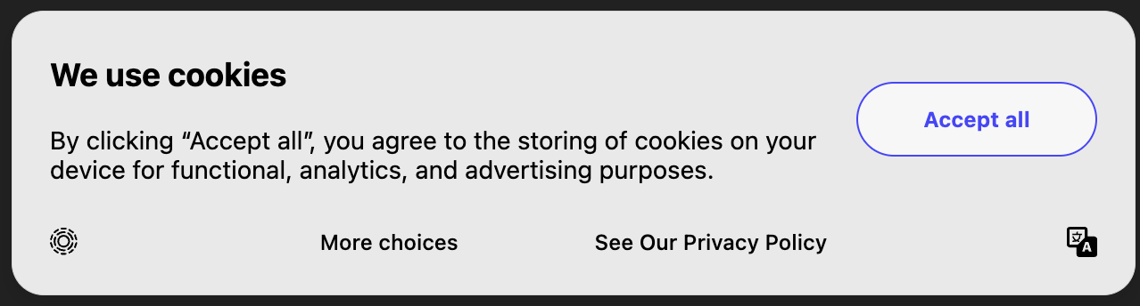
AcceptOrRejectAllStandard GDPR style banner for opting in or out of all purposes. Selecting "More Choices" gives the ability to opt in or out of specific purposes.
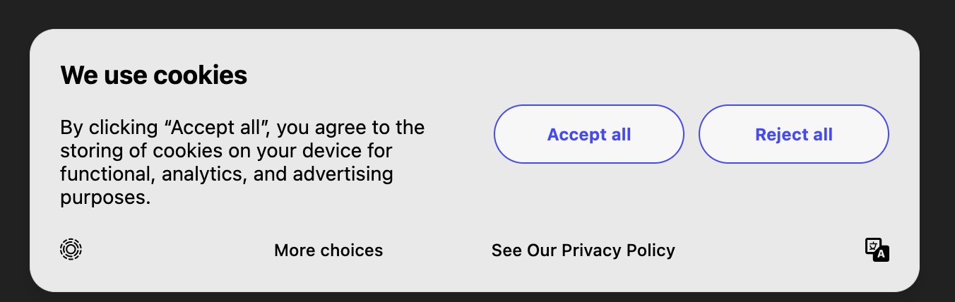
| Button Title | Callback Description |
|---|---|
| Accept All | Opts the user into all allowed purposes in current consent experience. |
| Reject All | Opts the user out of all allowed purposes in current consent experience. Essential is never opted out. |
| More choices | Redirects to the CompleteOptions view state. No purposes change. |
| See our Privacy Policy | Redirects to the privacy policy link specified in Consent Display Settings or the data-privacy-policy data attribute. |
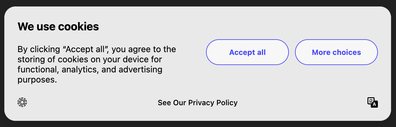
AcceptOrRejectAllOrMoreChoicesSimilar to AcceptOrRejectAll, but the "More Choices" button is a primary button.
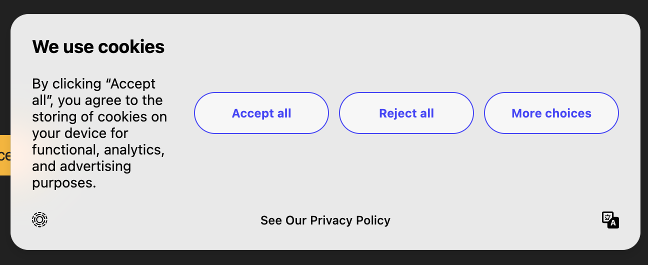
| Button Title | Callback Description |
|---|---|
| Accept All | Opts the user into all allowed purposes in current consent experience. |
| Reject All | Opts the user out of all allowed purposes in current consent experience. Essential is never opted out. |
| More choices | Redirects to the CompleteOptions view state. No purposes change. |
| See our Privacy Policy | Redirects to the privacy policy link specified in Consent Display Settings or the data-privacy-policy data attribute. |
QuickOptionsThis banner is recommended for GDPR-like regimes where customers can opt in or out of multiple purposes with 1 click. Each button includes the purposes for all options to the left of that button. For example, "Analytics" button includes "Essential", "Functional" and "Analytics".
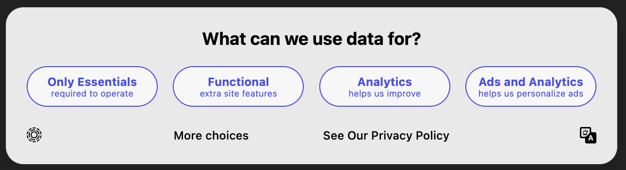
| Button Title | Callback Description |
|---|---|
| Only Essentials | Opts the user out of all purpose types other than Essential. Essential is never opted out. |
| Functional | Opts the user in to Functional, but opts out of Analytics and Advertising. Does not change SaleOfInfo. |
| Analytics | Opts the user in to Functional and Analytics, but opts out of Advertising. Does not change SaleOfInfo. |
| Ads and Analytics | Opts the user in to Functional and Analytics and Advertising. Does not change SaleOfInfo. |
| More choices | Redirects to the CompleteOptions view state. No purposes change. Does not change SaleOfInfo. |
| See our Privacy Policy | Redirects to the privacy policy link specified in Consent Display Settings or the data-privacy-policy data attribute. |
QuickOptions3This banner is the same as QuickOptions but the Functional & Analytics buttons are combined into 1.
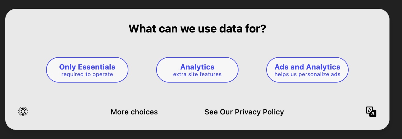
| Button Title | Callback Description |
|---|---|
| Only Essentials | Opts the user out of all purpose types other than Essential. Essential is never opted out. |
| Analytics | Opts the user in to Functional and Analytics, but opts out of Advertising. Does not change SaleOfInfo. |
| Ads and Analytics | Opts the user in to Functional and Analytics and Advertising. Does not change SaleOfInfo. |
| More choices | Redirects to the CompleteOptions view state. No purposes change. Does not change SaleOfInfo. |
| See our Privacy Policy | Redirects to the privacy policy link specified in Consent Display Settings or the data-privacy-policy data attribute. |
CompleteOptionsThis option is linked to in most other banners under the "More Choices" footer. This allows for explicit opting in or out of each purpose. If a user begins fully opted out, this UI requires clicking each checkbox to fully opt in.
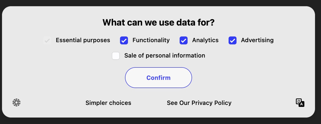
With optional description text:
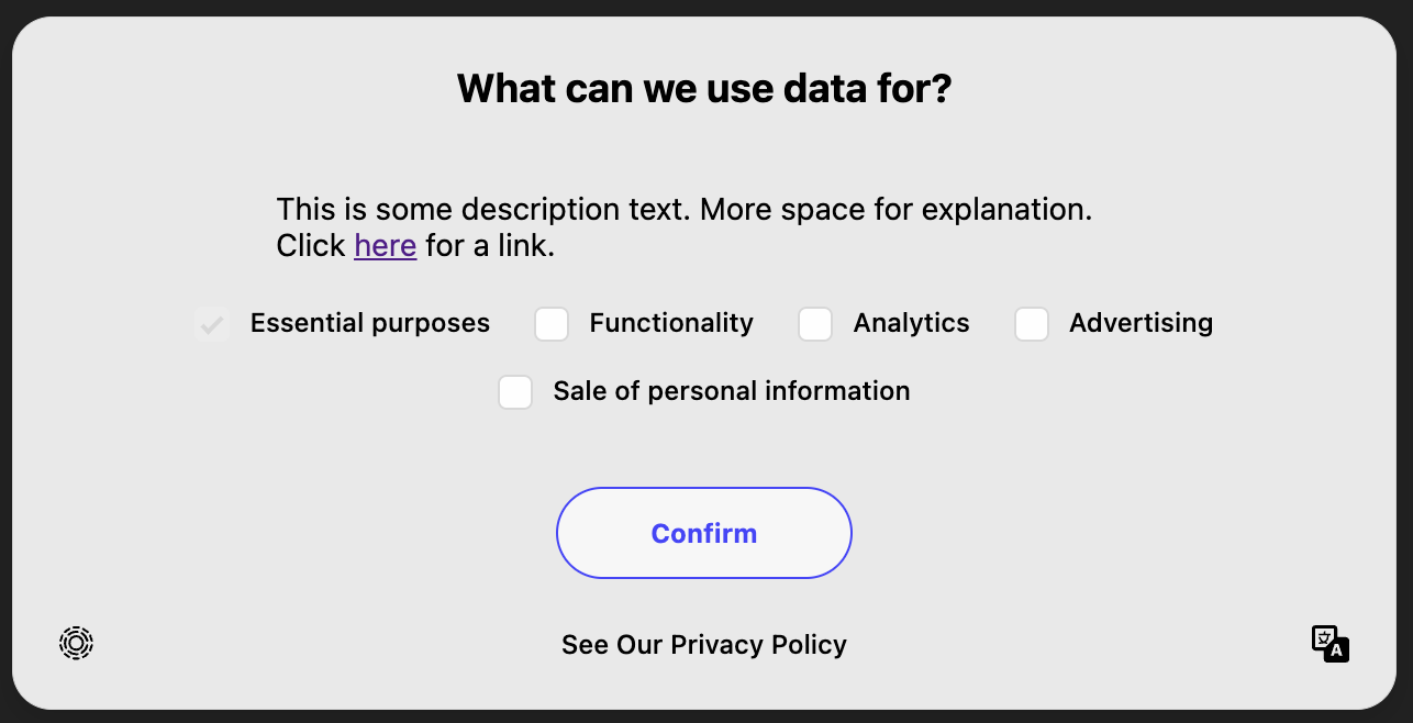
| Button Title | Callback Description |
|---|---|
| Toggle Checkbox | Checking the box opts the user in to a purpose, unchecking the box opts a user out of a purpose. Opt out changes are not applied until "Confirm" is clicked. |
| Confirm | Applies the consent change event for any modified checkboxes. |
| See our Privacy Policy | Redirects to the privacy policy link specified in Consent Display Settings or the data-privacy-policy data attribute. |
CompleteOptionsInvertedThis option is similar to CompleteOptions but the checkboxes are inverted -- checking each box opts the user out of a purpose.
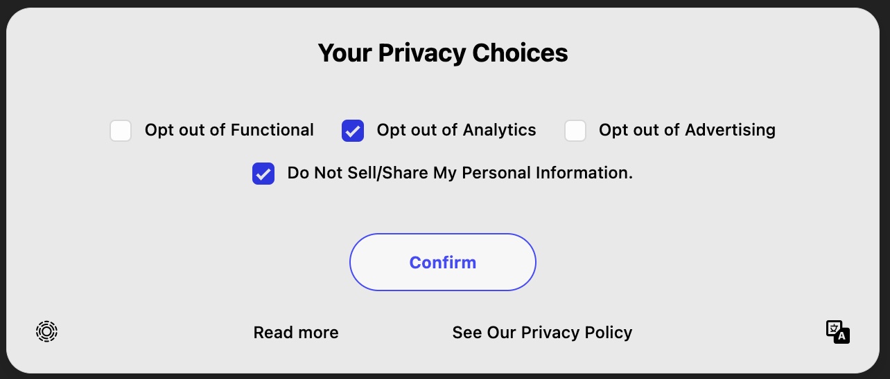
| Button Title | Callback Description |
|---|---|
| Toggle Checkbox | Checking the box opts the user out of a purpose, unchecking the box opts a user in to a purpose. Opt out changes are not applied until "Confirm" is clicked. |
| Confirm | Applies the consent change event for any modified checkboxes. |
| See our Privacy Policy | Redirects to the privacy policy link specified in Consent Display Settings or the data-privacy-policy data attribute. |
| Read more | Redirects to the secondary policy specified using the data-secondary-policy data attribute. |
CompleteOptionsTogglesThis is a good banner style when you are using Transcend for Preference Management.
| Button Title | Callback Description |
|---|---|
| Toggle Switch | Switching one of the toggles opts the user in or out of a purpose. Changes are applied immediately as the toggle is switched |
| X - Icon | Closes the modal with no changes to purposes and no changes to consent confirmation. |
| See our Privacy Policy | Redirects to the privacy policy link specified in Consent Display Settings or the data-privacy-policy data attribute. |
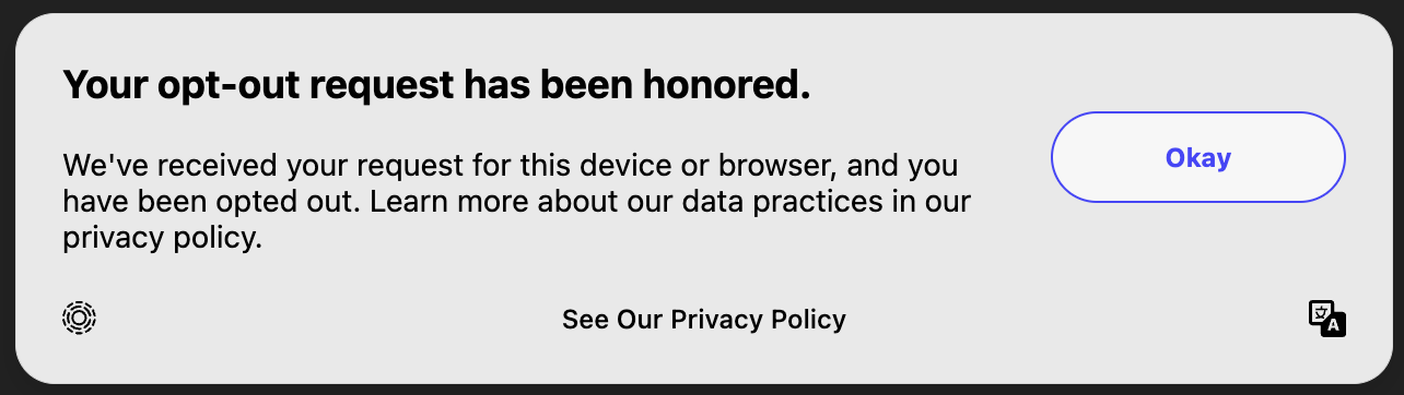
DoNotSellDisclosureUnlike the other view states, this view state should be opened using onClick={(event) => transcend.doNotSell(event)}. Note: for React development, please use: onClick={(event) => transcend.doNotSell(event.nativeEvent)}. This view state will opt the user out upon opening of the modal, while the other view states require an additional button to be clicked to ensure compliance.
This is the recommended flow for US state laws with a do not sell requirement, as it allows for minimal friction in the opt-out process through a single click opt out.
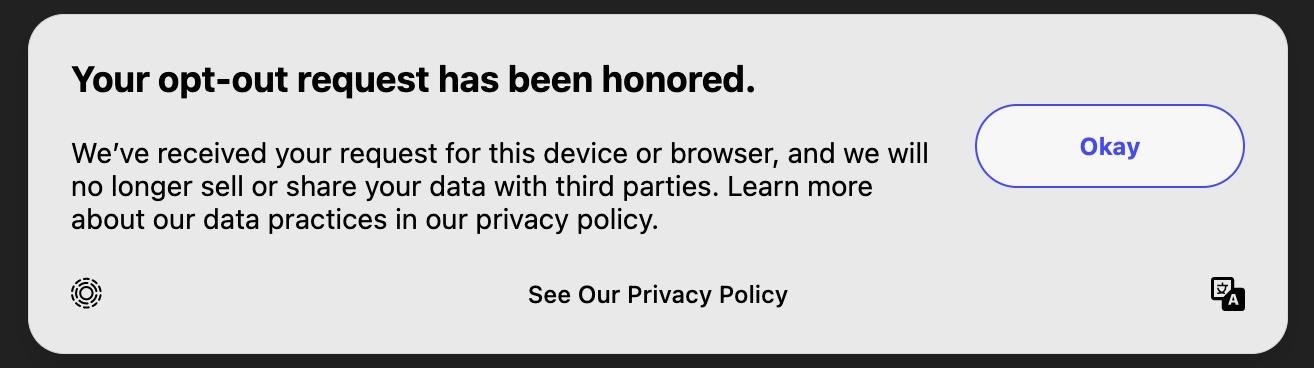
| Button Title | Callback Description |
|---|---|
| On Modal Open | Opts the user out of the SaleOfInfo purpose. |
| Okay | Closes the modal with no changes to purposes and no changes to consent confirmation. |
| See our Privacy Policy | Redirects to the privacy policy link specified in Consent Display Settings or the data-privacy-policy data attribute. |
OptOutDisclosureUnlike the other view states, this view state should be opened using onClick={(event) => transcend.optOutNotice(event)}. Note: for React development, please use: onClick={(event) => transcend.optOutNotice(event.nativeEvent)}. This view state will opt the user out of all purposes as soon as the modal opens, while the other view states require an additional button to be clicked to ensure compliance.
| Button Title | Callback Description |
|---|---|
| On Modal Open | Opts the user out of all purposes. |
| Okay | Closes the modal with no changes to purposes and no changes to consent confirmation. |
| See our Privacy Policy | Redirects to the privacy policy link specified in Consent Display Settings or the data-privacy-policy data attribute. |
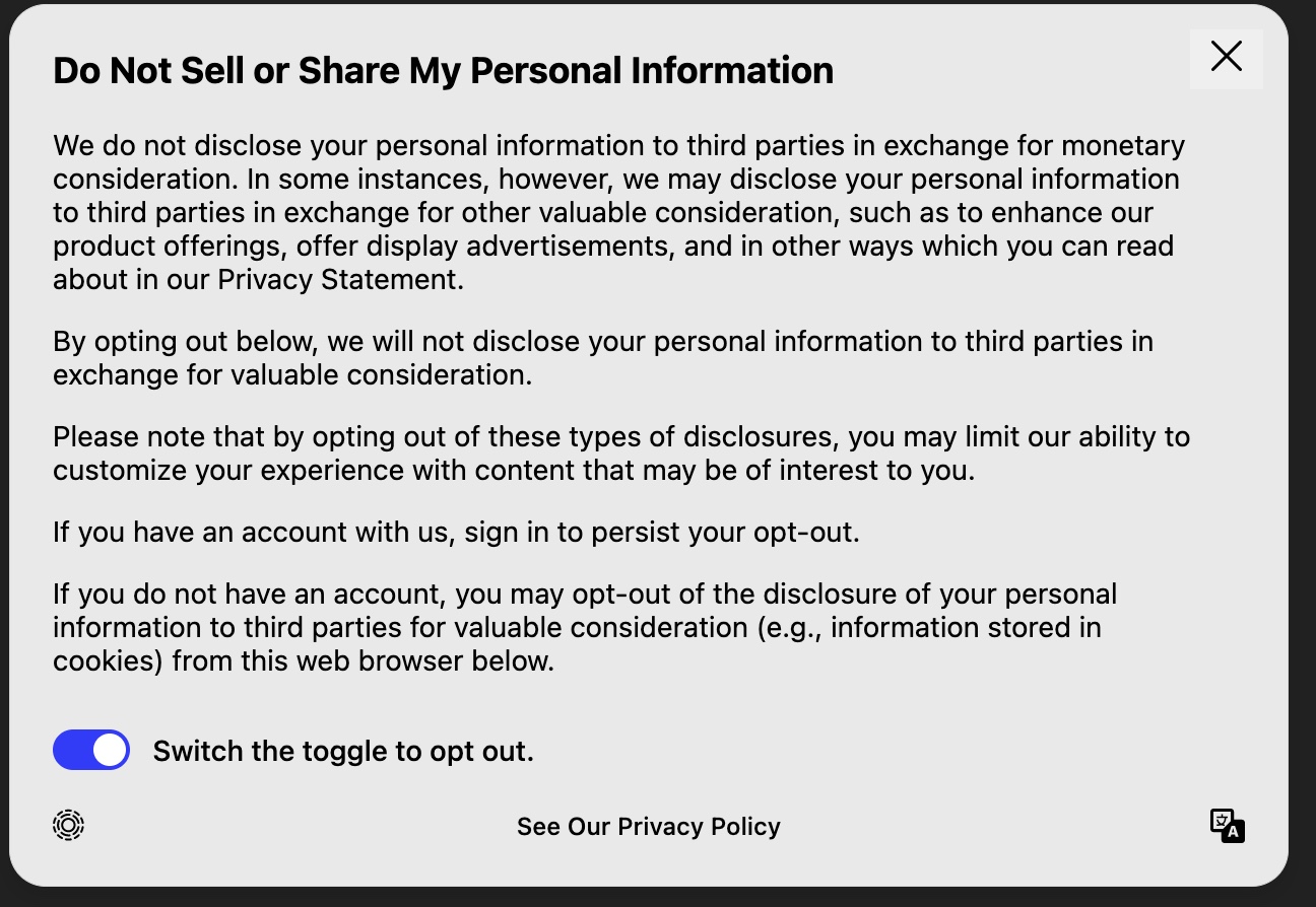
DoNotSellExplainerThis is a 2 click opt out for do not sell or share. This option is useful for companies that need to provide more context about what the opt-out means, and how the opt-out changes when the user is logged in or out.
| Button Title | Callback Description |
|---|---|
| Toggle Switch | Opts the user in or out of the SaleOfInfo purpose. |
| X - Icon | Closes the modal with no changes to purposes and no changes to consent confirmation. |
| See our Privacy Policy | Redirects to the privacy policy link specified in Consent Display Settings or the data-privacy-policy data attribute. |
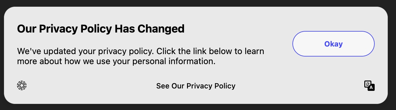
PrivacyPolicyNoticeThis banner can be used to notify users of privacy policy changes. This banner does not collect consent preferences, however, it will save a consent timestamp for whenever the user acknowledges the policy change, and closes the modal.
| Button Title | Callback Description |
|---|---|
| Okay | Closes the modal with no changes to purposes, however, airgap.getConsent().confirmed is set to true to prevent the modal from re-showing. |
| See our Privacy Policy | Redirects to the privacy policy link specified in Consent Display Settings or the data-privacy-policy data attribute. |
PrivacyPolicyNoticeWithCloseButtonThis banner can be used to notify users of privacy policy changes. It does not collect consent preferences, however, it will save a consent timestamp for whenever the user acknowledges the policy change, and closes the modal. This banner is similar to PrivacyPolicyNotice, however instead of using a button to close the modal - an X icon is used in the top right-hand corner of the modal.
| Button Title | Callback Description |
|---|---|
| X - Icon | Closes the modal with no changes to purposes, however, airgap.getConsent().confirmed is set to true to prevent the modal from re-showing. |
| See our Privacy Policy | Redirects to the privacy policy link specified in Consent Display Settings or the data-privacy-policy data attribute. |
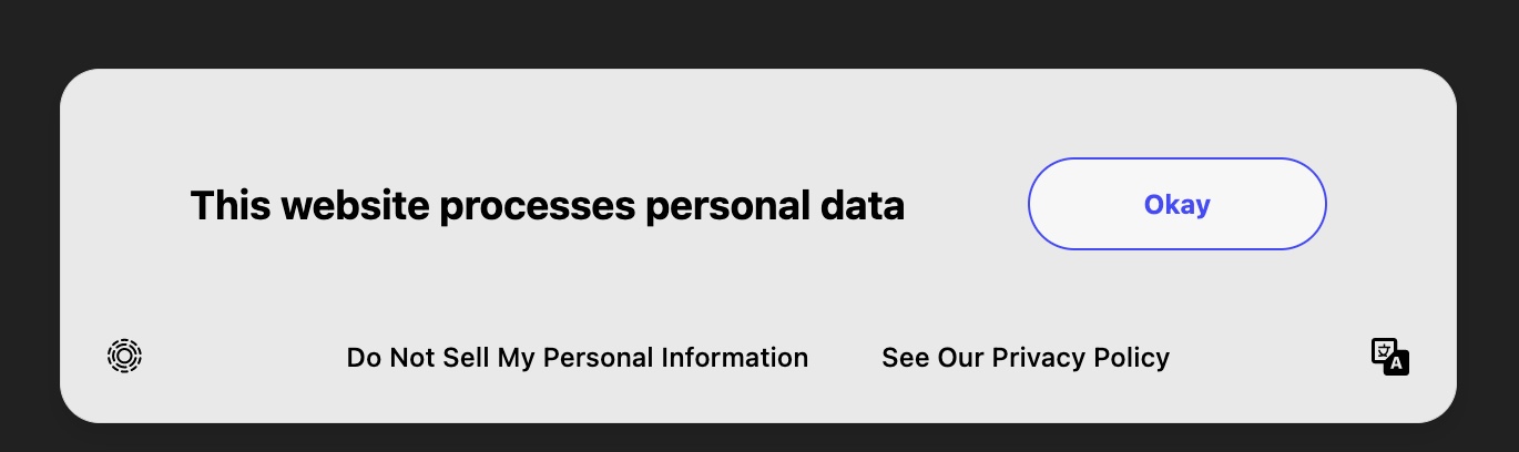
NoticeAndDoNotSellDeprecated: Use DoNotSellDisclosure or DoNotSellExplainer for CPRA compliance This option adds too much friction, and would likely be ruled non-compliant.
| Button Title | Callback Description |
|---|---|
| Okay | Closes the modal with no changes to purposes and no changes to consent confirmation. |
| Do Not Sell My Personal Information | Redirects to the CompleteOptions view state. No purposes change. Does not change SaleOfInfo. |
| See our Privacy Policy | Redirects to the privacy policy link specified in Consent Display Settings or the data-privacy-policy data attribute. |
AcceptOrRejectAnalyticsA banner that handles opting in or out of the Analytics tag.
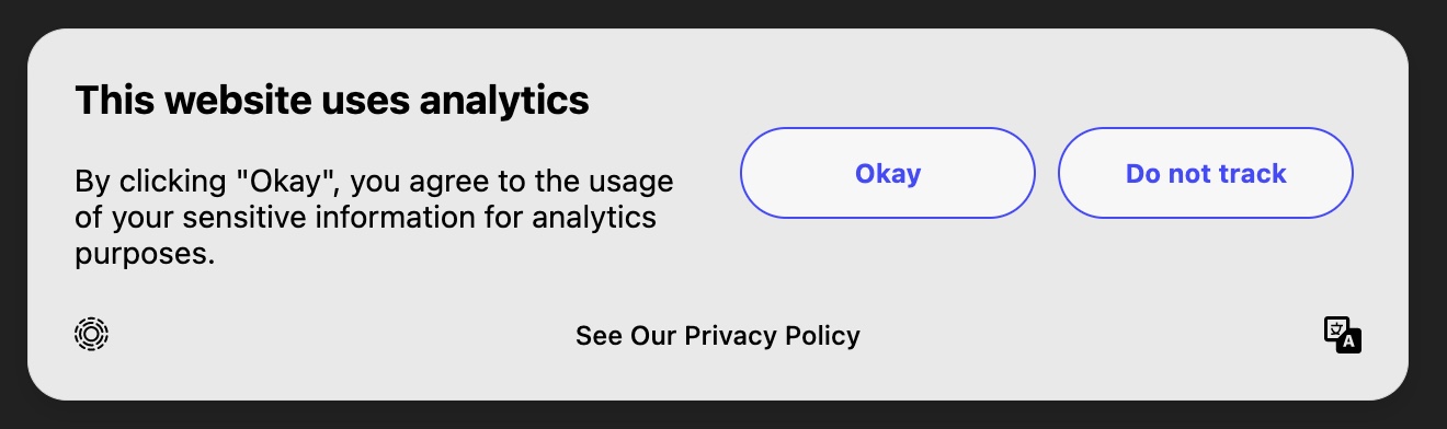
| Button Title | Callback Description |
|---|---|
| Okay | Opts the user into Analytics. |
| Do not track | Opts the user out of Analytics. |
| See our Privacy Policy | Redirects to the privacy policy link specified in Consent Display Settings or the data-privacy-policy data attribute. |
AcceptOrRejectAdvertisingA banner that handles opting in or out of the Advertising tag.
| Button Title | Callback Description |
|---|---|
| Okay | Opts the user into Advertising. |
| Opt out of advertising | Opts the user out of Advertising. |
| See our Privacy Policy | Redirects to the privacy policy link specified in Consent Display Settings or the data-privacy-policy data attribute. |
AcceptAllWARNING: In some jurisdictions this UI may be considered a dark pattern. Use at your own risk. To learn more, head over to our blog post: Demystifying dark patterns: A practical primer for CPRA compliance.
| Button Title | Callback Description |
|---|---|
| Accept All | Opts the user into all allowed purposes in current consent experience. |
| More choices | Redirects to the CompleteOptions view state. No purposes change. |
| See our Privacy Policy | Redirects to the privacy policy link specified in Consent Display Settings or the data-privacy-policy data attribute. |
AcceptAllOrMoreChoicesWARNING: In some jurisdictions this UI may be considered a dark pattern. Use at your own risk. To learn more, head over to our blog post: Demystifying dark patterns: A practical primer for CPRA compliance.
| Button Title | Callback Description |
|---|---|
| Accept All | Opts the user into all allowed purposes in current consent experience. |
| More choices | Redirects to the CompleteOptions view state. No purposes change. |
| See our Privacy Policy | Redirects to the privacy policy link specified in Consent Display Settings or the data-privacy-policy data attribute. |
AcceptAllRejectAllToggleWARNING: In some jurisdictions this UI may be considered a dark pattern. Use at your own risk. To learn more, head over to our blog post: Demystifying dark patterns: A practical primer for CPRA compliance.
| Button Title | Callback Description |
|---|---|
| Toggle Switch | Opts the user in or out of all purpose. |
| X - Icon | Closes the modal with no changes to purposes and no changes to consent confirmation. |
| See our Privacy Policy | Redirects to the privacy policy link specified in Consent Display Settings or the data-privacy-policy data attribute. |
LanguageOptionsThis is the view state that allows the user to select their language.
| Button Title | Callback Description |
|---|---|
| Each Language | Each option changes the selected language for the modal, no purposes change. |
| More choices | Redirects to the CompleteOptions view state. No purposes change. |
| See our Privacy Policy | Redirects to the privacy policy link specified in Consent Display Settings or the data-privacy-policy data attribute. |
Collapsed
| Button Title | Callback Description |
|---|---|
| Transcend Icon | Open's Transcend modal, no purposes change. |
This package is distributed through npm and GitHub package registries and assumes an installation of npm and node.
git clone git@github.com:transcend-io/consent-manager-ui.git
yarn
yarn start
This command will run a very simple HTML file defined in ./index.html. Any changes made to the ./index.html or ./src will cause the page to auto-reload without needing to restart the server.
This repository has Jest tests available for all view states. These unit tests help to ensure core functionality remains unchanged, and run as part of the PR CI process. The test themselves include snapshots of the view state HTML to help prevent regressions in terms of UI logic or DOM behavior.
To run these tests, pull down this repository and run
yarn test
For maintainers: if a change you're making introduces a diff, you can walk through the snapshot changes interactively and review diffs/update snapshots on a case by case basis by running
yarn test:watch
FAQs
Transcend Consent Manager reference consent UI
The npm package @transcend-io/consent-manager-ui receives a total of 740 weekly downloads. As such, @transcend-io/consent-manager-ui popularity was classified as not popular.
We found that @transcend-io/consent-manager-ui demonstrated a healthy version release cadence and project activity because the last version was released less than a year ago. It has 7 open source maintainers collaborating on the project.
Did you know?

Socket for GitHub automatically highlights issues in each pull request and monitors the health of all your open source dependencies. Discover the contents of your packages and block harmful activity before you install or update your dependencies.
Security News
Recent coverage mislabels the latest TEA protocol spam as a worm. Here’s what’s actually happening.

Security News
PyPI adds Trusted Publishing support for GitLab Self-Managed as adoption reaches 25% of uploads

Research
/Security News
A malicious Chrome extension posing as an Ethereum wallet steals seed phrases by encoding them into Sui transactions, enabling full wallet takeover.