@vaadin/card
A visual content container.
Documentation + Live Demo ↗

<vaadin-card theme="cover-media">
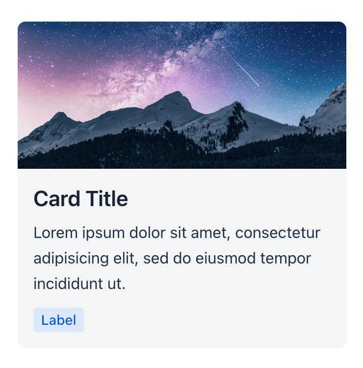
<img
slot="media"
src="https://images.unsplash.com/photo-1519681393784-d120267933ba?ixid=MXwxMjA3fDB8MHxwaG90by1wYWdlfHx8fGVufDB8fHw%3D&ixlib=rb-1.2.1&auto=format&fit=crop&w=750&q=80"
alt=""
/>
<h3 slot="title">Card Title</h3>
<p>Lorem ipsum dolor sit amet, consectetur adipisicing elit, sed do eiusmod tempor incididunt ut.</p>
<vaadin-badge>Label</vaadin-badge>
</vaadin-card>
Installation
Install the component:
npm i @vaadin/card
Once installed, import the component in your application:
import '@vaadin/card';
Contributing
Read the contributing guide to learn about our development process, how to propose bugfixes and improvements, and how to test your changes to Vaadin components.
License
Apache License 2.0
Vaadin collects usage statistics at development time to improve this product.
For details and to opt-out, see https://github.com/vaadin/vaadin-usage-statistics.


