 React Loading


Loading Skleton component building block to easily create placholder loadings.
Features
🎨 Customizable - You can change the color, size and shape of the skeleton
🎮 Plug and Play - You can just import the component and start using it
🏠 Building block - You can use it as a building block to build complex loading component
🧸 Easy to adapt - It is a react component.
Docs
Storybook
Getting Started
Install via yarn or npm
npm install @yisheng90/react-loading --save
or
yarn add @yisheng90/react-loading
Usage
There are two ways to use it.
1. Use it as a component
import Skeleton from "@yisheng90/react-loading";

<Skeleton />;
2. Use it as a building block
import Skeleton from "@yisheng90/react-loading";
const CardSkleton = () => (
<div style={{ display: "flex", padding: "20px" }}>
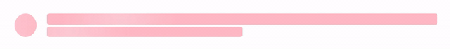
<Skeleton width={45} circle color="pink" />
<div
style={{
display: "flex",
flexDirection: "column",
justifyContent: "space-evenly",
width: "100%",
marginLeft: "20px",
}}
>
<Skeleton color="pink" />
<Skeleton width="50%" color="pink" />
</div>
</div>
);
Props
rows?: number
Defaults to 1. It is used to determine the number of rows to be display.
notes: This option will be ignored if circle is set as true
width?: number | string
Defaults to 100%. It is used to set the width of the skeleton. You can set it using %, rem or px.
height?: number | string
Defaults to 100%. It is used to set the height of the skeleton. You can set it using %, rem or px.
circle?: boolean
Defaults to false. It is used to set shape of the skleton.
color?: string
It is used to set the color of the skleton. You can set it using hex, rgb or rgba.
translucent?: boolean
Defaults to false. It is used to set the opacity of the skleton.
radius?: number
Defaults to 4px. It is used to determine the border radius of the rows. The unit is in px.
notes: This option will be ignored if circle is set as true
Examples
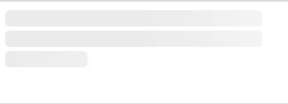
Rows

<Skeleton width={250} rows={6} />
Width
    <Skeleton width={250}/>
    <Skeleton width="250px"/>
    <Skeleton width="5rem"/>
Height

    <Skeleton height={25} />
    <Skeleton height="25px" />
    <Skeleton height="3rem" />
Circle

    <Skeleton circle width={35} />
    <Skeleton circle width={55} />
    <Skeleton circle width={75} />
    <Skeleton circle width={95} />
    <Skeleton circle width={115} />
Color
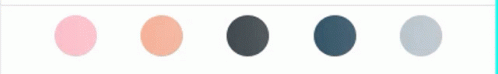
    <Skeleton color="pink" circle width={35}/>
    <Skeleton color="#F8B195" circle width={35}/>
    <Skeleton color="#2A363B" circle width={35}/>
    <Skeleton color="rgb(25,67,89)" circle width={35}/>
    <Skeleton color="rgba(25,67,89, 0.3)" circle width={35}/>
Translucent

<Skeleton color="black" width={250} height={30} translucent />
Contributing
Pull requests are welcome. For major changes, please open an issue first to discuss what you would like to change.
Please make sure to update tests as appropriate.
Contributors

License
MIT


