Research
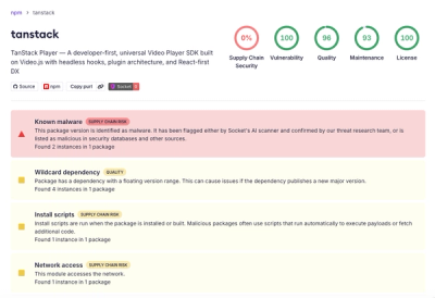
Malicious npm Package Brand-Squats TanStack to Exfiltrate Environment Variables
A brand-squatted TanStack npm package used postinstall scripts to steal .env files and exfiltrate developer secrets to an attacker-controlled endpoint.
@zendeskgarden/react-grid
Advanced tools
Components relating to layout grids in the Garden Design System
This package includes components relating to layout grids in the Garden Design System.
The Grid component is inspired by the Bootstrap flexbox
grid. With Garden, all of
the features are dynamic (based on props) – including the number of grid
columns and gutter width. The result is an incredibly powerful grid system
that will be immediately familiar to users of Bootstrap.
The Pane.Splitter component enables resizable-layouts between one or
more panes. PaneProvider and Pane
coordinate multiple Pane.Splitter components in a
CSS Grid or
CSS Flex
layout. The PaneProvider and Pane.Splitter components receive fr units as
values for building responsive resizable layouts by default.
npm install @zendeskgarden/react-grid

# Peer Dependencies - Also Required
npm install react react-dom styled-components @zendeskgarden/react-theming
import { ThemeProvider } from '@zendeskgarden/react-theming';
import { Grid } from '@zendeskgarden/react-grid';

/**
 * Place a `ThemeProvider` at the root of your React application
 */
<ThemeProvider>
  <Grid>
    <Grid.Row>
      <Grid.Col md={4}>1 of 3</Grid.Col>
      <Grid.Col md={4}>2 of 3</Grid.Col>
      <Grid.Col md={4}>3 of 3</Grid.Col>
    </Grid.Row>
    <Grid.Row>
      <Grid.Col md={6}>1 of 2</Grid.Col>
      <Grid.Col md={6}>2 of 2</Grid.Col>
    </Grid.Row>
  </Grid>
</ThemeProvider>;
import { ThemeProvider } from '@zendeskgarden/react-theming';
import { PaneProvider, Pane } from '@zendeskgarden/react-grid';

/**
 * Place a `ThemeProvider` at the root of your React application
 */
<ThemeProvider>
  <PaneProvider
    totalPanesHeight={1000}
    totalPanesWidth={1000}
    defaultColumnValues={{ 'col-1': 1, 'col-2': 1 }}
    defaultRowValues={{ 'row-1': 1, 'row-2': 1 }}
  >
    {({ getGridTemplateColumns, getGridTemplateRows }) => (
      <div
        style={{
          display: 'grid',
          width: '1000px',
          height: '1000px',
          gridTemplateRows: getGridTemplateRows(),
          gridTemplateColumns: getGridTemplateColumns()
        }}
      >
        <Pane>
          <Pane.Content>Pane 1</Pane.Content>
          <Pane.Splitter layoutKey="col-1" min={0} max={2} orientation="end" />
        </Pane>
        <Pane>
          <Pane.Content>Pane 2</Pane.Content>
          <Pane.Splitter layoutKey="row-1" min={0} max={2} orientation="bottom">
            <Pane.SplitterButton label="toggle row-1" />
          </Pane.Splitter>
        </Pane>
        <Pane>
          <Pane.Content>Pane 3</Pane.Content>
          <Pane.Splitter layoutKey="row-2" min={0} max={2} orientation="top">
            <Pane.SplitterButton label="toggle row-2" placement="end" />
          </Pane.Splitter>
        </Pane>
        <Pane>
          <Pane.Content>Pane 4</Pane.Content>
          <Pane.Splitter layoutKey="col-2" min={0} max={2} orientation="start" />
        </Pane>
      </div>
    )}
  </PaneProvider>
</ThemeProvider>;
the
Panecomponent usesResizeObserverwhich is not available in node.js or other server side environments (if testing with Jest) - please make sure to polyfill as needed. Since the ref used internally is not created when server side rendering, the ResizeObserver API will not be invoked and should not pose an issue when doing so.
FAQs
Components relating to layout grids in the Garden Design System
The npm package @zendeskgarden/react-grid receives a total of 31,720 weekly downloads. As such, @zendeskgarden/react-grid popularity was classified as popular.
We found that @zendeskgarden/react-grid demonstrated a healthy version release cadence and project activity because the last version was released less than a year ago. It has 1 open source maintainer collaborating on the project.
Did you know?

Socket for GitHub automatically highlights issues in each pull request and monitors the health of all your open source dependencies. Discover the contents of your packages and block harmful activity before you install or update your dependencies.

Research
A brand-squatted TanStack npm package used postinstall scripts to steal .env files and exfiltrate developer secrets to an attacker-controlled endpoint.

Research
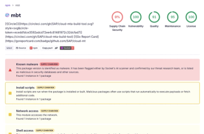
Compromised SAP CAP npm packages download and execute unverified binaries, creating urgent supply chain risk for affected developers and CI/CD environments.

Company News
Socket has acquired Secure Annex to expand extension security across browsers, IDEs, and AI tools.