Security News
Open Source Maintainers Demand Ability to Block Copilot-Generated Issues and PRs
Open source maintainers are urging GitHub to let them block Copilot from submitting AI-generated issues and pull requests to their repositories.
@zilahir/react-sliding-pane
Advanced tools
Pane that slides out of the window side. Like panes from Google Tag Manager.
Features:
See changelog.


I've found sliding pane very helpful in situations when normal modal window (or just popup) is not enough: long list with pagination, multi-step form or nested popups.
Install module and peer dependencies:
npm i --save react react-dom react-sliding-pane
import React, { Component } from 'react';
import { render } from 'react-dom';
import Modal from 'react-modal';
import SlidingPane from 'react-sliding-pane';
import 'react-sliding-pane/dist/react-sliding-pane.css';

class App extends Component {
    constructor(props) {
        super(props);
        this.state = {
            isPaneOpen: false,
            isPaneOpenLeft: false
        };
    }

    componentDidMount() {
        Modal.setAppElement(this.el);
    }

    render() {
        return <div ref={ref => this.el = ref}>
            <button onClick={() => this.setState({ isPaneOpen: true })}>Click me to open right pane!</button>
            <div style={{ marginTop: '32px' }}>
                <button onClick={ () => this.setState({ isPaneOpenLeft: true }) }>
                    Click me to open left pane with 20% width!
                </button>
            </div>
            <SlidingPane
                className='some-custom-class'
                overlayClassName='some-custom-overlay-class'
                isOpen={ this.state.isPaneOpen }
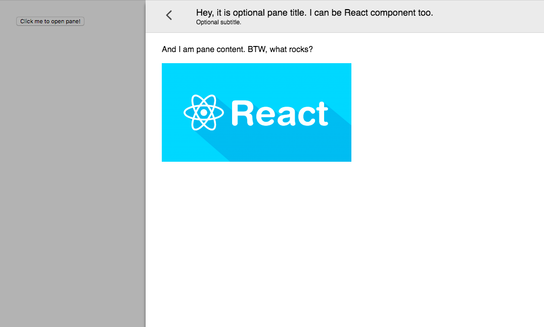
                title='Hey, it is optional pane title.  I can be React component too.'
                subtitle='Optional subtitle.'
                onRequestClose={ () => {
                    // triggered on "<" on left top click or on outside click
                    this.setState({ isPaneOpen: false });
                } }>
                <div>And I am pane content. BTW, what rocks?</div>
                <br />
                <img src='img.png' />
            </SlidingPane>
            <SlidingPane
                closeIcon={<div>Some div containing custom close icon.</div>}
                isOpen={ this.state.isPaneOpenLeft }
                title='Hey, it is optional pane title.  I can be React component too.'
                from='left'
                width='200px'
                onRequestClose={ () => this.setState({ isPaneOpenLeft: false }) }>
                <div>And I am pane content on left.</div>
            </SlidingPane>
        </div>;
    }
}

render(<App />, document.getElementById('app'));
npm run docs
open docs/example.html
FAQs
Full height sliding pane
We found that @zilahir/react-sliding-pane demonstrated a not healthy version release cadence and project activity because the last version was released a year ago. It has 1 open source maintainer collaborating on the project.
Did you know?

Socket for GitHub automatically highlights issues in each pull request and monitors the health of all your open source dependencies. Discover the contents of your packages and block harmful activity before you install or update your dependencies.

Security News
Open source maintainers are urging GitHub to let them block Copilot from submitting AI-generated issues and pull requests to their repositories.

Research
Security News
Malicious Koishi plugin silently exfiltrates messages with hex strings to a hardcoded QQ account, exposing secrets in chatbots across platforms.

Research
Security News
Malicious PyPI checkers validate stolen emails against TikTok and Instagram APIs, enabling targeted account attacks and dark web credential sales.