Research
wget to Wipeout: Malicious Go Modules Fetch Destructive Payload
Socket's research uncovers three dangerous Go modules that contain obfuscated disk-wiping malware, threatening complete data loss.
a-frame-components
Advanced tools
Welcome to the AFrame Components Repository! This collection of custom components is designed to enhance your AFrame-based virtual reality (VR) projects by providing additional functionality, effects, and integrations that are easy to use and integrate.
Welcome to the AFrame Components Repository! This collection of custom components is designed to enhance your AFrame-based virtual reality (VR) projects by providing additional functionality, effects, and integrations that are easy to use and integrate.
This repository offers a variety of AFrame components that you can use to create immersive and interactive 3D scenes in the browser. Whether you're building simple VR experiences or complex interactive applications, our components are designed to be flexible, modular, and customizable.
To use the components from this repository in your AFrame project, follow these steps:
  <head>
    <script src="https://aframe.io/releases/1.5.0/aframe.min.js"></script>
  </head>
Add Component Scripts: Include the desired component scripts in your HTML file after including AFrame. You can link directly to the files in this repository (though we recommend downloading or bundling them for production use):
npm install a-frame-components
After installing the components, you can use them in your AFrame scenes by adding them to your entities. Here are some examples:
import { useEffect, useState } from "react";
import { load } from 'a-frame-components';

export default function SpaceShipScene() {
    const [loaded, setLoaded] = useState(false);
    useEffect(() => {
        load().then(() => {
            setLoaded(true);
        });
    }, [])
    if (!loaded) {
        return <></>
    }
    const margin = '.1 .1 .1 .1'
    return (
        <a-scene>
            <a-entity position="0 2.5 -2">
                <frame-container direction="vertical" alignment="flexStart" margin={margin}>
                    <frame-container direction="horizontal" alignment="flexStart" margin={margin}>
                        <frame-menu-container
                            id="menu"
                            forward-step="0.05"
                            text-value="Menu 1 a"
                            menu-direction={'up'}
                            flex-direction="column"
                            justify-content="flexStart"
                            align-items="flexStart"
                            component-padding="0.01"
                            menu-item-height={`.2`}
                            menu-item-width={`1.0`}>
                            <frame-base-interactive
                                font-size=".07"
                                value={'word1'}
                                title={'Title 1'}
                                interactive-type={'button'}
                                width={1}
                                height={"0.2"}
                                margin="0 0 0.05 0"
                            />
                        </frame-menu-container>
                        ...
For each component, you'll find detailed API documentation below:
To use the frame-container component for creating a layout with vertically centered items, distributed evenly along the main axis, and with a specific margin around the container, you might define it like this:
'frame-container': {
  alignment: 'center', // Center items vertically (in a horizontal layout)
  direction: 'vertical', // Lay out children vertically
  'justify-content': 'center', // Evenly distribute children along the vertical axis
  margin: '10px 20px 10px 20px', // Top and bottom margins of 10px, left and right margins of 20px
};
This setup ensures that the children of the frame-container are vertically arranged, centered both along the main and cross axis, and the container itself has a specified margin from its surroundings.
Manage event listeners with the 'userEventListenerOn' hook. Pass the event , a handler, and a css selector for the component.
import { useEventListenerOn } from 'a-frame-components';

export default function SpaceShipScene() {
    useEventListenerOn('click', () => console.log('Element clicked'), '#menu');
    let guiProps = useBindEventOn('change', 'title', (evt)=>event.detail.value)
    return (
      <>
        <a-scene>
           <frame-gui-button value="a b asdfutton" {...guiProps} />
          <frame-menu-container id="menu">
            <frame-base-interactive
                font-size=".07"
                value={'word1'}
                title={'Title 1'}
                interactive-type={'button'}
                width={1}
                height={"0.2"}
                margin="0 0 0.05 0"
            />
          </frame-menu-container>
        </a-scene>
      </>
    )
}
{
  "compilerOptions": {
    //....
  },
  "include": [
    "src/**/*",
    "types/**/*",
    "node_modules/a-frame-components/types/**/*"
  ]
}
This project is licensed under the MIT License.
FAQs
Welcome to the AFrame Components Repository! This collection of custom components is designed to enhance your AFrame-based virtual reality (VR) projects by providing additional functionality, effects, and integrations that are easy to use and integrate.
The npm package a-frame-components receives a total of 405 weekly downloads. As such, a-frame-components popularity was classified as not popular.
We found that a-frame-components demonstrated a not healthy version release cadence and project activity because the last version was released a year ago. It has 1 open source maintainer collaborating on the project.
Did you know?

Socket for GitHub automatically highlights issues in each pull request and monitors the health of all your open source dependencies. Discover the contents of your packages and block harmful activity before you install or update your dependencies.

Research
Socket's research uncovers three dangerous Go modules that contain obfuscated disk-wiping malware, threatening complete data loss.

Research
Socket uncovers malicious packages on PyPI using Gmail's SMTP protocol for command and control (C2) to exfiltrate data and execute commands.

Product
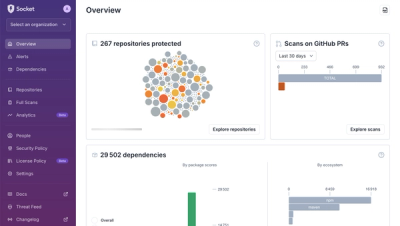
We redesigned Socket's first logged-in page to display rich and insightful visualizations about your repositories protected against supply chain threats.